

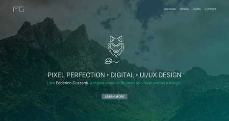
One Page Love is a One Page website design gallery showcasing the best Single Page website designs from around the web.
Get Started for FREE
Sign up with Facebook Sign up with X
I don't have a Facebook or a X account


 Your new post is loading...
 Your new post is loading...
Your new post is loading...
One Page Love is a One Page website design gallery showcasing the best Single Page website designs from around the web. 
No comment yet.
Sign up to comment
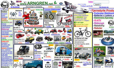
Craigslist is one of the ugliest websites on the Internet. The home page is an indistinct wall of links and text, the site is tough to navigate, the postings are cluttered, and the design has barely changed in the past 15 years. At a time when websites are competing to offer the best digital experiences, Craigslist is the pinnacle of user unfriendliness. And that's exactly what makes it brilliant, says Pascal Deville.
Jeff Domansky's insight:
Yes they're ugly. But these websites have a little bit of charm.
Web design has a big influence on internet presence, affecting things like how traffic interacts with a website (bounce- and conversion-rates) to how effective the site is in the context of SEO and branding. While content is obviously crucial to any site, the aesthetic presentation of that content is equally important. To get a feel for good web design and visually arresting content, here are 20 of the most beautiful websites in 2015.
Jeff Domansky's insight:
Creativity with your coffee and a great collection of website design inspiration. Recommended viewing. 9/10

PARKJH's curator insight,
December 10, 2015 4:33 AM
Inspiration of websites's good online for the enterprice planning 
Cheryl Chng's curator insight,
January 8, 2016 3:44 AM
Creativity with your coffee and a great collection of website design inspiration. Recommended viewing. 9/10
Here is an awesome showcase of creative side menu websites that we have prepared with the aim to provide you the dose of inspiration for your upcoming design projects. Other than coming up with a website that has side menus you can suggest other guys in your field too for them to take inspiration and work on coming up with the one for themselves. I personally liked them all as these are visually stunning and creative. With the belief that you all will like them too let us begin with the compilation of creative side menus websites. Check it out!...
Jeff Domansky's insight:
DesigniMag showcases all the latest and creative websites featuring elegant side menus. Inspiration to help you create a side menu website.
From
line25

WordPress themes are great sources of design inspiration, but it’s even more interesting to check out the best selling premium themes to see the kind of styles are popular with the general public. In today’s web design showcase I round up some of the most purchased themes from multiple marketplaces to compare their layouts. Can you see any common trends?...
Jeff Domansky's insight:
Who can resist these tasty WordPress website designs? Ultimate creativity. 10 / 10
Accelerate positive outcomes with premium WordPress themes. As long as you work with the right ones, these themes can help you create E-commerce, business, portfolio, blog and event pages. It’s a lot better and a lot faster than designing websites from ground up. So, join me in unveiling a dozen or so accomplished themes that really make the grade in 2015....
Jeff Domansky's insight:
Useful collection of top WordPress themes.

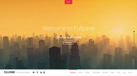
The very first website with parallax scrolling effect was designed by Ian Coyle in 2011. It was the site for Nike “Nike Better World”. These days parallax scrolling is overused by a wide range of websites. However, it’s a great tool that gives pleasant user experience and is a perfect solution for storytelling. In this roundup I put together 30 fantastic examples of parallax scrolling websites for your inspiration. Feel free to click on the images to see the parallax scrolling websites in action....
Jeff Domansky's insight:
Lots of inspiration for website designers .

Design professional Andy Rutledge may have bitten off more than he could chew by trying to address the “broken design” of news websites. In a blog post that outlines all the problems with The New York Times’ design, Rutledge makes bold claims like, “It is hard to believe that the Times, or any other similar publication, actually cares about the news when they treat it with this sort of indignity.” So what he proposes is his own rendition of what a NYT.com section front should look like — and journalists on Twitter, especially from the publication under scrutiny, weren’t feeling it. And, really, they’re right. It’s hard to take seriously a design that completely ignores the constraints of a typical newspaper, or as Ryan Sholin mentioned, “Boy, it sure is easy to redesign a news site without any regard for advertising, performance, or politics. But so much fun!” Because, really, couldn’t we all whip together something glorious and beautiful if we weren’t constrained by practical needs within the newsroom?...
Jeff Domansky's insight:
Great read and cautionary tale when critiquing and offering insight into social media.
|
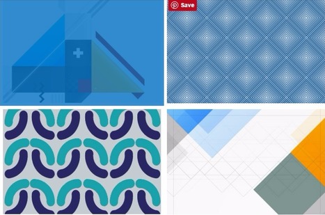
Some trends last for ages while others are cyclical, but whether classic or fleeting, design trends are both inspiring and incredibly useful when it comes to your graphics work. So what’s been hot in 2016? The five styles that have dominated the year so far are outlined here to help you develop eye-catching and relevant concepts, while still staying true your unique creative vision.
Jeff Domansky's insight:
Abstract Swiss is particularly interesting design.
Light colors are easy on the eye, which means that they aren’t as likely to take attention away from the main goal or goals of a site. Negative space, on the other hand, makes websites look less cluttered and easier to navigate. Even though negative space can actually be filled with any color, white is typically the safest bet. For example, a brand like Best Buy is associated with the colors blue and yellow, but the company primarily uses these colors in the navigation menu of its site, which leaves plenty of whitespace to help guide visitors' eyes to calls-to-action (CTAs) like "Shop" and "Find out more."
Jeff Domansky's insight:
Nothing like a little design inspiration in these six websites provide that in spades.
Sometimes websites are just so darn ugly. You have to wonder what they were thinking about when they slapped it together. However, if you want users to take an interest in your website you can learn from all the mistakes of previous website admins. While it might be a bit ugly below, every website is a goldmine of information on how not to design a website. When you put together the lessons, you can determine the best way to design your own site....
Jeff Domansky's insight:
Whoa! Lots of lessons here! Recommended viewing. 9/10

The Windoor's curator insight,
December 10, 2015 2:43 AM
Aunque el diseño no lo es todo - puesto que el contenido soporta la mayor parte del peso - si que tiene cierta relevancia. La usabilidad y accesibilidad son factores estrechamente relacionados: una web bien diseñada y jerarquizada según un orden lógico e intuitivo puede posicionarnos y diferenciarnos respecto a otras, aunque tengan el mismo contenido.
From
line25
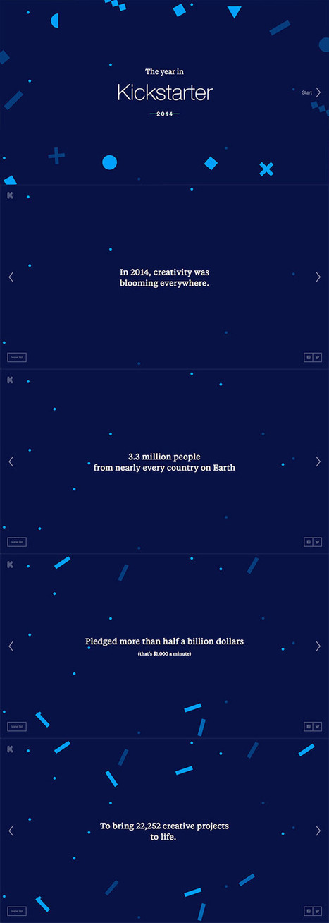
I kinda wish I’d thought of this topic earlier this year, but I recently came across some really cool 2014 Year in Review features that I’d missed at the turn of the year. I thought there was probably some others that I’d missed too, so I took some time to round up all the best microsites that documented various stats from 2014. There’s some inspirational layouts and clever use of web effects that make them definitely worth checking out!...
Jeff Domansky's insight:
More irresistible website creativity. Enjoy! 10/10
Yes, we are a tad late, but it’s always a great post to see how trends have moved forward, or how designs last year are now this years trends. It’s interesting to look at where 2015 will take us. Is the trend of flat web design over? We certainly won’t be missing responsive web design this year, with more and more devices being created and used to surf the web. Or will go back to mobile only websites. Only time will tell. We would love to pull our favourite out from this lot posted below, but we simply cannot, there are too many great designs in all shapes and sizes, what is your favourite ?...
Jeff Domansky's insight:
Creativity with your coffee. These 52 web designs are definitely worth viewing. 9/10

Canva just introduced a simple-as-pie new online Design School that empowers everyone to learn AMAZING graphic design skills. Yes, it’s for people just like us — businesses & brands communicating through social media! The school includes a series of quick & easy tutorials that cover everything beginners need to know about design. So if you want to become a better visual communicator, here’s a taste of the powerful graphic design hacks you’ll learn at the Canva Design School....
Jeff Domansky's insight:
Want to design images that people can't help but LOVE and share? No worries. Anna Guerrero shares 10 easy graphic design hacks.

Decisions, decisions, decisions! Every day we are faced with a constant series of decisions. Whether it is deciding to eat that piece of cake, or make a career change, the decisions we make shape our lives and who we are. We like to think that all of our decisions are rational and that we are in control, however our unconscious mind, drives how we respond to advertising, brands, products, and in the end determines all of our buying decision. As a result, our landing page design plays an integral role in how our brains make a decision to buy a product or not. The reasons unconscious triggers determine our decisions can be found in the structure of our brain. We can break our mind into three separate parts....
Jeff Domansky's insight:
Designing with psychology? When it comes to landing pages, they can work together.

Considering how Twitter's main site has seemed to regress in recent times and greater attention has been placed on the mobile app, we've decided to give the site a makeover and show how the site can be improved...
We understand that Twitter is designed more for mobile, but considering how neglected its desktop site feels – and especially since it is its main source of revenue – we decided to take matters into our own hands and present our vision of how Twitter should look and feel. The AimBefore starting the redesign, it was important to look at what Twitter does right first and incorporate those features into the new look. For one, its simplicity is its greatest strength, and so the overall aim was to evolve the platform instead of creating an entirely new interface from scratch.
While it’s very tempting to fill the entire page with different columns and boxes to give users more features to interact with, doing so would make the page busier, which would compromise the overall experience. Therefore, we limited the design to two columns and placed tweets on the left-hand column to maintain consistency....
Jeff Domansky's insight:
Wow. Just wow! I hope Twitter is watching. This is a wonderful and whimsical "what if?" redesign of our favorite social media channel from the very creative folks at Simply Zesty...
|


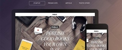
Many impressive designs, wonderful creativity and plenty of inspiration for web designers, marketers and bloggers in this collection of 604 websites and growing. Recommended reading. 10/10