 Your new post is loading...
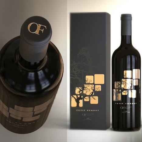
Your label is one of the first thing people are going to notice about your bottle. And a label can tell you a lot about the wine inside: what kind of occasion it’s best for, whether it’s a red or a white (or a sparkling or a rose), what varietal it is, what type of flavor to expect… seriously, your customer is drawing a LOT of information from your label. And because they’re looking for your label to get all of that information, you want to make sure that your label is an accurate representation of who you are and what your customer can expect from your wine. It’s a big deal! Here’s a roundup of 30 of our favorite cool wine labels for inspiration...
Trends are mysterious things. Some stay for years and others are just a swift shimmer that leave as fast as they enter the scene. Still others shift and evolve with the times. Design is both the driving force and the result of this cycle of trends—with packaging design creating personal experiences (like the unboxing experience) that connect consumers to brands on a deeper level. With that in mind, here are the 9 packaging trends that we are predicting for 2017....
Back in 2011, food research consulting firm Technomic released a report claiming nearly a quarter of all vodka consumed was flavored. Manufacturers took notice, and over the ensuing half-decade, liquor store shelves exploded. What was once considered a comparatively benign liquor now encompassed a diversity of flavors ranging from fruit-based to dessert-infused to abominations such as fresh-cut grass, tobacco, and sriracha. Pinnacle Vodka now boasts more than 40 “playful” varieties, up from 30 in 2013. My own local store carries five different types of coconut vodka alone. As one would expect, this trend spilled over into other categories of booze. Though lacking the insipidness of vodka, liquor producers found creative ways to appeal to the flavor-seeking niche. Jack Daniel’s introduced honey and cinnamon whiskies, Hoxton gave us iris-imbued gin, and just recently, tequila manufacturers debuted a host of flavored varieties....
2016 is coming with new and exciting trends. We saw some web design trends are fading in 2015 and some are growing up like hero header, flat design and retro/vintage background are appear in modern website designing. Today we are going share third collection of Web Design Trends 2015. I hope your will enjoy the amazing websites collection and get some great ideas for your next web design projects....
Graphic design is an industry that has been growing and changing for centuries at the hand of countless designers.
So, to celebrate this rich and exciting history, we’ve compiled a list of 40 famous designers that have done their part in shaping graphic design in some way.
From those who specialize in typography or magazine design, through to album covers and political posters, each of these people have made their mark on the industry and shaped it in some way through hard work and some great designs. With that, let’s have a look at 40 people who changed graphic design for good....
Do you want to make your infographics iconic? Okay, so we don’t mean “iconic” in the usual sense. We mean using icons in your infographic design. Icons are those little illustrative graphic images/clip art that represent an object, action or idea. They are often stylized and simplified designs. N
Using icons can make your infographic design more cohesive and more professional. With Venngage you can choose from over 10,000 icons in our icon library and stylize them to your preference by editing their colors, sizes and positions. Here are some tips for how to use icons in your infographics....
Alright, for the sake of those who feel uncomfortable around negativity, you’ll be happy to know that negative space is also known as ‘white space’.
Is that better? Okay, let’s continue.
Note that just because it’s called negative space it’s not necessarily black. Similarly, it’s not always white just because it’s referred to as white space. Negative space or white space is the open or empty space left around any object. Consider it as the breathing room that you leave around every piece of image or text on your design. This dictates how crowded or how light your overall design looks....
As we mentioned last week, picking the right colors is the single most important decision you can make when designing an infographic. Most designers realize this, and for years they’ve been trying to answer one question: is there a science to picking colors that work well together or is it just subjective? Why do some colors match, while others look strange?
The internet has been debating this for a while without much consensus, but I believe the real answer is both: it’s an art and a science. Every design decision is heavily influenced by a designer’s intuition and sense of aesthetics, but there is also a strong scientific component that conveys if a color works well with another.
Expert designers use it to validate their intuition, but we are going to learn how to use color theory to pair beautiful colors together....
Why are style guides so important? They ensure brand consistency throughout any collateral you produce – no matter who created it.
Style guides (or brand bibles) contain all the necessary information to create whatever your company needs. Whether it be a website, advertisement, internal memo, or whatever else, this little document will make your life a breeze. So, if these guides are so important, why isn’t everyone on the bandwagon?
The biggest reason is time. Style guides don’t just magically appear. They take time and effort to create, and time is a precious thing. But how much time does it take to explain to a designer how much space you need around your logo at all times? And how they’re not supposed to change any of the colors? What about finding every font you use and having to relay that to them as well? Not to mention any iconography you’ve got circulating. Then when you hire a second designer since your business is booming, you’ll have to explain it all over again.
Do yourself a favor. Create a style guide now and save yourself a lot of time and frustration down the road. Let’s get started with some basics....
Though print and web designers have a lot in common, there are some important variations that people (both outside and inside the industry) often don’t understand — ranging from workflow and file formats to tools and terminology. While certainly not extensive, the following guide offers a brief overview of some of the biggest (and often, the most confusing) differences between the two disciplines.....
If you’re looking into learning, studying, broadening your knowledge of web design then reading an eBook is great place to start. Within this article we have composed the 15 best eBooks for web designers that we think are great and even better, they’re all free!...
Print ads were once the standard format for creative advertising. But as more and more advertising dollars are allocated to digital outlets, print advertising is seen as an expensive, untrackable, traditional media format.
You would think the category is void of innovative ideas, but that’s certainly not the case. In fact, many brands are finding new ways to merge the digital and physical world through magazine and newspaper ads. Here are 15 print ads that should make you rethink the word "traditional."...
Just as a Supernova produces a light that expands in different directions, our team has created a selection of the most amazing mockups responding to requests from our users, we have classified into six categories which can explore endless creative possibilities.
Why limit ourselves when we know that everything around us is constantly expanding, dare to go beyond Infinity and observes the universe of mockups from a new perspective, we call it supernova, 80+ PSD Mockups with new features that allow you create your own universe and fill light. Dive into Supernova Bundle....
|
As it turns out, posters aren't as old-school as we might think. In fact, they're still quite effective devices for promoting events. Making yours stand out, however, is the tricky part.Like so many other things in marketing, it requires a combination of creativity and formula. But what are the success factors? And what makes a poster look its best? You're in luck. Our friends at Venngage, who know a thing or two about creating compelling visuals, put together this infographic to guide you along your poster-making journey. It'll help you figure out what information is essential to include on your poster, and how to make it aesthetically appealing -- without overwhelming the viewer....
So what is product packaging? It’s a practical tool, yes. (I mean, how else are you going to effectively get beer into your mouth?) But it’s also more than that. Like any good design, packaging tells a story. It’s also a sensual experience, literally engaging us through sight, touch and sound (and possibly smell and taste, depending on the product/package). All of these details help us understand what the enclosed product is for, how it should be used, who should use it and, maybe most importantly, if we should buy a product or not. In the Ultimate Guide to Product Packaging Design we look at how to get your packaging to tell the story you want....
UP UNTIL A few years ago, most books in the public domain were lacking. Not lacking in words, which hadn’t changed, but lacking in style, lacking in design, lacking, mostly, in the emotional bond many readers forge when (sorry!) they judge a book by its cover. Most of the classics found on Project Gutenberg didn’t have a cover, and those that did tended to have a scanned, grainy image from a long time ago. “It might technically be available, but if it is, it’s ugly and poor quality,” Jennifer 8. Lee, a co-founder of digital literary studio Plympton, says of the covers on many public domain texts.
It feels wrong to complain about something that’s free, but without a cover, a book, though certainly still a book, is just a bit less gripping. Two years ago, Lee and her collaborators at Plympton were redesigning the website for DailyLit, which aims to get people to read small chunks of fiction daily. They figured they’d use books from Project Gutenberg, the volunteer effort to digitize and archive classic works in the public domain. Then they saw what they were working with. Lee considered commissioning new covers. “It was prohibitively expensive,” she says. Then she recalled a conversation she had with Creative Action Network, a startup aimed at crowdsourcing artwork to support artists and social causes. (Remember Design for Obama? That was them.)...
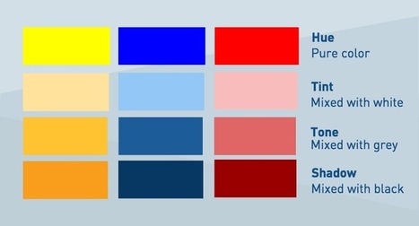
And one of the easiest palettes to use (and hardest to mess up) is a monochromatic one. Although mono does mean “one,” this approach to color isn’t just using the same single shade in multiple places in your design. Instead, you can create a monochromatic color palette by choosing one base color (traditionally one of the 12 on the color wheel) plus any number of variations of that base.
What type of variations? Let’s look at our options: - Shades: the base color darkened with black. - Tones: the base color dulled (or desaturated) with gray. - Tints: the base color lightened with white...
When you are browsing different social media platforms – Facebook, Twitter, LinkedIn, you are likely to see images with text on them – these can be inspirational, informative, or just plain fun. Having your message on a colourful image will catch your customer’s eye more effectively than just using text alone.
However, if you are a small business owner, you probably don’t have the budget to hire a a graphic designer. Luckily, there are plenty of options on the market today to help you create the graphic yourself for minimal time and effort....
As most of you guys probably know, the footer is the last significant part of a website. It tends to be used for placing important information, such as the RSS feedback button, slide galleries, contact information, latest posts, the site map, among others. But the footer its not just a large space to fill the bottom of the page. It's a whole design area, in which the designer can place some pretty cool ideas that will not fit inside the main space of the site. In this countdown, we will be showing you some of the coolest footer ideas on the web, so lets get it started.
Futuristic fonts are only applicable to certain types of projects. These designs often require an ultra-hip, ultramodern, revolutionary-themed appearance. These fonts have an edge. They are stimulating and can even be sexy. Futuristic fonts are often used on graphics promoting big entertainment events like a concert.
These kind of fonts are also the go-to typefaces for projects with a futuristic feel or persona. Take the Black Eyed Peas for instance. The group has adopted this avant-garde, modernistic character on their songs, videos and outfits. It only follows that the font they use on their concert posters and album covers is part of the futuristic font family. Music duo Daft Punk also embraces this identity. And so when you check out the duo’s website, you’ll instantly be presented with a variety of futuristic fonts as part of the site’s overall design...
Color is everywhere. Our mind is engaging with different colors on a consistent basis, and associates them with different things. A study titled Impact of Colors in Marketing describes how researchers found that up to 90% of snap judgments made about products can be based on color alone (depending on the product). But although we are so familiar with colors, there is a large spectrum of uncertainty when it comes to using color for art and design.
When we talk about web or graphic design, color might be the single most important choice. The right color decision is the foundation for a beautiful, engaging and seamless design. However, the wrong color choice can destroy a design, even if everything else is there.
Let’s look at an example. The image below features the exact same infographic – the same content, the same hierarchy, the same positioning of elements....
Let's talk about latest web design trends and standards in 2015. And we also help you by sharing tools, that help you achieve trendy looks. Check it out!
For every trend, I will provide you some data and research that supports the fact followed with examples of real websites utilizing it. I will also recommend some tools, resources and services for implementing the trend into your project...
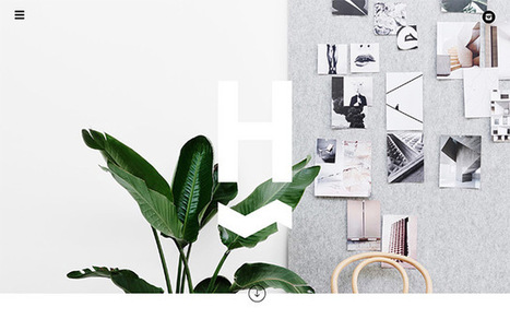
inspiring Sites of the Week is the weekly series where we feature the latest and hottest websites targeting the design world from around the globe. If it’s creative, unusual, has great functionality and is built using cutting-edge technology we feature them here. Get inspired by the best designs in the industry in the eighty edition of the series.
Are the fortunes of design on the rise in Silicon Valley? A resounding yes, says John Maeda, design partner at the venture capital firm Kleiner Perkins Caufield Byers.
During a presentation at South By Southwest 2015 on Sunday, Maeda argued that not only is Silicon Valley taking design more seriously; design is actually taking over. Here are four key reasons why the most successful tech companies of the future will really be design companies....
You notice well designed food packaging while wandering grocery store aisles. You try to identify the fonts used on advertisements or store signs. You’re tempted to buy greeting cards just because they have a really great design or illustration.If you’re like me, maybe you’re constantly bookmarking designs you find online or you compile boards of inspiring work on Pinterest....
|


![How To Design With Monochromatic Colors [With Expert Tips From A Designer] – Design School | Public Relations & Social Marketing Insight | Scoop.it](https://img.scoop.it/zXsjH9kCIWNkvGWEa4Xnyzl72eJkfbmt4t8yenImKBVvK0kTmF0xjctABnaLJIm9)


A wine label design can tell you a lot about the wine inside. 99Designs rounded up 30 amazing, tasty, creative wine labels to help inspire your next selection.