 Your new post is loading...
While many imaging apps’ tools closely resemble those used by artists in the real world – such as brushes and pens – the color picker feels like a completely digital device. A new project from the folks at Adobe Research and University of Toronto reimagines it as a skeuomorphic palette that’s designed to be more natural and intuitive, while allowing for the creation of harmonious color schemes and works of art. Instead of forcing users to choose from colors from across the entire spectrum, Playful Palette presents you with an interface that’s more like how you’d mix paint in real life. Pick a bunch of colors represented as paint blobs, make a puddle with them, blend them with lighter and darker hues by pushing in different directions and get a gradient of colors to work with. Hit ‘play’ on the clip for a better idea of what I’m talking about:...
Working with color can be so much fun. Color can set the mood and tone of a design. Color can make a design appear clean or messy. Another thing we can use color for is to draw attention to a desired piece of content or element. In this post, we’ll go over the various way in which color can be manipulated to draw attention to something. Some of the examples will talk about repetitiveness, some about photography and others about how a lack of color can be a strategic thing too. Let’s get started in analyzing how to draw attention through color....
Everyone, even non-designers, can agree that the smallest typographical change can make a world of difference (*cough* Warren Beatty *cough*). Elevating designs through typography is a skill every designer should have in their back pocket. Do you want to become a typography wiz—and, ultimately, an even better designer? We want that for you too! That’s why we’ve gathered a list of the best free typography resources—handpicked, just for you. Free typography education Check out these e-courses, e-books, and workshops to get started on your typographical journey....
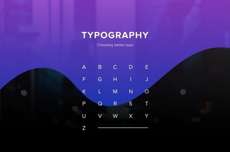
One of the most important skills you can learn as a designer is how to choose type. This is because text is one of the primary ways designers can communicate with users. Typography can make or break a design. There’s a beauty and complexity to typography. Some people devote their entire careers to type. Thankfully, their work is well documented, so we have tons of online resources for typography. This article is designed to serve as a starting point for helping you learn how to choose type for your designs. It will encourage you to explore fonts and font combinations beyond those you’re familiar with....
2017 is the year we return to the organic roots and we will see a return to the natural. In terms of colors, the start has been given by Pantone (as every year, in fact), who has crowned the color for 2017 as Greenery, based on it’s meaning of new beginning, freshness and environmentalism. Manifesting as a “fresh and zesty yellow-green shade that evokes the first days of spring”, Greenery envelops the notion of breathing, reinvigorating and appreciating the great outdoors. That said, let’s take a closer look at the graphic design trends that define 2017. Most of them influence both print and web design, but some of them are just for the web....
One Page Love is a One Page website design gallery showcasing the best Single Page website designs from around the web.
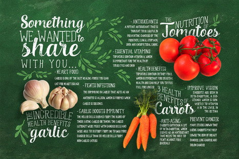
As it turns out, posters aren't as old-school as we might think. In fact, they're still quite effective devices for promoting events. Making yours stand out, however, is the tricky part.Like so many other things in marketing, it requires a combination of creativity and formula. But what are the success factors? And what makes a poster look its best? You're in luck. Our friends at Venngage, who know a thing or two about creating compelling visuals, put together this infographic to guide you along your poster-making journey. It'll help you figure out what information is essential to include on your poster, and how to make it aesthetically appealing -- without overwhelming the viewer....
While clients often ask you to cram in as much information into a page as possible, seasoned web designers know this can lead to a usability nightmare. Confident and careful use of whitespace, in contrast, is all about giving content room to breathe. The examples listed here work because everything the visitor needs is still there on the page; all that’s absent would just be clutter. In place of that clutter, whitespace helps create a balanced, easy to navigate interface where you can find what you need without being overwhelmed....
Strikingly is the best website builder for anyone to build a gorgeous, mobile-friendly website easily. Quick, simple and stylish. Get started today. EDITOR POSSIBLE Click anything to edit, and publish instantly. Absolutely no code or design experience needed. We keep it simple and focused. Build a beautiful website in under 30 minutes. ...
Have you seen the hand-drawn look? Hand lettering's rising popularity has imposed a new grungy, ornated style in fonts that we can't get enough of. These type families offer uniqueness and naivety, while adding an unpretentious touch to print and web designs alike. If you haven't tried your hand at lettering yet, get started with these brilliant fonts that evoke that coveted hand-drawn look....
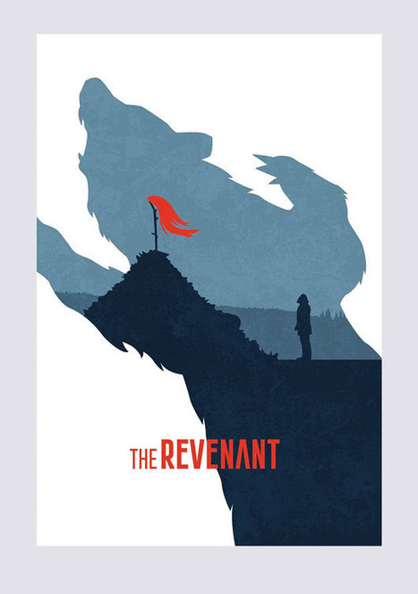
What better time to kick off a fun community contest than right before the Academy Awards?! This time around, we turned to our designer community to reimagine the 2016 Oscars movie posters for the 8 “Best Picture” nominees, drawing inspiration from the minimal movie poster trend.
The results were great – and Mad Max and The Martian were definite favorites. Check out the winners and some of the highlights below!...
There were trends that carved a quite niche for themselves such as responsiveness, mobile-friendliness, animations; others that matured such as flat style or scrolling effects; a few that remained unchanged like hamburger menu button or one-pages; and those that took the web by storm and quickly passed like dynamic patterns.
The year certainly supplied creative folks with a fertile environment where one can easily go wild. Although it is challenging to trace every key moment, however, we can demonstrate the overall picture through a collection of ingenious and exclusive projects.
We are going to dive into the best web designs of 2015 that were highly and justly rewarded by Designmodo team. Here’s what we have for you....
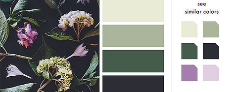
There’s no reason for your designs to look drab – especially when it comes to color. A quick glance online and you’ll find a stockpile of color scheme apps ready to help you learn, play and perfect your next palette.From clever Hex code games to comprehensive color wheels, here are 15 of our favorite free color scheme apps to take your designs to the next level....
|
Designing for the web, you must keep up-to-date with the latest trends and tools. For trends, it’s fairly easy to know what’s going on, but it can be hard to keep up with the latest tools. Let’s look at ten web design tools you can add to your toolbox.
I launched Typewolf as a side project in June of 2013. Working as a designer, I was always frustrated by the lack of good resources for choosing fonts for design projects. Seeing type samples set in “the quick brown fox jumps over the lazy dog” isn’t very useful when it comes to web design—seeing how real type performs on actual websites is much more helpful. I’ve also noticed that other typography sites tend to be written from a type designer’s perspective rather than from the perspective of someone who actually uses type in their day-to-day work. I’ve been a designer for 15 years, so everything on Typewolf is approached from a designer’s perspective....
Just like previous years, we've undertaken great efforts to look for, categorize, and create font previews of 100 typefaces that you can use to do almost anything. Regarding their licenses, you should pay attention to each one individually as, while the majority are completely free, some are for personal use only and others are not full families – this means that you’ll only be able to download regular or medium weights or condensed styles for free. Font Selection As you know, the selection has been made keeping the typical type classifications in mind to help you browse more efficiently: Serif, Sans Serif, Slab Serif, Rounded, Geometric, Decorative, Display, etc. Many of these fonts can also be downloaded as a web font kit so that you can use them in your online projects....
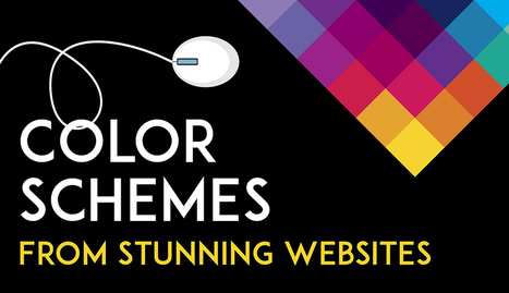
Color is such a fundamental part of the way we perceive the world that we often take it for granted. Think about it: From the youthful and vivid orange on someone’s attire to the gray and gloomy sky above us, colors have the power to mold our perceptions of others and even the circumstances we find ourselves in. This is why one of the most powerful tools in a designer’s arsenal is color. It can either make or break a design; it can be the determining factor in engaging viewers or sending them promptly on their way. As a non-designer, I often find it difficult to find just the right colors for my amateur projects. Whether I’m creating a simple image to support my content or more elaborate projects such as a slide deck or infographic, I frequently spend a good amount of time looking for the perfect color scheme. I ask myself questions like: Do I want my design to be inviting? Provocative and bold? Or intelligent and elegant? Unless you’re a seasoned designer, it takes time and effort to find a color combination that works, which is why the design team at Visme decided to provide our users with a handy list of beautiful color schemes from websites that have been recognized by Awwwards, the most prestigious award for Web designers and developers....
‘Crowded’ websites are difficult to read. Complexity often makes users uncomfortable. If we’ve overwhelmed them with lots of different information, all fighting for their attention, they will leave or not take the action we’d wanted them to do. It may be purchasing something on e-commerce website or reading the article on a blog. There is, however, a concept that helps graphic designers to create great web experiences, making the content appealing and easy to follow. It’s white space – the way of giving your layouts extra room, simply by avoiding unnecessary clutter and using the space between elements for their advantage....
Fresh, innovative, creative, minimalist award winning web design agencies websites for inspiration. Today we've selected 26 best web design agencies' websites. Beautiful examples of Web Design Agencies websites for inspiration. These agencies are are using the latest technologies “HTML5, CSS3 and JavaScript” for their websites to create perfect and eye catching design. Let’s take a quick look at some amazing new web trends to keep in mind when designing your next website project.
When I worked as a web designer, I was fascinated by how design trends changed each year. Since hanging up my design boots and focusing on being CEO of Envato, my focus has shifted from visual trends, to industry and technology ones. As I did in 2014 and 2015, here’s my take on where the world is moving!...
If you look at how product pages take shape across different companies, it's clear that they run the gamut. Some go for the direct approach, displaying an image of a product and explaining why someone should buy it. Other companies create elaborate pages with moving parts and fancy coded elements. Of course, some companies fare better than others at creating delightful product pages. But since we prefer to focus on the positive, we scouted out 14 examples that we find truly admirable. From messaging, to value propositions, to general product promotions, these brands nail these features in a persona-friendly way....
You never get a second chance to make a first impression -- that’s why your homepage is undoubtedly one of the most important web pages on your website. For any given company, the homepage is its virtual front door. If a new visitor doesn't like what they see, their knee-jerk reaction is to hit the "back" button. That's right -- unfortunately, a lot of people still judge a book by its cover.What makes a website's homepage design brilliant instead of blah? Well, it takes more than looks alone -- it also has to work well. That's why the most brilliant homepages on this list don't just score high in beauty, but also in brains....
See what the design world will look like this year with Shutterstock’s latest infographic.Global TrendsThe top four trends making an impact around the world.
When thinking about web design, you must consider the full spectrum of possibilities that the internet presents. Done boldly, designers can push the limits of human interaction and imagination on a global scale – as is often seen with edgier industries, such as creative agency websites.
In this article, we’ll boil down some of the most prominent web design trends emerging in 2015. It is here that we can find true innovation and new opportunities – a few of which may completely change our understanding of a “modern website”....
The tremendous thing about the design community is that we all love to share. We really do. Whether we share our thoughts and ideas via an in-depth article or by giving advice/feedback on a forum, or even by freely offering high-quality resources. The sharing is what makes our community truly great!
Here are last month’s 50 best free resources for designers…
|


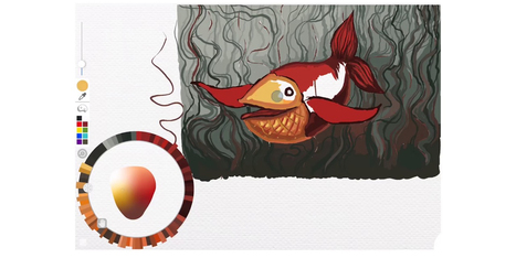


Adobe Research and University of Toronto have reimagined the color picker as a skeuomorphic palette that's designed to be more natural and intuitive.