Public Relations & Social Marketing Insight
444.4K views | +4 today
Follow
Public Relations & Social Marketing Insight
Social marketing, PR insight & thought leadership - from The PR Coach
Curated by Jeff Domansky
Your new post is loading...
Scooped by Jeff Domansky
Scoop.it!

Is this the year of illustration? - 99designs Blog

Is this the year of illustration? - 99designs Blog | Public Relations & Social Marketing Insight | Scoop.it

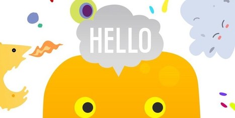
For the early part of this century we saw a lot of colorful artwork in the shape of icons and vibrant mascots. Heavily shaded, three-dimensional characters, and richly rendered forms were all the rage.


Now, illustration is heading for a more authentic and organic experience. Low-color, hand-drawn looks that are specifically created for a single-site use are becoming more common and are expected to stick around.


Custom designs will more often take on a unique, loose and even childish feel. Websites will feel more personable compared to the copy and paste looks we have been seeing thanks to the prevailing flat design/minimalism bandwagon....

Jeff Domansky's insight:

Illustration dates back long before the invention of writing. We are talking cave painting—Lascaux and Altamira to be precise. So, what's trending today?

No comment yet.
Scooped by Jeff Domansky
Scoop.it!

10 Rules of Composition All Designers Live By – Design School

10 Rules of Composition All Designers Live By – Design School | Public Relations & Social Marketing Insight | Scoop.it

So, it’s safe to say that composition is pretty important. So, what exactly is a composition? Well, in very simple terms, it’s the part where all the separate elements come together to form a whole. When all of your type, your images, your graphics and colors, come together to form one cohesive design.


A successful composition means that you have arranged, distributed, aligned and compiled your design in a way that not only looks good but is also highly functional and effective. So, let’s run over a few tips, tricks and techniques that will have you mastering composition in no time....

Jeff Domansky's insight:

Foolproof composition techniques that will hold all your design elements in all the right places.

No comment yet.
Scooped by Jeff Domansky
Scoop.it!

20 Reasons Good Design [Really] Matters To Your Business – Design School

20 Reasons Good Design [Really] Matters To Your Business – Design School | Public Relations & Social Marketing Insight | Scoop.it

Recently, we started asking businesses how much they valued design in their workplace.


And this is one of the most common answers we heard: For the challenge of perfecting a steady design flow – is it really worth it?


Firstly, we’re strong believers in the notion that design in the workplace should be easy. And secondly – a thousand times yes.


To outline exactly why, we created this list of proven reasons design is a good business decision....

Jeff Domansky's insight:

20 tasty reasons why design matters to business. Good reading and creativity. 9/10

No comment yet.
Scooped by Jeff Domansky
Scoop.it!

Why The Shape of a Company's Logo Matters

Why The Shape of a Company's Logo Matters | Public Relations & Social Marketing Insight | Scoop.it

Think about the iconic brand names you know: Apple, Target, McDonald’s, Gap. What images come to mind? For many of us, probably their logos. That’s because whether it’s an apple or big golden arches, a logo is crucial to a company’s identity. Now, new research says that logos are even more important than businesses and consumers realize. A recent study in the Journal of Consumer Research found that even just a basic element of logos—their shape—affects how people perceive a company and its products.


There’s already a good amount of research on how logos influence customers. For example, a 2011 study found that when a company has an incomplete logo (think IBM), people perceive the business as more innovative but less trustworthy. Another weird logo effect that researchers have found: when consumers see a complex-looking logo over and over again, they start to like the brand more. Given these past findings, Amitava Chattopadhyay and his team at INSEAD thought something as simple as a logo’s overall shape—circular or angular—might also impact people’s opinions in a significant way....

Jeff Domansky's insight:

Welcome to a world in which curves are a good thing.

Master 2 Commerce des Vins's curator insight, February 2, 2016 2:36 AM

#logo #psychologie #visuel #veille #m2cdvins

Scooped by Jeff Domansky
Scoop.it!

24 Examples of Split-Screen Layout In Web Design | Bashooka

24 Examples of Split-Screen Layout In Web Design | Bashooka | Public Relations & Social Marketing Insight | Scoop.it

One of the more interesting design trends is the split-screen layout, in which some kind of vertical break divides portions of the page into two or more parts. A split-screen websites will showcase messages which are equal in terms of importance. If you offer goods, as well as services, you may feature your products on one side of a split screen and then highlight your services on the other side. So here, we take a look at some of examples of split-screen layout in Web design.

Jeff Domansky's insight:

Enjoy some creativity with your coffee.

No comment yet.