Public Relations & Social Marketing Insight
444.5K views | +10 today
Follow
Public Relations & Social Marketing Insight
Social marketing, PR insight & thought leadership - from The PR Coach
Curated by Jeff Domansky
Your new post is loading...
Scooped by Jeff Domansky
Scoop.it!

The Precarious State Of Logo Design

The Precarious State Of Logo Design | Public Relations & Social Marketing Insight | Scoop.it

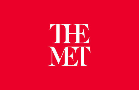
Three weeks ago the Metropolitan Museum of Art—known colloquially and now formally as "the Met"—unveiled a new logo and identity system designed by the international firm Wolff Olins. The response from critics was swift and fierce. Influential typographer Erik Spiekermann harped on the logo's proportions and "forced curvy shapes"; New York Times critic Michael Kimmelman accused the museum of pandering to younger audiences; and Justin Davidson, of New York magazine, compared it to a typographic bus crash. Ouch.

It’s a familiar scenario with logo and identity reveals—the images get passed around the Internet, critics weigh in, and the peanut gallery follows. Such was the case with Google, Airbnb, Hillary Clinton's campaign logo, the Olympics, and the rebrand that (arguably) sparked incendiary "logogate" culture: Gap.

Jeff Domansky's insight:

Critics are everywhere. I like The Met logo a lot – it's classic and classy.

Marsien's curator insight, March 14, 2016 7:21 AM

Critics are everywhere. I like The Met logo a lot – it's classic and classy.

Scooped by Jeff Domansky
Scoop.it!

The 13 Most Drastic Big Brand Logo Changes Ever Seen

The 13 Most Drastic Big Brand Logo Changes Ever Seen | Public Relations & Social Marketing Insight | Scoop.it

Lots of cool logos and creative inspiration... What were they thinking and how and why did their logos evolve?

Jeff Domansky's insight:

Nice nostalgia trip and a bit of marketing history.

Karoly Domonyi's comment, May 13, 2013 10:30 AM
Old logo is best!
Jeff Domansky's comment, May 13, 2013 3:09 PM
Can't agree with you there Karoly LOL.
Scooped by Jeff Domansky
Scoop.it!

The ultimate guide to logo design

The ultimate guide to logo design | Public Relations & Social Marketing Insight | Scoop.it

A lot goes into a great logo design. While a logo seems like just a little thing to create, it represents an entire company or brand, and must convey identity, values, and more. You can’t think of it as just a “little” design job. It can be the most important design a company has, and one that guides future design and branding decisions. With this guide you’ll learn all the steps necessary for creating a fantastic logo for your own project or a potential client’s.

Jeff Domansky's insight:

Creativity with your coffee: some lessons, some logos and some inspiring designs.

No comment yet.
Scooped by Jeff Domansky
Scoop.it!

30+ Beautifully Inspiring Logos | GoMediaZine

30+ Beautifully Inspiring Logos | GoMediaZine | Public Relations & Social Marketing Insight | Scoop.it

Your logo is a visual representation of everything your company stands for. And with a statement like that, who wouldn’t be overwhelmed? It can be a difficult undertaking to sum up you or your clients’ entire brand identity in just an image or logotype. So where do you begin? Inspiration is the first thing that comes to mind. Here at Go Media we often ask clients to send us some logos they like to get a sense of their aesthetic taste. Of course we have an in-depth discovery meeting where we glean as much information about their company to create the most representative logo for their brand....

Jeff Domansky's insight:

Oh, c'mon. You know you want to take creativity break with your coffee. ;-)

No comment yet.