 Your new post is loading...
A common myth suggests that great presentations are an art form. While some of the world’s best presenters are certainly artists, we know that their presentations obey the kind of narrative structure that allows even novice public speakers the opportunity to deliver great presentations. So, What is Narrative Structure?Well, that depends on the industry, because narrative structure is important in every profession. While different definitions exist, they all point to the “structural framework” of how an idea or story is presented to an audience. The reliance on structure in a narrative underlines just how attainable great, engaging presentations are. Because if we can show how those are built (e.g. the skeleton), then all that’s left is adding the muscle, or content, and delivering it according to the narrative structure. The other key element in the narrative structure definition is the idea or story. Without the idea or story, there is no narrative to structure. So we really want to lean on storytelling as a way to engage our audience, and for a good reason....
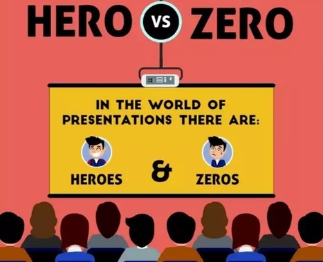
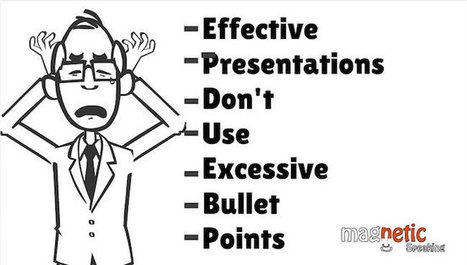
To pull off a KILLER presentation you need to: - Think creatively ... no more lazy bullet points
- Use tools and shortcuts so you can spend your time on the important stuff
- Create clean and captivating slides that appeal to people's emotions
In other words, you need to be a presentation HERO. Here's how to be one ...
We all know the basics of good presentation skills: don’t read from a script; don’t overwhelm your audience with verbose slides; and the like. But for a particular kind of high-stakes presentation — one in which you’re trying to get buy-in from key decision-makers — those basics aren’t enough. To persuade the people who have the power to approve your idea or let it die, you need to start with a strong outline. Here are the questions to ask yourself so you can structure a presentation, from the outset, that defuses potential objections upfront and is so compelling a “yes” becomes far more likely....
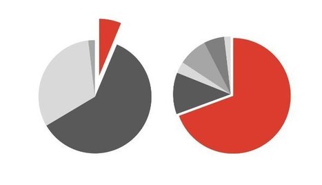
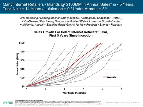
People are usually surprised to hear that I don’t have a problem with Mary Meeker’s huge, yet very unattractive, annual deck of slides. People come out of the woodwork each time it’s released asking me to make them over. Last year, one Paris designer did just that. But dolling up her data took away some of the meaning. For me, the usefulness of how she collected and ordered the information trumps the need to finesse the design of her charts. (Instead of redesigning Meeker's slides, we chose instead to focus on one data visualization problem child: pie charts. Meeker's deck doesn’t have many pie charts, but all of them warranted commentary....
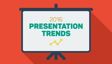
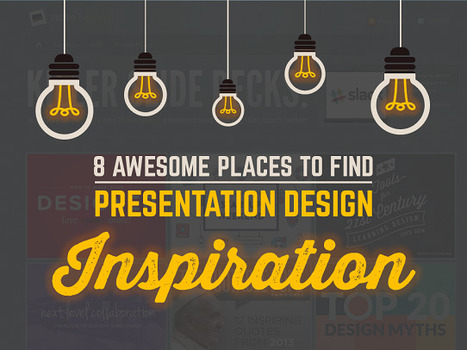
Each year, we see new trends surfacing in the world of presentation design. From passing fads to design standards that will endure beyond 2016, these trends will continue to shape the way presentations are created and delivered before boardrooms, classrooms or even TED audiences across the globe.
While some of them may exist only for the sake of aesthetics, others have actually been adopted to suit the needs and preferences of modern-day consumers. For example, the use of flat design, many experts say, is more than just the latest craze; it responds to the fact that realist elements are very hard to incorporate into responsive systems designed for screens of all sizes.
To keep you up to date with the latest design techniques, we’ve compiled a list of presentation design techniques that will help you create a presentation that looks fresh and contemporary–just like the content you will hopefully deliver to your audiences....
Tufte writes, “Graphical excellence is that which gives to the viewer the greatest number of ideas in the shortest amount of time with the least ink in the smallest space.” These are words to live by for the slide designer.
I thought I would share five lessons I’ve learned from Tufte over the years that could easily contribute to more effective presentations.
While he emphasizes simplicity and clarity in his graphics, he focuses on the importance of balance and complete, accurate presentation of information. This allows the audience to form opinions and make informed decisions about what they see....
Every time I ask the question “what’s the most difficult part of writing a speech?” the answer is always the same. STARTING. Writing a presentation is inherent…
Via Baiba Svenca
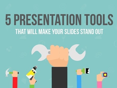
Lucky for you, there are tons of FREE PRESENTATION TOOLS at your disposal to enhance your slides and turn them from boring to awesome. Here at Presentation Panda, we’re all about finding clever hacks to pimp out your slides in record time.
Whether it’s coming up with gorgeous backgrounds for your slides, selecting complimentary font styles, or innovating with screenshots and other images, it’s little things like this that will take your presentation from good to great. That’s why you’ll love these five presentation design tools: they’re free, easy to use, and will make your next presentation look fantastic.
I am evangelizing the 10/20/30 Rule of PowerPoint. It’s quite simple: a pitch should have ten slides, last no more than twenty minutes, and contain no font smaller than thirty points.This rule is applicable for any presentation to reach agreement: for example, raising capital, making a sale, forming a partnership, etc....
|
A snoozer slide deck can tank the best presentation no matter how strong your message. By including a short video in your slide deck, you can both clarify key points and spark an emotional response in your audience. Here are three ways to add video to a Google Slide.
PowerPoints are awful. Long and uninteresting, they are the corporate drone of visual media—synonymous with endless meetings, academic conferences, and corporate retreats. For graphic designers, however, slide-based presentations like PowerPoint are synonymous with "client decks," and they're necessary for pitching a design to a client or potential client. These are not your typical boardroom slide show presentations. They can be impeccably designed and visually engaging because, if done right, they'll persuade the client to go the direction the designer wants. Presentations can be a designer’s best tool for selling an idea. Admittedly, it’s not graphic designers' favorite part of the job, but there is a lot that others can learn from how they do it. We asked five designers from four top studios and agencies for tips on creating slide-based presentations—whether on PowerPoint, Keynote, or some other program....
The best designers in the world are not only known for their amazing designs, but also for their inspirational and motivational quotes about design.
Many of the lessons they teach can, unsurprisingly, be directly related to PowerPoint design!
If you need some inspiration and guidance for your next PowerPoint presentation, look no further:
We have compiled a list of 20 of the BEST inspirational quotes about design that relate directly to PowerPoint.
After each designer’s quote, we’ve given a short explanation of how it relates to your presentation, and what you can do to make it amazing....
Mary Meeker’s annual Internet Trends Report for Kleiner Perkins is a comprehensive and provocative collection of data about technology change. It’s also the most cluttered, visually jumbled 213-slide pileup in the history of PowerPoint. Reading this deck is like walking through a construction site in which the Hell’s Angels are putting on three simultaneous Cirque de Soleil shows during a Green Day concert. In a snowstorm. While it’s arguable whether there is a unifying intellectual concept here, one thing is completely clear: there is no unifying design concept (unless you count the wordy, telegraphic headings on each slide). Just as you can learn from Meeker’s trend insights, you can also learn from her design disasters. As you look at these slides, ask yourself two questions: - In a quick glance, what main idea jumps out from the slide? If I study the slide further, does it reveal more information? - In too many cases here, the answer to the first question is “Gee, I dunno,” and the answer to the second is “Ouch, I am getting a headache.”...
Each year, we see new trends surfacing in the world of presentation design. From passing fads to design standards that will endure beyond 2016, these trends will continue to shape the way presentations are created and delivered before boardrooms, classrooms or even TED audiences across the globe.
While some of them may exist only for the sake of aesthetics, others have actually been adopted to suit the needs and preferences of modern-day consumers. For example, the use of flat design, many experts say, is more than just the latest craze; it responds to the fact that realist elements are very hard to incorporate into responsive systems designed for screens of all sizes.
To keep you up to date with the latest design techniques, we’ve compiled a list of presentation design techniques that will help you create a presentation that looks fresh and contemporary–just like the content you will hopefully deliver to your audiences....
The problem with presentation design is often more about time than actual design. But you must take time in crafting stellar presentations. This might include building a template that you use for presentations or honing in your public speaking skills.
Here, we’ll walk through a few ways to design a great presentation that will engage your audience. (While most of these tips are structured around creating a digital presentation, using software such as PowerPoint, the concepts can also be applied to posterboard style presentations as well.)
When it comes to presentation design, for instance, there's no shortage of avenues you can take. And while all that choice -- colors, formats, visuals, fonts -- can feel liberating, it's important that you're careful in your selection as not all design combinations add up to success.
We're not saying there's one right way to design your next PowerPoint presentation, but we are saying that some designs make more sense than others. To see some examples of the best PowerPoint presentation designs, check out the following decks....
And what's worse than a boring presentation? Five, 10, or even 15 boring presentations. That's the fate clients subject themselves to during the new business process. And while you might think they deserve to be in this situation, it won't help you win the account.
Don't be that agency that drives the client team over the edge with a PowerPoint presentation in 11-point Comic Sans text. Check out this SlideShare for a few tips on how to create presentations that don't suck....
In a previous post, we mentioned that people tend to nod off in conference calls and how it is important to learn to conduct teleconferences better to minimize loss of time. One suggestion was to use online meeting software where you have the added benefit of presenting slides to your attendees via screen sharing, to help better engage with your audience.
This raises the question: what should you present and how can you make awesome slides which will stimulate your attendees visually? How you go about displaying your material can play a crucial role in the success of your presentation.
Today, we look at how to build killer presentation slides that will keep your participants enthralled and engaged during your meetings. These principles can be applied to both traditional face-to-face presentations and online presentations.
|


Learn how you can create a great presentation using narrative structure!