 Your new post is loading...
We all know it can be tough to perform when the creative juices are not flowing. This is especially true when you are doing the same thing over and over and over again and having to come up with creative eye-popping solutions every single time.
That’s why I curated this list. I pulled from various websites & forums and just .. put it all together. Hope you enjoy, and most of all never have an excuse to be in a creative slump.. ever again....
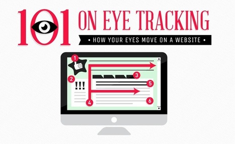
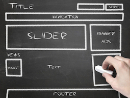
Creating a successful website involves more than just a visually appealing design. The most effective websites create a satisfying user experience based on how consumers track and read the information on the page.
Take your DIY design skills to the next level by getting a crash course in typography.
...Every little change you make to a word or a body of text can make a huge difference in the overall piece. The little details do matter.
In fact, one of the only college courses Steve Jobs took was on calligraphy and typography, which he believed played a critical role in the success of Apple. As he once said in his Stanford University commencement speech, "If I had never dropped in on that single course in college, the Mac would have never had multiple typefaces or proportionally spaced fonts." Can you imagine a world where Apple products didn't have a focus on beautiful design? I certainly can't.
So, what do you say? Are you ready to take your DIY design skills to the next level? Let's get started....
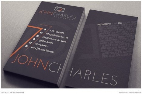
A business card is an important part of your successful marketing plan. For its size and cost, it’s probably the most important part. Of course, you can’t expect your business card to tell the whole story about your business. A good business card design must be approached with great care to obtain as well as get the attention of new clients to purchase the item or service you are selling.
A good business card should not be taken for granted as an item for announcements, connecting with your clients or a way for you to achieve new connections. Since your card will speak for you long after your meeting is over, think of your business cards as your sales force; they need to reflect your company and your product the way you would....
A grey website design looks very professional and gives a very neat and sophisticated feel. Grey is one of the most widely used colors in web designs because it is a neutral color that is a perfect option to be used for website backgrounds.
Here, we are presenting a creative and inspirational collection of some clean grey website designs for you. All the website designs presented in this collection are handpicked. This means we have spent hours in finding out the best and creative grey website designs. We went through hundreds of websites to find the cream of the crop. Enjoy!
Why do you update your website, create quality content, post in social channels and optimize your pages? You not only want visitors to your website, but ultimately an increase in sales and profits, right? Once they arrive on your page after your carefully crafted search optimization, you want a landing page that converts.Landing pages are a concise and customized web page specifically designed to capture a visitor’s information through a lead-capture form. Landing pages allow you to target your audience, offer them something of value and convert a higher percentage of visitors into leads. Oh, and all the while, capturing their information....
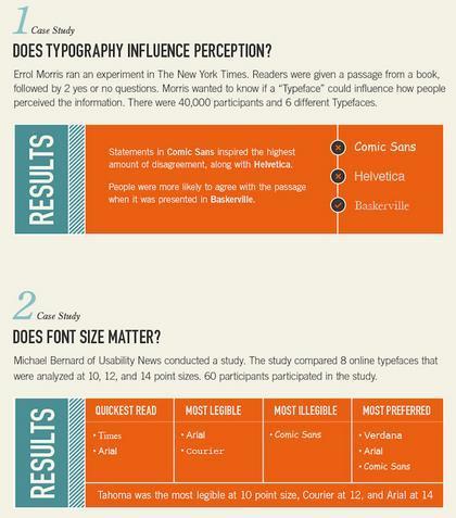
When you think about conversion optimization, what comes to mind? Testing colors, call-to-action buttons, headlines, and other elements including text, right?
Although those elements do affect conversions, what about other design aspects such as typography?
I know what you are thinking. How the heck does typography affect conversions? Well, certain font types will affect people’s decisions in different ways. For example, if you are trying to get your users to agree with a passage, they are more likely to do so if you use the font type Baskerville....
A lot goes into a great logo design. While a logo seems like just a little thing to create, it represents an entire company or brand, and must convey identity, values, and more. You can’t think of it as just a “little” design job. It can be the most important design a company has, and one that guides future design and branding decisions. With this guide you’ll learn all the steps necessary for creating a fantastic logo for your own project or a potential client’s.
The first careful study of the popular new style suggests they don't. Some even find it disorienting.
You may not know the term "parallax scrolling," but you've probably seen it in action. In the past couple years, parallax has become perhaps the most popular site design tool out there, embraced by commercial products and (largely thanks to "Snow Fall" from the New York Times) mainstream media alike. The effect occurs when various page elements move at different speeds, creating a sense of animation and a heightened interactive experience (examples below). It's a step away from pragmatism and functionality toward novelty and visual appeal.
Whether that step takes web design in the right or wrong direction has become a topic of considerable debate. The parallax style has excited web developers and inspired any number of hype lists. It's also triggered a backlash among critics who feel its bells-and-whistles approach detracts from actual content. Pitchfork creative director Michael Renaud recently told the Atlantic Wire he expects people to "tire" of the trend within a year or two....
Five inspiring graphic design blogs written by prominent, successful designers.The Web offers plenty of places to draw design inspiration from, but one of my favorite ways to stay current with graphic design trends and the amazing work that other people are doing is to follow the blogs of successful and talented designers. From providing advice, to sharing their design process and recent work, to creating fun content, graphic design blogs are often a creative playground of sorts for their authors. Below are five that I always find inspiring....
Lots of cool logos and creative inspiration... What were they thinking and how and why did their logos evolve?
Creating compelling visual imagery for your social media profiles has never been more important for your brand. ... graphic design plays an important role, not only in building brand awareness and recognition, but also attracting the user’s attention. Because of this, marketers and social media managers should have a basic understanding of graphic design, especially design that works where your social audience spends most of their time: online and on mobile devices. When graphics are used consistently over various platforms, customers may view it several times over, in turn generating more brand recognition. Social media imagery is essential to getting people to follow you, so here we will provide you with a few tips on how to create the best imagery for your posts....
The color scheme of a site creates its atmosphere. It should be fitting, good looking, and attractive. At the same time, it should not impede visitors to use the website and easily find all necessary information. No matter what kind of business you have, don’t be afraid to use bold color schemes for your website. Here I have showcased 50 fantastic websites with extremely bright color palette for inspiration. All of them are great examples of beauty and creativity in web design....
|
We all need inspiration at one point or another. Whether it's Monday morning or Friday afternoon, sometimes we need to kickstart our creative juices. With that said, we're here to help!
Our web design team has picked some of their favorite blogs for education, inspiration, and procrastination. Are we missing any of your favorites? Hit us up on Twitter. Without further ado...
Looking for some inspiration as you build you next website?
Design is valuable, an investment, and will pay dividends over the life of your business. First and foremost, your website may be one of the first things that a potential customer sees related to your brand. If they come to a website that looks like it was built in 1995 using Adobe Dreamweaver, this will reflect poorly on the brand.
Worse, a bad design may be enough to send someone running back to Google and into the arms of a competitor that has a website that is easy on the eyes. A good design is simple. The arch-enemy of a good website is complexity. Why?...
Today, we thought we would highlight some of the amazing packaging designs featured in Andrew Gibbs’ Box Bottle Bag: The World’s Best Package Designs from TheDieline.com – one of our favorite recent design books.
Gibbs does a great job seeking out and discovering the “very best” packaging designs out there, which he categorizes as one of six style types: Luxe, Bold, Crisp, Charming, Casual, and Nostalgic. Let’s take a look at each of these categories and try to find out why they work....
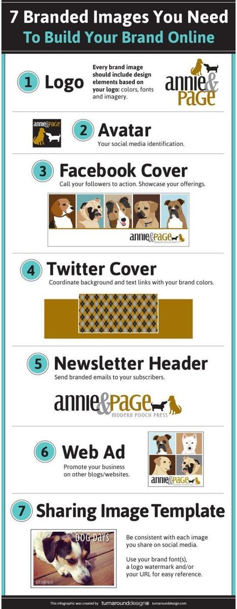
Building your brand online takes work. Every image that you associate your business with needs to represent your brand in some way. You certainly don’t want to cut corners in this area. This infographic by Turn Around Design covers 7 images you need to build your brand online:
Are you a web designer looking for the right place to get your creative juices flowing? Look no further — the following list is the perfect remedy for someone stuck-in-a-rut, bored of seeing the same designs over and over. Here are the most inspired, curated, and constantly updated websites around to help your creativity....
After navigating through the wilderness of search results, a unique visitor has landed on your page, and you’ve got one shot to make things work. For people who care about UX design, a user’s behavior and impressions about a site, along with whether they stay and convert, is important.
Is the site easy to navigate? Is the information organized? Will user’s click your CTA? These questions, among many others, should be considered when choosing the layout for your site because it can play a huge part in why users stay and why they convert....
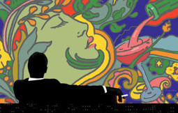
AMC unveiled the official poster for the final season of Mad Men, designed by renowned artist Milton Glaser. As Glaser explains in an exclusive interview with amc.com, the imagery plays on recurring themes from the series,”notably the head of a woman and the wine being poured.” Another familiar element that Glaser incorporates is “the figure that has become symbolic of the program” — the iconic silhouette of Don Draper from the show’s opener. Juxtaposing Don’s original Season 1 image with psychedelic art indicative of the new season was a challenge that Glaser happily accepted, and the result is, as he puts it, “harmonious and convincing as a single experience.”
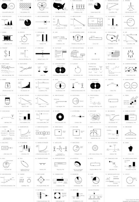
In celebration of their 100-year anniversary, the American Film Institute selected the 100 most memorable quotes from American cinema, and a few years ago, for kicks and giggles, I put the first eight quotes into chart form. I planned to chartify all 100, but I got distracted.
Lately though, finishing what I started became my distraction. So here it is: the 100 most memorable quotes in chart form and I can finally put it to rest. See the big version for more detaildetail...
iStock has queried creatives from around the world to determine what to look for in 2014 design trends. Entitled Hot or Not (oh how we miss the original Am I Hot or Not), the infographic gives a thumbs up/thumbs down look at flat design and skeumorphic design; short form storytelling versus long form; real models versus retouched; 3D and offset printing; and more. Give it a look.
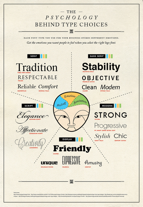
Cool advice...Today’s infographic covers the psychology behind type choices. You will learn how serif, sans serif, script, modern, and display typefaces and their fonts are best used for moving your audience to feel how you want them to feel....
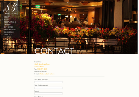
...For some, this is that last page on the site map where you just throw a bunch of information. You can leave it up to the person to decide how they want to contact you and what they want to contact you about. For others, this is the last attempt to get your potential customer to give you their business. The contact page is much more important than many give it credit. Many basic websites just throw some numbers and e-mails up and move along. But in most cases, this is the page your customer sees before they decide they want you on their project. Or before they decide they want to visit you to purchase your product. It’s extremely important to make sure your contact page delivers in the best way possible. It can be a tricky thing to handle, so today, we’ve gathered 20 sites with great contact pages and forms to give you a bit of a creative boost....
In 1953, writers George Plimpton, Harold L. Humes, and Peter Matthiessen banded together to found The Paris Review, the famed magazine that gave voice to literary giants like Ernest Hemingway and Jack Kerouac. Today the formidable institution is celebrating an impressive 60 years in operation....
|


![Top 10 Design Trends For 2014 [Infographic] | Public Relations & Social Marketing Insight | Scoop.it](https://img.scoop.it/mO5bvywlZP3EN-R7UPR29Tl72eJkfbmt4t8yenImKBVvK0kTmF0xjctABnaLJIm9)


For some situations...