 Your new post is loading...
As a web or graphic designer you must have a keen sense of color combinations and feel which colors look good together and which don’t. Anyway, even with this great skill in color combining, you may find yourself in situations when you just feel less inspired. That’s when these best color palette tools come in handy!
These 20 best color palette tools will help you choose and create the best color palettes for your graphic or web designs. Choose the one that is perfect for you and start using it! Enjoy!...
Chrome Extensions is probably a great reason as to why Chrome is now the world’s most popular browser. And for web designers Chrome extensions is now an important part of their toolset.
Here’s a list 20 awesome Chrome Extensions for web designers. We’ve probably missed a whole bunch so please add those in the comments!...
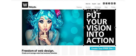
Webydo is a professional web suite that enables graphic designers to create and manage exceptional HTML websites, without writing code. With this sophisticated online software, designers can bring any design to life, and with a click of a button, publish an advanced HTML website with a friendly built-in CMS for the website owner....
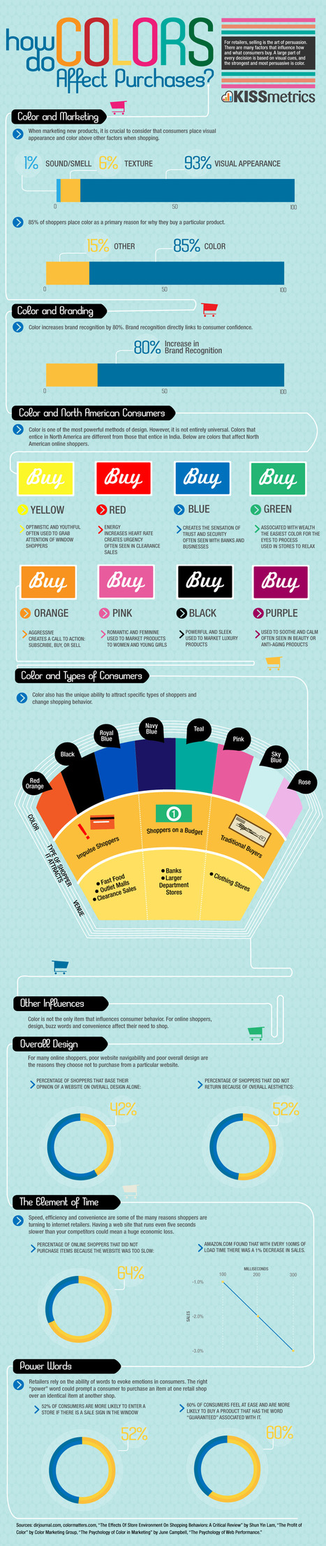
Sometimes it’s the simplest things that can make the biggest difference. One small factor in UX that can make a huge difference is color.
In fact, 85% of shoppers rate color as a primary reason for why they buy a product. It’s important to use the right colors to get the most out of your UX.
This infographic by Kissmetrics will guide your through making the right color choices for your design. The infographic describes the emotions associated with each color so that you can choose the one that best fits with your overall design.
It also talks about which colors best appeal to which type of consumer so that you can tailor your design to appeal to your customer base....
An effective responsive design solution is the number 1 requirement for a modern website in 2014. Discover the 9 essential responsive web design best practices
Via Ana Cristina Pratas
It’s no secret that designers have their special “go-to” places for inspiration and I was recently asked me what mine are.
When looking for inspiration with typography and design, these are the websites that I highly recommend bookmarking. It’s good stuff, really it is....
Navigation menu design is not a simple bar on top of the screen. New solutions and design tricks are widely used for this key site element.
Via Mark Strozier
After my article on using neuroscience and psychology to boost your social media marketing, I thought a follow-up was warranted, this time for website and landing page conversions.
The psychology of web design has been a highly tested field, including relaying on triggers to entice users to complete an action. There are several different forces behind human behavior, like the classic FOMO (“fear of missing out”), curiosity, and the use of color to convey a message or feeling.
The following triggers are proven ways to increase action on your website....
Digital marketers and web designers love rotating banners, which allow multiple pieces of content to occupy a single prominent space on a web page. (Synonymous terms include image sliders, carousels and animated sliders.)
On the surface, the idea seems like a great way to keep several competing departments happy, giving them all a piece of prime real estate on the page. But there’s just one problem: your visitors probably won’t consciously pay attention to them. The evil truth of rotating banners is that they do the opposite of what’s intended, distracting users away from your most important content.
If you’re still using an image slider on your homepage or landing page, here’s a quick roundup of research that may help you better understand how this popular design solution could be killing your conversions....
A grey website design looks very professional and gives a very neat and sophisticated feel. Grey is one of the most widely used colors in web designs because it is a neutral color that is a perfect option to be used for website backgrounds.
Here, we are presenting a creative and inspirational collection of some clean grey website designs for you. All the website designs presented in this collection are handpicked. This means we have spent hours in finding out the best and creative grey website designs. We went through hundreds of websites to find the cream of the crop. Enjoy!
The psychology of colour is a fascinating subject. Different colours and shades can have drastic impacts on what we can do and how we feel. Studies have shown, for example, that weightlifters in blue rooms can handle more weight and that eaters in restaurants with red, orange and yellow colour schemes eat more food faster (which is why almost all fast food joints have those colours inside). Pastel greens and blues are calming, and white looks clean and sterile.
Colours have these impacts on us for a variety of reasons, be they cultural, environmental or based on our past experiences, and many people are taking advantage of the associations we have with colours. Website owners and internet marketers in particular are turning to this fascinating subject to see just how the psychology of colour affects how users respond to call to action buttons. Below is what these owners are learning and how you can apply the lessons to your own site....
The first careful study of the popular new style suggests they don't. Some even find it disorienting.
You may not know the term "parallax scrolling," but you've probably seen it in action. In the past couple years, parallax has become perhaps the most popular site design tool out there, embraced by commercial products and (largely thanks to "Snow Fall" from the New York Times) mainstream media alike. The effect occurs when various page elements move at different speeds, creating a sense of animation and a heightened interactive experience (examples below). It's a step away from pragmatism and functionality toward novelty and visual appeal.
Whether that step takes web design in the right or wrong direction has become a topic of considerable debate. The parallax style has excited web developers and inspired any number of hype lists. It's also triggered a backlash among critics who feel its bells-and-whistles approach detracts from actual content. Pitchfork creative director Michael Renaud recently told the Atlantic Wire he expects people to "tire" of the trend within a year or two....
If you're a small business owner and you run your own website with Wordpress, check out this list of common errors and how to avoid them.Wordpress has made it easy for anybody to set up a site and blog, but there are a number of pitfalls that you can easily avoid by following these tips!
|
Yes, we are a tad late, but it’s always a great post to see how trends have moved forward, or how designs last year are now this years trends.
It’s interesting to look at where 2015 will take us. Is the trend of flat web design over? We certainly won’t be missing responsive web design this year, with more and more devices being created and used to surf the web. Or will go back to mobile only websites. Only time will tell.
We would love to pull our favourite out from this lot posted below, but we simply cannot, there are too many great designs in all shapes and sizes, what is your favourite ?...
If you’re a practicing web designer, then you have a few favorite tools for website creation.
What are they, when and why do you use them, and do they stand the test of time? Have a look at what else is out there. Get inspired and potentially discover essential means to build websites for your clients this year.
Check the list below with 15 hand-picked platforms and tools for creatives in our profession. Most of them found their place here because they’re proven to be helpful, and easy to use. In 2015, we’re definitely looking at more streamlined ways to complete client projects....
Hand-picked collection of brand style guide examples, pattern libraries and design manuals for inspiration. Find all the best style guides in one place. Maintained by Saijo George, find me on Twitter or LinkedIn.
Web Design Basics
Love these five web design basics:
* Learn TYPE Design.
* Pick Great Fonts That Fit Your TONE.
* Pick 3 Color Palette & STICK TO IT.
* Photos = RIGHT SIZE.
* When In Doubt, Give It SPACE.
This last tip is our favorite. Nothing we hate more than claustrophobic web design. Problem is claustrophobia is easy to create. We all WANT to do so much.
When I was an Ecommerce Director we studied our links carefully. We found that 5% of our links received 90% of the clicks. That equation turned out to be a fractal. No matter how small we cut it, no matter how we shifted the design, a small % of the links dominated.
This means MOST of what WE, as designers, think is important isn't. We learned to be Google - Vicious about what we added. Adding meant something had to COME OFF the design. This strange User Interface math means you have more ROOM than you realize.
Find what matters and LINK IT. Design what matters and eliminate the flotsam and jetsam so you have SPACE around what matters since it is that SPACE that signals IMPORTANCE to your visitors. .
Via Martin (Marty) Smith
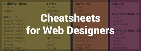
It doesn’t matter how many years of experience you have of a programming language, framework or CMS, you will always need to, from time to time, refer to the official documentation or, and more than likely, a handy quick reference cheatsheet, as it’s literally impossible to remember and know absolutely everything.
In this post I have collected an avalanche of useful cheatsheets, references, guides, checklists and docs, covering almost all aspects of web design, that will not only help to improve your productivity, but will also help to solve some of those frustrating programming issues that often arise (I’m looking at you PHP!).Just click on the ‘view’ button beside each resource and either save the PDF or bookmark the page....
A huge list of tools, apps, icons, and backgrounds for creating amazing, professional images for social media and marketing....
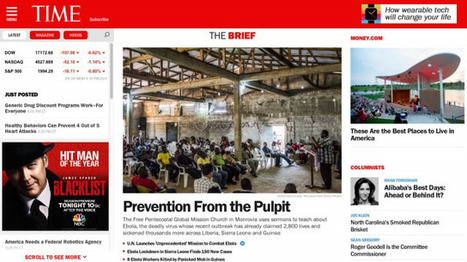
The media website you keep seeing again -- and again, and again...
Responsive design is still a new concept that is changing as designers and developers figure new ways to marry form and multi-function. Dan Mall, founder of web design firm SuperFriendly, noted that while responsive design is only about four years old, many of the programs being used to build new site are much olderz.“
I think there are really great tools that are coming out, but I think that we as an industry are still wrapping our heads around what it means to design for different context,” Mall said. “I think as the tools become more intuitive and the process becomes more intuitive, it will free us up to start thinking about these things in different ways.”
The designers that Mashable spoke with pointed to a variety of sites as examples of forward-thinking responsive websites, including blog publishing platform Medium, gaming site Polygon and digital magazine The Great Discontent....
We all need inspiration at one point or another. Whether it's Monday morning or Friday afternoon, sometimes we need to kickstart our creative juices. With that said, we're here to help!
Our web design team has picked some of their favorite blogs for education, inspiration, and procrastination. Are we missing any of your favorites? Hit us up on Twitter. Without further ado...
A total site redesign is a tricky thing. At some point, you must redesign your site, but when you do, you run the risk of your traffic dropping off. Redesigning a site is one of the biggest SEO challenges that a company can face. What’s going to happen once the site is officially launched? What will happen with any 404s? How will the site perform in the search engines? What about existing links to nonexistent pages?
If you are currently redesigning your site or planning on a full site overhaul in the future, here’s what you need to know:...
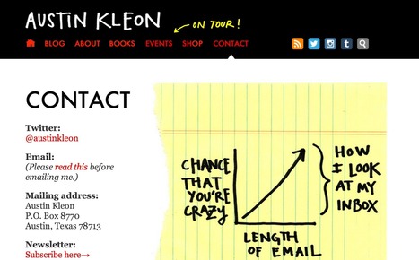
Looking for contact pages worth turning into role models for your page? Here are 20 Contact Us pages for you to learn from!
Minimalist web designs, when properly done, are always a great source of inspiration. It is very interesting to see how designers approach the task of delivering a project in a simple way. Keeping only important elements in the layout and getting rid of things that are not essential. And remember that you can still use colors in a minimalist website, so don’t worry about having to stick to neutral colors. Check out the examples we have here and give a shot to the minimalist approach in your next project....
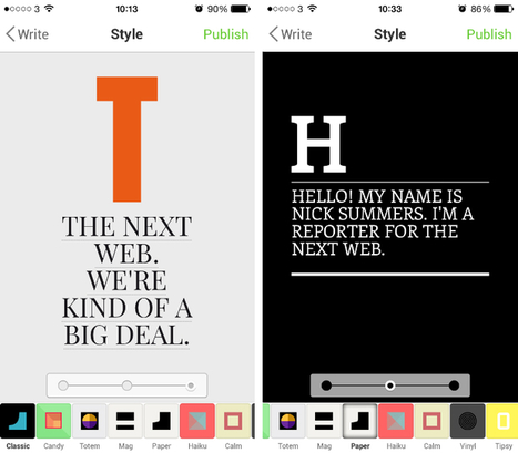
If you sit down with any experienced graphic designer, they’ll happily talk to you for hours about the importance of typography. It’s everywhere you look, from huge billboard ads to the front of your favorite t-shirt. Type can reflect many emotions, but most of us rarely notice its profound impact.
Notegraphy is an iOS and Web app that wants everyone, regardless of their experience in Adobe Illustrator, to have fun with typography and create vibrant, sophisticated examples that can then be shared with their friends online. Just as Instagram made photo-editing dead simple and accessible, Notegraphy wants to do the same with type....
|


421Find out which color suits your business best
The colors in this picture caught my attention from the start, I love how vibrant and bright they are