

A lot of these lists just cram everything and anything into the lineup. So, we decided to pick our designers’ brains to bring you the best resources that we are using on a daily basis.
Get Started for FREE
Sign up with Facebook Sign up with X
I don't have a Facebook or a X account


 Your new post is loading...
 Your new post is loading...
Your new post is loading...
A lot of these lists just cram everything and anything into the lineup. So, we decided to pick our designers’ brains to bring you the best resources that we are using on a daily basis.
Jeff Domansky's insight:
Caroline Reder shares a useful list of best design tools. Recommended reading. 9/10

No comment yet.
Sign up to comment

Whether you like the man or not, these logo redesigns of Trump For President 2016 are absolutely hilarious and quite frankly brilliant. With the release of his campaign logo of Trump Pence “Make America Great Again”, it made a lot of people giggle over the inappropriate interlocking of the T and P. As you can tell it is pretty funny and was mocked instantly on social media. So is there any way to make this logo any better?
Jeff Domansky's insight:
Well and hilariously carried off.

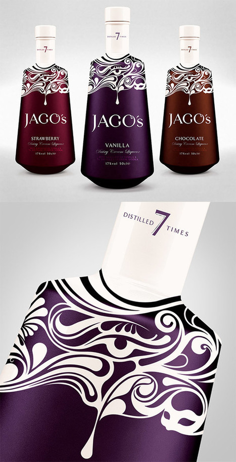
Design agencies have developed a major sweet tooth for packaging. The once humble chocolate bar has become the latest canvas for creatives to experiment with unexpected concepts and show off their design chops. Since packaging actually has a real impact on how we perceive taste, these 15 examples of chocolate brands must be absolutely delicious. Check them all out below....
Jeff Domansky's insight:
Check out these sweet examples of packaging design.

Successful creatives have one thing in common: they're always looking at fresh material to inspire their work. As much as you'd like to sit down and pull from an unlimited well of design ideas, there is no such thing as inspiration in isolation. Radically innovative work demands equally inventive sources. Don't feel guilty for keeping your eyes and ears open to what other creatives are doing, especially if it's the work they're most proud of: these pieces have the potential to take your own work to places where it's never been before! A word of caution: don't let this inspiration hunting derail you from actual creation. The happiest creatives, as we brought up in this article, don't let comparison get a point where it negatively affects their output. Today, I'll share 50 of the most inspiring and influential blogs curated by successful creatives. In doing so, we'll be looking at 10 categories....
Jeff Domansky's insight:
You'll find at least a couple of creative design inspiration resources in this list.

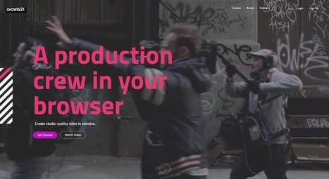
You never get a second chance to make a first impression -- that’s why your homepage is undoubtedly one of the most important web pages on your website. For any given company, the homepage is its virtual front door. If a new visitor doesn't like what they see, their knee-jerk reaction is to hit the "back" button. That's right -- unfortunately, a lot of people still judge a book by its cover.What makes a website's homepage design brilliant instead of blah? Well, it takes more than looks alone -- it also has to work well. That's why the most brilliant homepages on this list don't just score high in beauty, but also in brains....
Jeff Domansky's insight:
Browse through these excellent website homepage design examples to get inspiration for your own homepage design strategy.
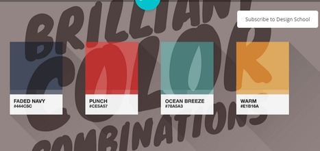
Color makes a design come alive.It can attract attention, set a mood, and even influence our emotions and perceptions.
But sometimes it can be hard to know where to start when choosing a color palette for your design project.
So we’ve done the hard work for you— giving you 100 color combinations inspired by nature, food & drink, travel, and everyday items.
Want to use these color combinations in Canva? Click here to sign up for free if you haven’t already (if you haven’t — are you kidding me?!).
Canva lets you change the colors of your design by entering the hex code in the color menu. Check out the video below for a quick tutorial on how...
Jeff Domansky's insight:
A stunning collection of color palettes inspired by food, nature, travel and everyday items. Free to download in Canva! Recommended reading! 9/10
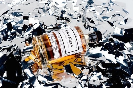
Back in 2011, food research consulting firm Technomic released a report claiming nearly a quarter of all vodka consumed was flavored. Manufacturers took notice, and over the ensuing half-decade, liquor store shelves exploded. What was once considered a comparatively benign liquor now encompassed a diversity of flavors ranging from fruit-based to dessert-infused to abominations such as fresh-cut grass, tobacco, and sriracha. Pinnacle Vodka now boasts more than 40 “playful” varieties, up from 30 in 2013. My own local store carries five different types of coconut vodka alone. As one would expect, this trend spilled over into other categories of booze. Though lacking the insipidness of vodka, liquor producers found creative ways to appeal to the flavor-seeking niche. Jack Daniel’s introduced honey and cinnamon whiskies, Hoxton gave us iris-imbued gin, and just recently, tequila manufacturers debuted a host of flavored varieties....
Jeff Domansky's insight:
Counting down the tastiest designed liquor bottles in the world.

Marsien's curator insight,
March 15, 2016 5:26 AM
Counting down the tastiest designed liquor bottles in the world.
In a sea of similar items, how do you make your product packaging stand out? One of our favorite ways is by complicating it a little with 2016’s coolest packaging trend. Designers are imbuing their designs with texture, giving packaging a tactile quality that drives shoppers to grab them off the shelf. A great way to accomplish this tactility is by adding a pattern to your package. A play off of color and shape that gives a little hint as to what’s inside, or tells a story without using words. Designers have been doing this for ages, but if you pay close attention, you’ll notice that the kinds of aesthetic stories they tell change from year to year. Here are five different ways for you to work with the hottest 2016 packaging trend – using patterns to create textural design and to stand out from the crowd:...
Jeff Domansky's insight:
Patterns are all the rage. Make sure your design stands out on the shelf with these five textural packaging trends. Recommended viewing! 9/10

Monica S Mcfeeters's curator insight,
February 10, 2016 5:00 AM
Want your brand to be noticed? Here is how you compete with the others for attention within the textured packaging trend.

See what the design world will look like this year with Shutterstock’s latest infographic.Global TrendsThe top four trends making an impact around the world.
Jeff Domansky's insight:
Here's a fascinating look at visual design trends from Shutterstock one of the world's leading stock photo services. Recommended viewing. 10/10
What better time to kick off a fun community contest than right before the Academy Awards?! This time around, we turned to our designer community to reimagine the 2016 Oscars movie posters for the 8 “Best Picture” nominees, drawing inspiration from the minimal movie poster trend. The results were great – and Mad Max and The Martian were definite favorites. Check out the winners and some of the highlights below!...
Jeff Domansky's insight:
The Creative Edge turned to its designer community to reimagine the 2016 Oscars movie posters for the 8 "Best Picture" nominees. Here's what they came up with. Recommended viewing. 9/10

GwynethJones's curator insight,
January 30, 2016 12:14 PM
I LOVE this both for ART classes, English classes, & in the Library! Reimage Book Covers!? Reimagine ANYthing! Get kiddos thinking!
UP UNTIL A few years ago, most books in the public domain were lacking. Not lacking in words, which hadn’t changed, but lacking in style, lacking in design, lacking, mostly, in the emotional bond many readers forge when (sorry!) they judge a book by its cover. Most of the classics found on Project Gutenberg didn’t have a cover, and those that did tended to have a scanned, grainy image from a long time ago. “It might technically be available, but if it is, it’s ugly and poor quality,” Jennifer 8. Lee, a co-founder of digital literary studio Plympton, says of the covers on many public domain texts.
Jeff Domansky's insight:
Very tasty, creative redesigns of classic book covers.

It is natural to look at brilliant designs by Paul Rand, Saul Bass or David Carson and to want to create designs like that – or even to want to be as great as them. This inspiration is what has reeled many of us into the field of graphic design. For some, it leads nowhere. For others, it unearths a true passion for design and occasionally it brings a brilliant designer into the limelight. Inevitably, greatness is a status that occasionally churns in the back of a graphic designer’s subconscious. This article brings the concept of greatness to the forefront and breaks it down by looking at commonalities between the all time great graphic designers; both in talent and fame. This list is a good starting point for anyone questioning their status in graphic design....
Jeff Domansky's insight:
Greatness, especially in the creative field, can be tough to define. Here we break it down by looking at the commonalities between famous graphic designers.
As we prepare for another exciting year of design, let’s take a look back at some of the best 2015 content from The Creative Edge…
Jeff Domansky's insight:
Creativity with your coffee! Recommended reading. 10/10
|
Typeface selection plays a critical role in the readability of your content. Although it may be one of the overlooked aspects when it comes to designing websites. One of the main finding of Nielsen Norman Group Eye-tracking Study of Web Readers was “Text Attracts Attention Before Graphics”. The study revealed:
Jeff Domansky's insight:
Think topography doesn't matter? Think again and check out these amazing typography resources from Optimizer WP.
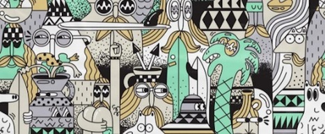
If you follow the right people, that's what Instagram can do for you. There are a lot of really talented artists and designers out there who use Instagram as a sort of mini art gallery -- a social portfolio, if you will. And it's a jackpot for people who love browsing gorgeous design work. To help you narrow your search, I've carefully curated some of the best Instagrams to follow for design inspiration. I did my best to place them in categories -- illustration, graphic design, pop art and installation, color palettes, street art, photography, typography, and calligraphy -- although you'll notice some of their work could fall into a number of different lists. Whether you're a designer looking for inspiration, or you simply harbor an appreciation for art and design, you'll want to check out (and follow) these accounts. ...
Jeff Domansky's insight:
Check out Lindsay Kolowich's carefully curated list of the best Instagram accounts for beautiful illustration, graphic design, photography, typography, street art, and more. Recommended reading. 9.5/10

Designers of any creative art borrow design inspiration from several sources online. Open source community provides most of the designs we find all over. They also contribute to the open source platforms where other designers can access their creative designs. Borrowing from different people and sources prevents monotony. This keeps the followers hooked and excited. The internet provides endless solutions to our existing problems. Solutions are just a click away. This article discusses such life-changing design inspiration resources to help you solve all your design needs, regardless of what kind of a designer you are, so:
Jeff Domansky's insight:
Creative inspiration right here. Many of my own favs included.
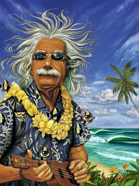
To understand the development of surf art, you need to understand the development of the surfboard—a paradigmatic design object in itself, with an amazing history in the 20th century. The guys (mostly denizens of Californian and Hawaiian beaches) who developed the surfboard as we know it were often social outsiders. Behind the clean lines and perfectionism of their boards was a desire to create a lifestyle outside of the normal working man’s routine. So it’s no surprise that surfing design eventually blossomed into the hyper-expressive and offbeat style that we now know. But let’s start at the beginning to see how this awesome story unfolded....
Jeff Domansky's insight:
Surf's up. So's creativity!
From
99designs

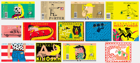
When the weather warms up, the arctic length of the supermarket beer aisle starts to beckon. And every year, when we venture over, we are amazed by the amount of design talent on display. Moreover, it is clear that the trends in beer label design are always changing. The growth of the craft beer (a.k.a. artisanal, a.k.a. micro-brewed, a.k.a. small batch, whatever) industry appears to be unstoppable. In fact, there are so many bottles to choose from now, almost all of them thoughtfully designed, that it has become rather difficult for any one to stand out. Is it still possible to do so on the basis of a particularly good beer label design alone? We think so.Here is our trend observation: the best examples of beer label design today do not take the middle road. They are either distinctly maximal (colorful, visually loud, eclectic and full of attitude) or minimal (confidently spare, geometric, typography-oriented, exuding elegance). Below we’ve rounded up our favorite recent examples of each type...
Jeff Domansky's insight:
With beer label design, the best way to stand out is often a super maximal approach or a very minimal one. Here 99 Designs rounds up great examples of each.
![Design School's Ultimate Guide to Designing With Backgrounds [With Ready-to-Use Templates] | Public Relations & Social Marketing Insight | Scoop.it](https://img.scoop.it/eUy0foC9bWwH53Mpp35bKjl72eJkfbmt4t8yenImKBVvK0kTmF0xjctABnaLJIm9)
In order to arrange your design, you need a place to start. Backgrounds are the foundation of your graphics — it helps pave the path to forming a successful composition. Textures and colors help create depth and contrast, allowing your graphics to stand out and get noticed. Well composed images can help create space for you to overlay text, while visually communicating your message at the same time. Using a background can help give your designs more context and provide a visual element to help support your content. Bonus: We’ve designed most of the images in this article as templates for you to personalize! To use them for your own stuff, just click them and they’ll be ready to edit in your Canva account (No Canva? It’s free!).
Jeff Domansky's insight:
Blogging or designing visuals? Learn these background design tips to make your message pop.

rodrick rajive lal's curator insight,
April 25, 2016 11:10 PM
The post contains some interesting design tips on working with backgrounds with some ready-to-use templates thrown in!
Have you seen the hand-drawn look? Hand lettering's rising popularity has imposed a new grungy, ornated style in fonts that we can't get enough of. These type families offer uniqueness and naivety, while adding an unpretentious touch to print and web designs alike. If you haven't tried your hand at lettering yet, get started with these brilliant fonts that evoke that coveted hand-drawn look....
Jeff Domansky's insight:
Cool typefaces for creative designs.

Think about the iconic brand names you know: Apple, Target, McDonald’s, Gap. What images come to mind? For many of us, probably their logos. That’s because whether it’s an apple or big golden arches, a logo is crucial to a company’s identity. Now, new research says that logos are even more important than businesses and consumers realize. A recent study in the Journal of Consumer Research found that even just a basic element of logos—their shape—affects how people perceive a company and its products. There’s already a good amount of research on how logos influence customers. For example, a 2011 study found that when a company has an incomplete logo (think IBM), people perceive the business as more innovative but less trustworthy. Another weird logo effect that researchers have found: when consumers see a complex-looking logo over and over again, they start to like the brand more. Given these past findings, Amitava Chattopadhyay and his team at INSEAD thought something as simple as a logo’s overall shape—circular or angular—might also impact people’s opinions in a significant way....
Jeff Domansky's insight:
Welcome to a world in which curves are a good thing.

Master 2 Commerce des Vins's curator insight,
February 2, 2016 2:36 AM
#logo #psychologie #visuel #veille #m2cdvins

The really eye-catching execution advertises Purdy's XL brushes, which can paint on practically any surface. To communicate this, the agency used XLs to paint over a billboard-size section of an ordinary New York City street—covering materials including brick, glass, wood, metal and plastic. Among the objects that got a coating of bright yellow: a trash can, a newspaper stand, a bicycle, delicate flowers and even a pigeon. (Yes, it's fake. Don't go torturing actual NYC pigeons with your Purdy brushes.) And while this execution is visually reminiscent of OBI's famous German work from 2014, the message is different....
Jeff Domansky's insight:
Deutsch did some fun out-of-home work recently for Purdy—the Sherwin-Williams professional painting supplies brand—showing the versatility and accuracy of its paintbrushes in action.

As Buffer writes, over 90% of our assessment of a product is made on color alone, so it makes sense that color should be considered with care for every design decision, particularly on websites. Chances are, if we don’t like the color palette, we’re not going to stay on the site for very long.
Jeff Domansky's insight:
50 very tasty website designs and colors. Recommended viewing. 9/10
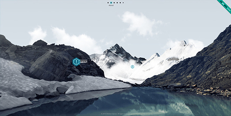
When thinking about web design, you must consider the full spectrum of possibilities that the internet presents. Done boldly, designers can push the limits of human interaction and imagination on a global scale – as is often seen with edgier industries, such as creative agency websites. In this article, we’ll boil down some of the most prominent web design trends emerging in 2015. It is here that we can find true innovation and new opportunities – a few of which may completely change our understanding of a “modern website”....
Jeff Domansky's insight:
99Designs boils down 13 of the most prominent web design trends emerging in 2015. Will they change your understanding of a "modern website"? You be the judge.

Landing pages are often the most effective means of getting customers to a product. Rather than a traditional website (with multiple tabs and in-depth content), the landing page is usually a stripped-down, single page that’s specifically made for potential customers to “land on” and convert. To achieve this, these pages utilize a CTA, or “call to action”, that encourages visitors to complete an immediate action – such as downloading an app, submitting an email or purchasing a subscription. Done correctly these pages can revolutionize online marketing efforts. Check out some of these awesome examples from our site and get ready to come in for a landing!...
Jeff Domansky's insight:
Discover some of the best landing pages created on 99designs.
|


