 Your new post is loading...
This is the 2nd post in Data Science introduction, Please go to my 1st post to get started. So, let’s go through a few more examples on Data science.
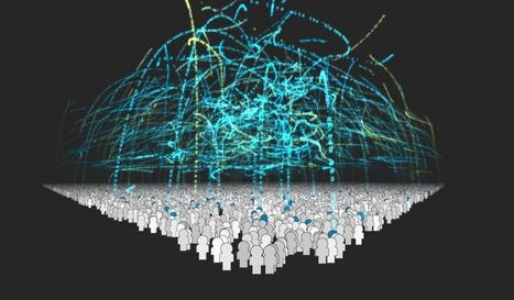
Clustering Algorithm If you were asked to decide how important a particular scientific paper was relative to other papers, how might you go about doing that?One way to decide between the two papers here, one in light blue and the other in dark blue, is to wait until other papers start to site these, and count up the number of citations...
We continue our special posts with the best data viz related content of the year, with a useful list of new tools and resources that were made available throughout 2014. A pretty straightforward compilation that was much harder to produce than initially expected, we must say, since the number of mentions to include was way beyond our initial (poorly made) estimates. So many new options out there!
So, we had a hard time gathering 20 of those new platforms, tools and resources – if you’re a frequent reader of our weekly Data Viz News posts, you’ll might recall several of the mentions in this list, -, and we deliberately left out the new releases, versions and updates of existing tools, such as CartoDB, Mapbox, Tableau, D3.js, RAW, Infogr.am and others.
Of course, there’s always Visualising Data’s list of 250+ tools and resources for a much broader view of what’s available out there.
I think we’ve looked at the very essentials of data visualization, and the post from DB Friends is going to help you to avoid making common mistakes when it comes to visualizing your data. The tools in this post can definitely attract many opinions, so if you feel like you’ve got something to say – leave a comment and we’ll take it from there.
“If I read news without dataviz I get a bit nauseous, I don’t have patience for words alone anymore. Nor infographics”. This helps explain why marketing expert and consultant León Markovitz co-founded Dadaviz, nicknamed by some as “the YouTube of data visualizations“. Online since June 11th, it’s a collection of the best dataviz selected from different sources by an invite-only community.
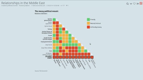
Want to learn the Who’s Who of political relationships in the Middle East, what’s the average commute time in the U.S. or where do the visitors of the Oktoberfest come from? This is the place to go.
Most of the published material is “curated” from external sources (the Middle East dataviz was taken from the Economist), but there’s also a certain amount of original work. Every visualization shared on Dadaviz links to the author, original link and data source, when available, so people can find out more and get more context if they wish. If someone wants to use a dataviz, they can reach directly the creators, or type “/embed” at the end of any Dadaviz link -which gives them an embed of the image with all the attribution already in place. Or they can simply share it on social media....
Storytelling with data is having its moment in the journalism world. After leaving The New York Times last year, Nate Silver has launched his new data journalism venture with ESPN, former Washington Post blogger and columnist Ezra Klein is expanding his chart-filled approach beyond public policy at Vox.com, and both the Times and the Post are starting their own data-driven sites to replace their departed stars.
While none of these ventures rely solely on charts and data to serve readers, The Post’s is explicitly betting that data on its own isn’t enough. Its forthcoming policy-focused website is premised on the notion that data and narrative go best together. The lesson for anyone looking to communicate or persuade using data is that the addition of human drama goes a long way....
Regular business folk who have trouble operating today's high-powered data visualization tools are the targets for a new offering unveiled today by Birst....
Birst Visualizer is the company's first foray into the world of data visualization tools, which have already solidified themselves spots in the big data tool belts of many of the world's largest companies. But instead of going straight up against giants like Tableau, QlikView, or TIBCO Spotfire, Birst wisely chose to attack the problem from a different angle, which is the guided approach.Users begin interacting with new software using a simple Google-like query interface. A sales manager can start typing "sales for Califor..." and before she's even done typing, Birst Analyzer will automatically rummage through the database, pull up the most recent sales data for California, and pop it into a bar chart.
It's a novel approach, and one that could possibly garner the fast-growing San Francisco company another big burst of sales of its own.There are about 25 different visualizations in the first release of software, ranging from basic bar and line charts to maps and trellises to colored bubbles. The software picks the visualization that it thinks best matches the query....
In my previous article I discussed the importance of ensuring that your data is clean and processed before attempting any form of data visualisation. Here I will share some really awesome tools that (once your data is clean and ready to use) you can have at your disposal to create mind-blowing representations of the facts and figures. Here is a list of tools, some more open and adjustable than others, that add value to your raw data and can be used as a source of inspiration and design when approaching the visualisation process....
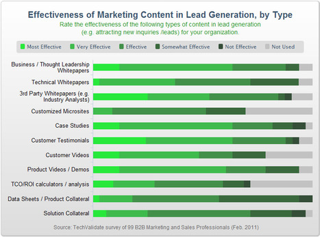
In today’s “content-age,” the creation of data is as simple as hitting “submit” on a blog entry or uploading a video to YouTube – anyone can do it, and practically everyone is doing it, causing content growth to increase at astonishing rates. In fact, just last year, there was enough digital data created to fill a stack of DVDs that would stretch all the way to the moon and back! In light of this, companies are realizing the importance of creating increasingly strong and engaging content that will rise above the waffle and hopefully have some kind of tangible impact. But what kind of content are companies finding most impactful?...
|
Welcome to Introduction to Data Science. In this first post, I want to go through some examples of data science activities and projects from the recent past that I found interesting. And use them to whet your appetites for the concepts that we are going to learn in the following posts....
The growth of data visualization says a mix of data and narrative is now s better way for businesses to tell their story.
Which tools ae best to tell your story? While price and software sophistication play a role, the more important criteria are:
- How you define success?
- What measures are most important to manage?
Once you’ve answered these questions, here are 14 of the best data visualization tools. They are grouped by categories to help you be a better storyteller with data,...
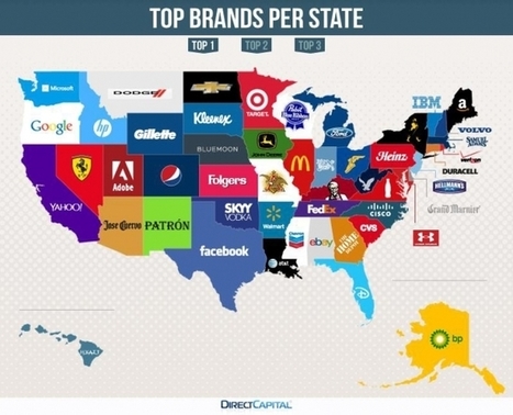
Like it or not, your surroundings inform the special little bubble you live in. Just when you thought you couldn't be stereotyped, well, here are some handy maps that define each state by the brands they Google the most.
The results are pretty fascinating, too, from the obvious to the surprising. I had no idea Grand Marnier was so popular in Delaware, or that American Eagle was so in vogue among West Virginians. Less surprising results are Microsoft in Washington and Disney in Florida.
Where it gets super interesting is when competing brands bubble up in adjacent states, like Jose Cuervo and Patron in Arizona and New Mexico, or Dodge and Chevrolet in Montana and North Dakota....
Data visualization is a powerful tool to communicate complex information in an engaging way. By visualizing information, our brains can synthesize and retain content more effectively, increasing its impact. But if data isn’t properly visualized, it can do more damage than good. The wrong presentation can diminish the data’s message or, worse, misrepresent it entirely.
That’s why good data visualization relies on good design. And it’s about more than just choosing the right chart type. It’s about presenting information in a way that is easy to understand and intuitive to navigate, making the viewer do as little legwork as possible. Of course, not all designers are data visualization experts, which is why much of the visual content we see is, well, less than stellar. Here are 10 data visualization mistakes you’re probably making and the quick fixes to remedy them....
There have never been more technologies available to collect, examine, and render data. Here are 30 different notable pieces of data visualization software good for any designer's repertoire. They're not just powerful; they're easy to use. In fact, most of these tools feature simple, point-and-click interfaces, and don’t require that you possess any particular coding knowledge or invest in any significant training. Let the software do the hard work for you. Your client will never know.....
In my previous article I discussed the importance of ensuring that your data is clean and processed before attempting any form of data visualisation. Here I will share some really awesome tools that (once your data is clean and ready to use) you can have at your disposal to create mind-blowing representations of the facts and figures.Here is a list of tools, some more open and adjustable than others, that add value to your raw data and can be used as a source of inspiration and design when approaching the visualisation process....
Our goal as savvy email marketers is to look beyond the lure of the one-time conversion and strive to build an ongoing relationship between consumers and our brands. Why is this goal so important? Because it’s been proven through many a marketing study that engaged customers become loyal customers and loyal customers are the most valuable segment in any list or database. This type of highly engaged, loyal customer typically has higher overall lifetime value than the casual consumer. They’re also more likely to be an evangelist, introducing new customers to your brand in a very personal way and building the next layer of loyal customers. But, how can you help to build a stronger bond with your customer base? In my last article, I outlined ways to stimulate an unengaged audience by increasing the relevancy of your email creative by including more dynamic content. Sharing relevant content demonstrates to customers that we know them as individuals and are dedicated to providing them with useful information, products or services. Using historical and behavior data is a great way to present content that’s tailored to their individual needs and preferences, but you also need to engage with your audience on an emotional level in order to achieve the goal of creating a true brand-loyal customer.... Let’s explore four creative ways in which email marketers have used data as a platform to build creative that forms a bond between their customers and their brand....
|


Second post in Data Science introduction and also worth reading by marketers wanting to explore Big Data concepts.