 Your new post is loading...
Appealing to the emotions of your website users is nothing new and certainly something that marketers and branding experts will have plenty of experience and specialist knowledge of. But because the online world is becoming so saturated with content, and because first impressions count, making people feel instantly at home on your site has never been more important. With SEO copywriters working hard on telling that all-important brand story and stunning images that inspire and uplift your visitors, you might think you’ve got everything covered. But if you haven’t looked at your use of colours in a while, you might be missing a trick. The simple fact is that colour is the first thing that visitors assimilate when they arrive on your site. It comes before images, typefaces, body copy or other online content, and without people even realising it, can change the way they think and act. Humans are programmed to equate colours to emotions, so whether you aim to soothe, energise, excite or promote trust, it’s essential to choose your colours wisely....
Are you testing over and over to find the best web tools and services? You can stop it as we’ve made the job easy for you and we are eager to present you probably the best web tools and services for 2017. You will find the most appreciated WordPress themes, a premium WordPress Signature Plugin, strong web development agencies that deliver on-time, website builders and many others. Check of all these below and keep in mind that many of them have free trials or even free forever plans.
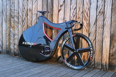
Titled after the portuguese word for feather, the ‘PLUMA’ track bike lives up to its namesake with a lightweight body and elegant shape. designed by Nuno Teixeira industrial design, the ‘PLUMA’ concept was dreamt up back in 2010, and after one year in production the first prototype is ready to hit the track. With a carbon sandwich and AIREX R63.80 PCV foam frame, the pluma bike sports a curvy physique to help air flow along the bike’s body. The streamlined bicycle aims to be feather soft as well as feather light, reducing the number of exposed moving parts and tubes to prevent injury to the rider in case of a fall. with a PRO track carbon disk rear wheel to minimize drag, and a PRO 5 spoke carbon track wheel at the front, the curvy ride carries no unnecessary weight. like the majority of professional velodrome track bikes, PLUMA is a fixed-gear model, and comes without breaks. Nuno Teixeira industrial design’s elegant bicycle has been taken from render to reality by constellation composite, specialists in turning concept transport designs into working physical pieces....
In the 1970s, designers were treated as rock stars–album cover designers, that is.“You were regarded almost like the fifth member of the band,” says Aubrey Powell, whose studio Hipgnosis was responsible for the album cover designs for artists like Pink Floyd, Paul McCartney, Genesis, and Led Zeppelin. A new book, Vinyl. Album. Cover. Art, revives Hipgnosis’s complete catalogue, displaying 480 illustrations from the studio’s archive. It’s a glimpse into a pre-digital era when a single illustration could take months to complete. Hipgnosis got its start in 1968, when Aubrey Powell and his creative partner Storm Thorgerson were asked to do an album cover for their friends’ second album. Lucky for Powell and Thorgerson, their friends happened to be the members of Pink Floyd; lead singer and guitarist Syd Barrett was their roommate. At the time, Powell was sneaking into the darkrooms at the Royal College of Art in London, where Thorgerson was a student, and experimenting with infrared film....
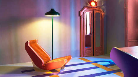
Less is a bore, as Robert Venturi once said. Minimalism has held a tight grip on the modern design industry for the past decade. We embraced the Apple aesthetic, extolled the logic of Helvetica, and worshiped at the church of Dieter Rams. It served its purpose, most recently, as a correctional to the excesses of the 1990s. But lately, as dispatches from Milan Design Week have shown, asceticism has given way to audacity. Every April, hundreds of thousands of people trek to Milan for its trendsetting design week, which ultimately influences the furniture, accessories, and textiles that make their way into homes, offices, hotels, restaurants, and virtually every other interior. This year the artistic influences ranged from ’30s art deco to ’70s eclecticism. Designers and manufacturers experimented with digital fabrication–like 3D knitting–and rediscovered artisanal craft techniques, like lacquering, metal casting, and jacquard weaving. But one thing was consistent: They’re embracing luxurious materials and textures, testing ambitious silhouettes, and piling on the details to yield products and furnishings that are visually enticing and emotionally evocative.In other words, minimalism is dead; maximalism has arrived....
Designing for the web, you must keep up-to-date with the latest trends and tools. For trends, it’s fairly easy to know what’s going on, but it can be hard to keep up with the latest tools. Let’s look at ten web design tools you can add to your toolbox.
I launched Typewolf as a side project in June of 2013. Working as a designer, I was always frustrated by the lack of good resources for choosing fonts for design projects. Seeing type samples set in “the quick brown fox jumps over the lazy dog” isn’t very useful when it comes to web design—seeing how real type performs on actual websites is much more helpful. I’ve also noticed that other typography sites tend to be written from a type designer’s perspective rather than from the perspective of someone who actually uses type in their day-to-day work. I’ve been a designer for 15 years, so everything on Typewolf is approached from a designer’s perspective....
Just like previous years, we've undertaken great efforts to look for, categorize, and create font previews of 100 typefaces that you can use to do almost anything. Regarding their licenses, you should pay attention to each one individually as, while the majority are completely free, some are for personal use only and others are not full families – this means that you’ll only be able to download regular or medium weights or condensed styles for free. Font Selection As you know, the selection has been made keeping the typical type classifications in mind to help you browse more efficiently: Serif, Sans Serif, Slab Serif, Rounded, Geometric, Decorative, Display, etc. Many of these fonts can also be downloaded as a web font kit so that you can use them in your online projects....
There is a big misconception about the role of web design. Many people see design as the lipstick, the visual appeal of a website. But your website should be more than a pretty digital brochure. Web design is a tool that can help you achieve specific business goals. For B2B companies, web design should be working towards increasing the leads you get from your website. Good web design can help increase your conversion rate and engagement with your content, funneling leads down your marketing funnel towards a sale.
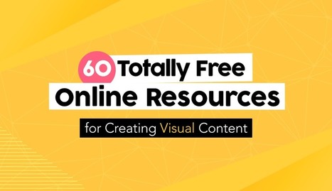
Creating engaging visual content doesn’t have to require a financial investment. Sure, at one time graphic designers needed expensive software and even more costly images to craft a winning visual campaign. But thanks to a host of free online resources, anyone can design high-quality visual stories with ease. Of course, navigating the sea of online images and editing tools is easier said than done. Some require membership, others charge royalty fees, some require advance permission and others charge for high-definition. Fortunately, we’ve scoured the Web for the most complete, the easiest to use and the most innovative resources to aid even the most amateur designer in crafting stunning visual content. Check out these 60 totally free design resources for non-designers...
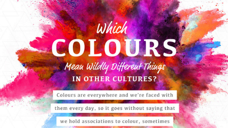
One of the most fun things to do in design is swirling the latest color trends into your work. Color is a fascinating topic, and even a generator that understands color theory has recently been invented. Because they mean different things, companies also actively use color in their brand designs to encourage feelings and behaviors from customers. However, in different cultures, color theory isn’t all black-and-white. In this delightful infographic, SilverDoor describes color associations of different cultures, adding contrast to the way you think. Telling a person from another part of the world that you’re “feeling blue” may mean something entirely different to them. Is your favorite color offensive to another culture? Find out in the infographic below....
‘Crowded’ websites are difficult to read. Complexity often makes users uncomfortable. If we’ve overwhelmed them with lots of different information, all fighting for their attention, they will leave or not take the action we’d wanted them to do. It may be purchasing something on e-commerce website or reading the article on a blog. There is, however, a concept that helps graphic designers to create great web experiences, making the content appealing and easy to follow. It’s white space – the way of giving your layouts extra room, simply by avoiding unnecessary clutter and using the space between elements for their advantage....
People are overexposed to so much stuff today that the concept of simplicity stands out as elegant, refined, and enviable. In web design, too, the concept of simplicity is enjoying a resurgence. People spend more time interacting with devices and online, so they increasingly crave an experience that is psychologically comfortable (intuitive) and visually calming or straightforward. Simplicity has never been so popular or so difficult to attain as it is today....
|
Looking for the perfect font for a branding or logo project? We’ve researched some of the very best fonts for tackling a new logo design – and complied them into a handy list for you to refer back to whenever you need.Whether you want an elegant serif, stunning slab, high-impact stencil or more, you’ll find a wealth of inspiration here. Scroll down for 15 of our favourite logo fonts...
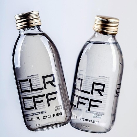
Until now, the risk of slightly stained teeth has been just a small price to pay for the satisfaction and energy boost that coffee brings. However, London-based startup CLR CFF claim to have created the world’s first ‘colorless coffee’—the pair of words itself almost an oxymoron. brewed with high quality arabica coffee beans and pure water, the disconcerting drink promises a ‘fresh, aromatic taste and flavor’ that does not require sugar or milk. Made with a ‘never before used’ coffee brewing method, the brew comes without the dark brown color of the coffee as we know it , and consequently does not yellow your tooth enamel. CLR CFF promises that the energy-boosting beverage does not contain preservatives, artificial flavors, stabilizers, sugar or any other sweeteners. the startup—founded by slovakian brothers david and adam nagy—came about after the pair struggled with teeth stains brought about by a caffeine-infused lifestyle. After finding nothing on the market that filled the gap left by coffee without staining their teeth, the duo set out to create a drink brewed with the same arabica beans, that wouldn’t have such a negative effect on their smiles..
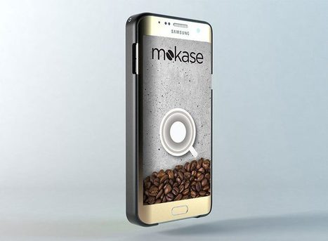
There will always be times in the day when you are in desperate need of a caffeine boost, yet no where near the closest café. and for these times, mokase have comprised the answer to your caffeine-deprived prayers, in the shape of a phone case that converts your smartphone into an on-the-go espresso maker. using a simple system of a disposable insert which houses the coffee, and an app that heats it up on demand, the mokase pours out an espresso made by your smartphone. On setting out to develop a product to brew coffee whilst out and about, Luigi Carfora and clemente biondo of ‘smart k’ had the idea of incorporating it into a gadget already carried around every day—the smartphone. the duo successfully designed a case that measures less than 1cm in thickness, is completely waterproof and insulates the coffee when brewed. through a side slit in the mokase, the ‘mokaromi’ cartridge is inserted. the coffee—sealed within a vacuum on the inside of the cartridge—is freed when inserted into the phone, as the ‘spout’ breaks the membrane of the vacuum allowing the drink to exit....
The Netflix queue is one of the most dangerous time-sinks on earth. But to designers, it can actually be a great source of inspiration, with everything from design documentaries to films that are pure visual art. Here are 22 must-see design movies and shows on Netflix....
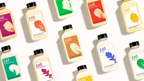
Josh Tetrick was standing in a Dollar Tree in Oakland, California, when he asked a customer which brand of mayo was best. The woman pointed to a gleaming white jar of Kraft.But Tetrick asked, “What about the Just Mayo?”–the flagship product of his company Hampton Creek–which sat nearby. “She said, ‘No, that’s the private-label brand at the Dollar Tree,’” Tetrick recounts. In other words, Just Mayo’s craft paper label–a label that had first been X-Acto-knifed, one at a time, for its initial appearance on shelves at Whole Foods–it didn’t register as some Brooklyn-inspired, vegan artisanal good to this bargain shopper in Oakland. It looked like the generic stuff sold by a budget retailer. “That was an important learning for me,” says Tetrick. “It shows how important context is in design.” And it cemented a hunch, that Hampton Creek, with the lofty, sometimes controversial goal of bringing sustainable, transparent, healthier processed foods to the mainstream consumer, simply didn’t make sense where many low-income and middle-class consumers were shopping: Walmart and Dollar Tree....
Working with color can be so much fun. Color can set the mood and tone of a design. Color can make a design appear clean or messy. Another thing we can use color for is to draw attention to a desired piece of content or element. In this post, we’ll go over the various way in which color can be manipulated to draw attention to something. Some of the examples will talk about repetitiveness, some about photography and others about how a lack of color can be a strategic thing too. Let’s get started in analyzing how to draw attention through color....
Everyone, even non-designers, can agree that the smallest typographical change can make a world of difference (*cough* Warren Beatty *cough*). Elevating designs through typography is a skill every designer should have in their back pocket. Do you want to become a typography wiz—and, ultimately, an even better designer? We want that for you too! That’s why we’ve gathered a list of the best free typography resources—handpicked, just for you. Free typography education Check out these e-courses, e-books, and workshops to get started on your typographical journey....
One of the most important skills you can learn as a designer is how to choose type. This is because text is one of the primary ways designers can communicate with users. Typography can make or break a design. There’s a beauty and complexity to typography. Some people devote their entire careers to type. Thankfully, their work is well documented, so we have tons of online resources for typography. This article is designed to serve as a starting point for helping you learn how to choose type for your designs. It will encourage you to explore fonts and font combinations beyond those you’re familiar with....
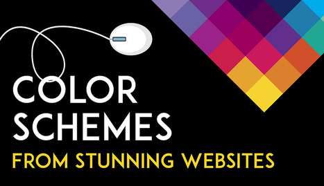
Color is such a fundamental part of the way we perceive the world that we often take it for granted. Think about it: From the youthful and vivid orange on someone’s attire to the gray and gloomy sky above us, colors have the power to mold our perceptions of others and even the circumstances we find ourselves in. This is why one of the most powerful tools in a designer’s arsenal is color. It can either make or break a design; it can be the determining factor in engaging viewers or sending them promptly on their way. As a non-designer, I often find it difficult to find just the right colors for my amateur projects. Whether I’m creating a simple image to support my content or more elaborate projects such as a slide deck or infographic, I frequently spend a good amount of time looking for the perfect color scheme. I ask myself questions like: Do I want my design to be inviting? Provocative and bold? Or intelligent and elegant? Unless you’re a seasoned designer, it takes time and effort to find a color combination that works, which is why the design team at Visme decided to provide our users with a handy list of beautiful color schemes from websites that have been recognized by Awwwards, the most prestigious award for Web designers and developers....
Learn how to create professional PowerPoint Templates using Slide Master in PowerPoint. Use these PPT templates for business presentations or personal use.
Via Baiba Svenca
2017 is the year we return to the organic roots and we will see a return to the natural. In terms of colors, the start has been given by Pantone (as every year, in fact), who has crowned the color for 2017 as Greenery, based on it’s meaning of new beginning, freshness and environmentalism. Manifesting as a “fresh and zesty yellow-green shade that evokes the first days of spring”, Greenery envelops the notion of breathing, reinvigorating and appreciating the great outdoors. That said, let’s take a closer look at the graphic design trends that define 2017. Most of them influence both print and web design, but some of them are just for the web....
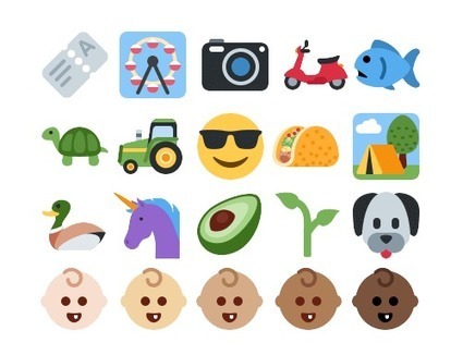
There is a lot of misinformation about these topics online, a fact made painfully clear to me as I was writing this article. Chances are you’ve encountered more than a little of it yourself. The recent release of Unicode 9 and the enormous popularity of emoji make now as good a time as any to take a moment to appreciate just how important this topic is, to look at it afresh and to fill in any gaps in our knowledge, large or small. By the end of this article, you will know everything you need to know about emoji, regardless of the platform or application you’re using, including the distributed web. What’s more, you’ll know where to find the authoritative details to answer any emoji-related question you may have now or in the future....
|


Got color on your website? Which ones, why it matters.