 Your new post is loading...
If you want an effective social media presence, you’re going to want images that fit with News Feeds, timelines and streams. Trouble is, the different channels all use different sizes and shapes for their images, and to keep you on your toes, they occasionally change them too.
We have you covered, though. From staid, professional LinkedIn to noisy Twitter to the image extravaganza of Pinterest, here are the updated social media image sizes for the major channels....
Every business, be it big or small, needs a logo for recognition and establishing an identity. However, not every business gets it right. There are some common mistakes we commit when designing a logo. These mistakes cause us not just embarrassment but loss as well.Let’s have a look at six logo design mistakes committed by designers and business persons that cause logos to fail:
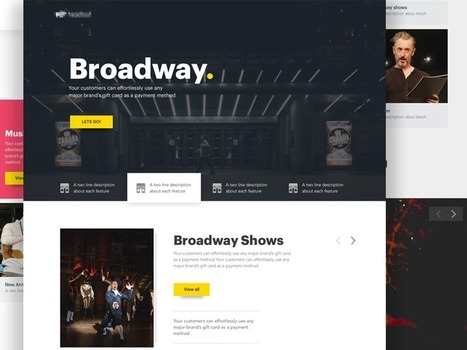
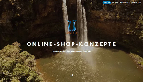
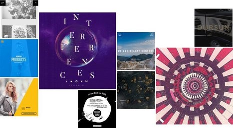
Landing Page Inspiration — December 2016.
You’d think that, 20 years later, as design has gotten more sophisticated and information about design has become much more accessible, designers would learn to avoid design mistakes, but a recent, large-scale usability study from 2016 by the NN Group found just the opposite to be true. Instead of learning from past mistakes, designers have been continually repeating them throughout the decades. In fact, if there’s one thing that’s certain in web design, it’s that these errors continue to persist because designers keep forgetting the basics:
- Enabling users to find information
- Enabling users to read that information
- Enabling users to understand where to click and where the destination is...
Ready to refresh your website? The start of the year is a great time to take a hard look at your existing design – or even new projects – and think about how to incorporate some of the latest trends into the framework.From functionality to color and typography, 2017 will be a year of new ideas and new visual concepts to explore. Some of those designs are already starting to pop up, providing you with just enough visual inspiration to get off to the right start in the new year. Let’s take a look....
This infographic will remind you about the important web design do’s and don’ts when creating websites. There are tips in this infographic for every level of expertise and for every part of the website design and development process....
While clients often ask you to cram in as much information into a page as possible, seasoned web designers know this can lead to a usability nightmare. Confident and careful use of whitespace, in contrast, is all about giving content room to breathe. The examples listed here work because everything the visitor needs is still there on the page; all that’s absent would just be clutter. In place of that clutter, whitespace helps create a balanced, easy to navigate interface where you can find what you need without being overwhelmed....
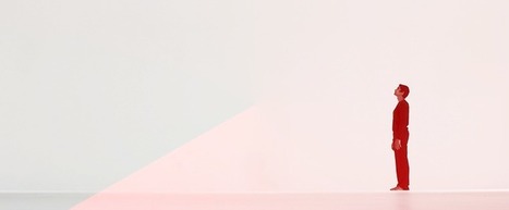
Trump's "Make America Great Again" hat was pervasive, potent, and deeply misunderstood.mp's ubiquitous bright red trucker hat, festooned with "Make America Great Again," is now seared into our collective memory. It was the most hated and most loved symbol of the election, the most comical and the most serious. It was a poorly designed product that turned out to be very strong branding. It was the most misunderstood design of the election—for designers and non-designers alike. But most of all, it's a lesson about the limitations of "good" design. "No one wants to give [Trump] credit, understandably, because it’s not something that was designed," says Lindsay Ballant, a designer, art director, and adjunct professor at the Maryland College of Art. "It should be something that designers think about. Good design doesn't necessarily mean effective design." As we move on from the 2016 election and contemplate the role of design in subsequent political campaigns, understanding the difference between good and effective design is imperative....
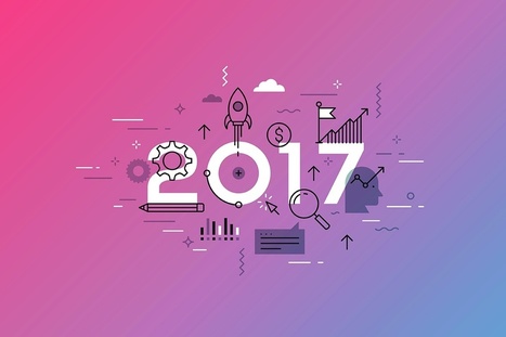
Web design is a fast growing industry with strong competition. Keeping your website designs updated with the latest trends will help you get more traffic. So look into the future and take steps as early as possible to stay ahead of the competition. In this post, I’ll focus on trends that will shape the digital design industry in 2017....
These technologies have combined to create a huge shift in the web design paradigm, creating, most notably, a responsive (or increasingly mobile-first) design philosophy. On the aesthetic side, 3 years ago flat design reigned supreme. And then Google introduced Material design, which brought us slightly out of abstraction. 2017 marks the year design takes one more step back into reality. Whether it’s through form, color choice or functionality, 2017 is a year of hybrids, where reality and technology collide to create a seamless browsing experience. Here are the 9 web design trends we think are going to bridge that gap...
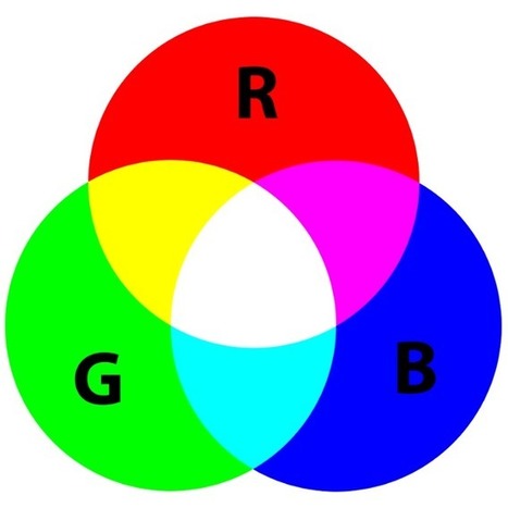
The art and psychology of color is a deeply intimate thing. Color affects us daily, from the moment we wake, throughout our day, and well into our evening. This connection to color, and the emotions it evokes plays a big part in how we design as educators, marketers, and brand storytellers. What Is The Psychology Of Color? Color psychology is the science of how color can affect human behavior. This field is a broach branch within psychology and can be very complicated. Humans interpret color based on their personal color preferences, but there are also stereotypical ideas and color associations that affect consumer preference. The combination of the two leads to color and color choice playing a large role in brand marketing and strategy....
It’s never too early to try and take a peek at the future. After all, web design will play a HUGE role in the way people connect with each other and receive information. A lot has changed since the days of crowded homepages and colorful fonts. Minimalistic design seems to be passé as well. Which makes us wonder: what’s in store for the future of web design? What elements will users favor more or expect to see? Below are the top three trends that could dominate web design by 2017. Take a look and see if you can implement them before the year is over....
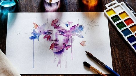
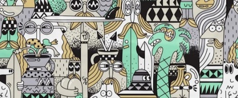
What if I told you you could visit an art gallery ... from the comfort of your own home? Or from a bus seat on your commute to work? Or while you're taking a break for lunch? If you follow the right people, that's what Instagram can do for you. There are a lot of really talented artists and designers out there who use Instagram as a sort of mini art gallery -- a social portfolio, if you will. And it's a jackpot for people who love browsing gorgeous design work. To help you narrow your search, I've carefully curated some of the best Instagrams to follow for design inspiration. I did my best to place them in categories -- illustration, graphic design, pop art and installation, color palettes, street art, photography, typography, and calligraphy -- although you'll notice some of their work could fall into a number of different lists. ...
|
When you're new to marketing, especially on a small team, you might have to do a lot of things at a moment's notice. And when it comes to things like blogging and social media, sure, you've got this. But soon enough, you're being pulled onto design projects. One day you're mocking up an infographic; the next, you're designing an ebook. You feel woefully unprepared -- and that design vocabulary? It can feel like a foreign language. Sound familiar? We've been there -- and we know we're not the only marketers who have, at some point, needed to become fluent in this vocabulary. So we decided to share a larger glossary, to help us all step up our game a bit. By no means is this the be-all-end-all of design terminology, so feel free to add your definitions in the comments as well. Here's what we have, organized alphabetically....
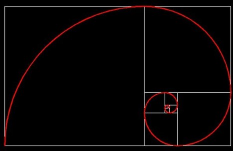
The golden ratio (or the divine proportion) is a mathematical constant that can be often seen in the natural world, as well as in the artwork throughout the history. In mathematical terms, when a is larger than b, and the two are added and then divided by a, the sum represents the golden ratio (1.618). That number is represented by the Greek character “phi”. It is still not clear why this ratio is so appealing to the human eye. Anything following this ratio tends to be perceived as attractive and even the slightest change in an image that gets closer to the ratio is automatically considered to be more beautiful to the human brain. It is not a matter of magic; it is just a yet unexplained fact that our minds react very positively to anything formed on the basis of the golden ratio. As many artists have been using this fact, so could you when it comes to web designing....
As it turns out, posters aren't as old-school as we might think. In fact, they're still quite effective devices for promoting events. Making yours stand out, however, is the tricky part.Like so many other things in marketing, it requires a combination of creativity and formula. But what are the success factors? And what makes a poster look its best? You're in luck. Our friends at Venngage, who know a thing or two about creating compelling visuals, put together this infographic to guide you along your poster-making journey. It'll help you figure out what information is essential to include on your poster, and how to make it aesthetically appealing -- without overwhelming the viewer....
When I worked as a web designer, I was fascinated by how design trends changed each year. Since hanging up my design boots and focusing on being CEO of Envato, my focus has shifted from visual trends, to industry and technology ones. As I did in 2014 and 2015, here’s my take on where the world is moving!...
2017 will also break with some of the more basic designs trends of 2016 by bringing back vivid colors and designs that bend the limits of the traditional grid. So, as you recover from your holiday-induced sugar high, let me walk you through 13 exciting web design changes you may see in 2017 in this slide deck (and some really awesome sites that are ahead of the curve). If you’re an overachiever you might want to get ahead of the curve as well and start thinking of some ways to implement these predictions for yourself. We can help you out with that! ...
Most conversion rate optimization experts you'll meet would agree: Copywriting first. Design second. The idea is that copy (and the message you're trying to convey through that copy) should dictate design – not the other way around. Now, this is in no way meant to underestimate the importance of design. Design can breathe life into the story the copy is telling, and done properly, great copy plus great design will always outperform great copy alone. The point is, it's not hard to find examples of "ugly" pages outperforming beautifully designed pages – and in those cases, it usually boils down to the copy....
Why have I used the adjective 'sensible' in my headline, instead of something more click-worthy like 'crucial'? The answer is that web design trends in 2017 should be all about meeting the user's needs. Gone is the temptation to show off what the browser can do, in its place is a passion for proper design; form follows function. Ignore all the web design trends pieces that tip their hats to virtual reality or to eye-catching animation; 2017 is about utilitarianism. Here are the 10 trends I think will be most noticeable....
As 2016 comes to a near close, our creative team here at Dock9 reflected on what we consider the rising web design trends of 2017. Like any trend, these go in and out of fashion and may not necessarily suit all our users. However, we like to think of each trend as an “additional tool” to our designer tool box, where we pick the right ones for the job at hand. This week we’ve compiled a list of 9 key trends we believe have been prominent in Web design this year, and we predict, likely to continue into 2017.
As we look forward to 2017 — a year that hopefully won’t be plagued by the passing of so many of the world’s greatest artists and performers — the big question on every designer’s mind has to be: what will define design in 2017? So with that in mind, I decided to ask Webflow’s own designers what trends they think will dominate the world of digital design in 2017. (And wrote up a little commentary on their thoughts.)...
Every year the world waits with baited breath for Pantone’s big color announcement, which sets the creative stage for industries like fashion, home decor and (of course) graphic design. The annual selection is meant not only to predict aesthetic trends, but take our global temperature. The chosen color is a cultural representation of the world’s current mood and attitude, which is why Greenery seems so fitting for the 2017 Pantone Color of the Year. Greenery is a continuation of 2016’s soothing Rose Quartz and Serenity, responding to another tumultuous year with hope and resilience. Drawing on universal qualities like the emergence of spring foliage and the lush outdoors, the color is meant as a symbol of new beginnings....
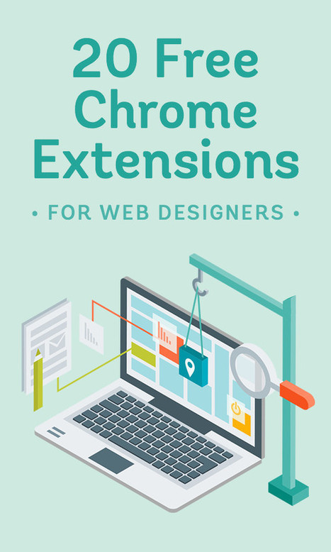
Web design has its fair share of intricacies and technical complications. It’s a specialized field that does not just require creativity – you need the right tools to make the work as seamless as possible as well. Google, being the trusted online genius that you rely on each time you have a question in mind, has laid everything down for developers and designers. Google Chrome allows you to install powerful and helpful extensions that make the job easier. And with design and developer tools built right into your favorite browser, it’s all easier and more efficient from hereon. Here are 20 free Chrome extensions that make web design a whole lot easier....
Empty space is not always wasted space.In fact, when it comes to web design, it's a best practice to give your content a little breathing room. Today's website visitors are content-scanners. They scroll quickly, skim posts, and get distracted by busy layouts trying to accomplish too much. The key to getting your visitors' undivided attention is simplicity -- and that starts with an effective use of whitespace. In this article, we'll take a brief look at why whitespace matters, what it means for conversion-driven web design, and how eight websites are using whitespace to lead their visitors towards a desired action....
|


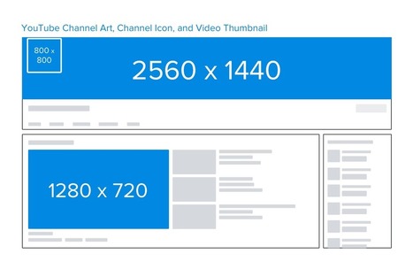


Practical tips to help you get your blogging and social media images right-sized.