 Your new post is loading...
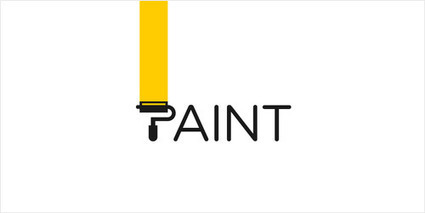
Typically, a logo’s design is for immediate recognition. The logo is one aspect of a company’s commercial brand, or economic or academic entity, and its shapes, colors, fonts, and images usually are different from others in a similar market.
Logos are also used to identify organizations and other non-commercial entities. These types of corporate identities are often developed by large firms who specialize in this type of work. However, if you want to save some bucks and want to design your logo then there are many sources to get logo design inspiration. Infact, we might able to help you by presenting this showcase of Highly beautiful, original and creative logo designs for your design inspiration.
All of these logos are very creative and following different trends like PhotoFill, Concealed, VariDots, Candy Stripe, Flip Flop, Sequential, but most importantly Texting which is a common element among all of them. Also, try to catch how they created using specific colors combination, typography adjustments and font selection....
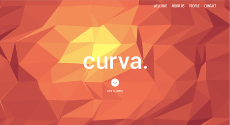
Presenting the recipients of Best In Class, a special award to commend the most impressive sites in each of the WOTY 2015 award categories.
So what’s the secret to designing with contrast in a way that will enhance your project? Unfortunately, there’s no magic formula. The process often starts to happen subconsciously as you build your design skills. If you’re thinking that this sounds like some mysterious skill that designers are keeping to themselves, don’t give up yet. Contrast is a design tool that anyone can use to organize and add visual interest to their design projects, so keep reading to find out how....
Useful for browsing or reading, this ebook describes 168 top websites from companies like Tumblr, Google, Airbnb, Dropbox, Bose, Coin, Reebok, and Nest, not to mention newcomers from around the world. Many examples are dissected and explained, along with 7 best practices for web design into 2016.
This 158-page ebook provides anywhere from 18 to 31 examples of these popular and powerful techniques (along with analysis of what works well for the sites)....
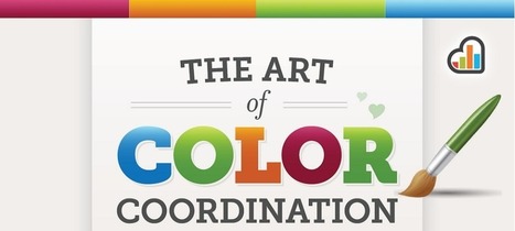
We already know what makes a successful logo—remember, simplicity is key. But what about its color scheme?
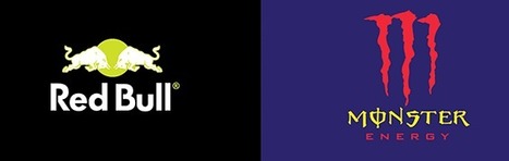
A Brazilian graphic designer, Paula Rúpolo, recently experimented with 22 major brand logos, swapping the colors of a brand's logo with that of its competitors. The results are mesmerizing and, surprisingly, viscerally unsettling.
"There's something unbelievably awkward and uncomfortable about seeing globally-familiar brand logos wearing someone else's clothes," as Rúpolo puts it.
For brands like Dunkin Donuts and Sprite, where the design is minimal and the brand relies on color to make its logo pop, the outcome is especially off-putting. For others, like Amazon, where there's very little color to begin with, the swap totally overwhelms the design. ...
This is not another “use red instead of blue” article. We have heard that one time too many. Applying colors is a delicate process that needs to take in context the audience and the entire environment of the website you want to modify. The choice is highly individual, as it needs to fit the website’s (and the brand’s) personality.
However, there is one utterly universal principle. Do you know what rules our perception? It is contrast. This article will not tell you “use colors in your designs,” but will tell you “use contrasts in your designs,” followed by a proof in a form of a case study...
Typography is an important but often under-represented part of a website's layout. With so much focus being placed on the presentational aspects of CSS and the use of large images and media that choke bandwidth restraints; it’s nice to occasionally remember that textual content can also make an impact on users and their experience. Content remains king, and a few good fonts can make even the simplest of sites look smart - though not so many that you have to wait for ages for the text to be visible.
Because of this, I’m going to show you a few handpicked examples of sites that make their content look terrific, and why you should consider following their example in your own work. We’re going to take a journey of how elegant typography can make a site shine; looking at the bold, creative, navigational, simplistic and interactive content that makes the designer's voice speak volumes - so let’s get started!...
Featuring an awesome line-up of designers, illustrators and typographers who are sharing their fantastic portfolios on the image-sharing site, this article is a must-read if you are looking to turn up the beauty, style and creativity on your daily feed.
From colorful hand-made typography to surreal 3D illustrations, head over here to learn more about these Instagram-savvy graphic designers....
Are the fortunes of design on the rise in Silicon Valley? A resounding yes, says John Maeda, design partner at the venture capital firm Kleiner Perkins Caufield Byers.
During a presentation at South By Southwest 2015 on Sunday, Maeda argued that not only is Silicon Valley taking design more seriously; design is actually taking over. Here are four key reasons why the most successful tech companies of the future will really be design companies....
Posters are one of my favorite design projects because you can bend the rules so many different ways. They’re creative, bold, groovy and can provoke so many emotions too. Some posters get you excited and pumped up such as music or event posters. And then others are chock full of information. Some may contain much more information than others. The key is finding the right balance with headline, copy, images and logos. When you’ve achieved that, you’ve got one sweet poster.
Knowing your audience and product/service/event is the first bit of critical information for a poster. After that, the mood, emotion or reaction will lead to colors, fonts and graphics that complement the information. Below are 25 tips to finding the perfect design theme to convey the message....
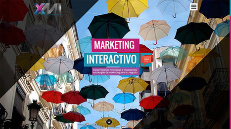
Website layout designs naturally tend to make use of horizontal and vertical lines due to the blocky nature of the coding behind them, but designers are breaking free from these constraints by using dynamic angles in their designs. Sometimes these angled lines are simply background images created in Photoshop, but others are animated elements made directly in code. Check out today’s web design showcase to see some great examples of website interfaces with angled lines....
No design experience?
No problem! Let's start from scratch and get familiar with the basic Canva tools that will help you create amazing designs.
Design Essentials will guide you through simple tools and techniques that will help you create designs you can proudly share with the world.
Fonts bring your words to life. Learn how to easily choose fonts that emphasize your message and make your designs look beautiful.
Color can be used to convey moods and create emphasis in your designs. We show you how to build meaningful color relationships to create visually stunning graphics.
Whether you upload your own, or choose from our library of over a million, images are a vital component of eye-catching designs. Learn how to use simple Canva tools to compose and enhance your images for greater visual impact....
|
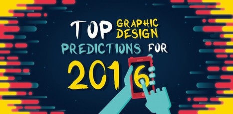
As a web & graphic design agency with an accent in visual storytelling, my team and I need to pay close attention to the everchanging trends of design, on and offline. Based on this monitoring, I’d like to share with you what I believe will be the 16 most prominent trends of graphic design in 2016.
Why is this important to you, if you’re not a designer? Well, if you’re a business owner, or if you own a blog, I’m sure you don’t want it to look and feel outdated. People will make a lot of assumptions based on the first impression they get from the design of your last post, your social profile or your flyer.
If you spend lots of hours writing your blog, wouldn’t you like to stand apart visually? Jump on board these trends before everybody does:...
Posters can be beautiful and illustrative, minimalistic and modern, cheeky and funny – really, the list goes on and on. We could all use a little more joy in our lives, so today we’ll be looking at some humorous posters about graphic design and the struggles graphic designers face every day.
Let’s lighten up the mood and explore 40 funny posters all about graphic design and those who love it dearly....
We are constantly exposed to advertising in our daily lives, be it online, in print, on billboards or through our television screens. In fact, research suggests we are exposed to, on average, 362 ads per day (not including brand exposures) but only 3 per cent of these will make an impression. That’s just twelve ads a day that actually engage us.
So how do you break through the advertising clutter and make a memorable advertisement for your audience or target market? First come up with a solid concept and then consider your design. Attention to layout and presentation will help your ad get noticed; but attention to concept and creativity will help your ad be remembered.
Here are fifty print ads that are creatively brilliant. They have a solid concept topped off with great design....
There’s no right choice here (unless your deadline is tomorrow), but if you’re the kind of designer who likes to plough on and get work done, this article is the resource for you.
You’re about to find 70 inspiring Pinterest design boards that are guaranteed to inspire your creative genius, for free, and get you on the road to your next great design....
Typography, like any expertise, can only be truly mastered with practice – but that doesn’t mean it has to be boring! What better way to spiff up your design skills than with some fun online games?
We’ve compiled a collection of entertaining typography games sure to test your knowledge. Pair typefaces at rapid speed, identify fonts in the blink of an eye, improve your kerning and ragging, and learn the history behind some of your favorite typefaces.Best of all? Nearly all these games are free to play!...
Recently, we started asking businesses how much they valued design in their workplace.
And this is one of the most common answers we heard: For the challenge of perfecting a steady design flow – is it really worth it?
Firstly, we’re strong believers in the notion that design in the workplace should be easy. And secondly – a thousand times yes.
To outline exactly why, we created this list of proven reasons design is a good business decision....
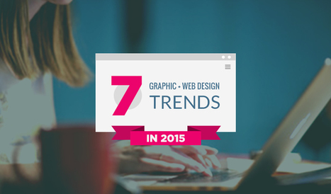
Let's talk about latest web design trends and standards in 2015. And we also help you by sharing tools, that help you achieve trendy looks. Check it out!
For every trend, I will provide you some data and research that supports the fact followed with examples of real websites utilizing it. I will also recommend some tools, resources and services for implementing the trend into your project...
We’ve curated some of the best attention-grabbing campaigns to inspire you when you’re tasked with creating your own advertisements and marketing materials.
The 71 brilliant advertisements featured in this article represent some agencies and designers that have flexed their creative muscles to get it right. As you can see, the tactics that these creative teams used to deliver their messages varied greatly, but they have at least one thing in common – stellar storytelling skills....
An online portfolio website is an extreme important part of this process. Here, I bring you 50 breathtaking portfolio websites for inspiration.
WordPress themes are great sources of design inspiration, but it’s even more interesting to check out the best selling premium themes to see the kind of styles are popular with the general public. In today’s web design showcase I round up some of the most purchased themes from multiple marketplaces to compare their layouts. Can you see any common trends?...
Ryan McArthur is a famous graphic and web designer who has turned famous inspirational quotes into excellent graphic design in these minimalist designs.
Design is hot. Design executives are being tasked with being design driven, but don't have the tools or processes to sustain this effort.
... In some ways, designers and design managers have shot themselves in the foot — design thinking neither negates nor replaces the need for smart designers doing the work. And because design thinking has many paths through parallel phases, it seems fuzzy compared to the process of creating code. Compared to analytical thinking or science, our industry still doesn't have a consensus on what design thinking means. Most designers couldn't tell you what it means
.It's been 20 years since I was ingrained with the concept that the designer mind could think much differently than a marketer, engineer or the guy in a suit-and-tie. Yet, for all its power and inspiration, I still don't completely understand the meaning of design thinking.
Should we abandon the concept? Absolutely not. I use the methods and ideas that it espouses daily. I believe we just lack some of the tools necessary for the practical application of these methods to stick within organizations....
|


![20 Reasons Good Design [Really] Matters To Your Business – Design School | Public Relations & Social Marketing Insight | Scoop.it](https://img.scoop.it/cN32AQDL_D2O0Bkb259EjDl72eJkfbmt4t8yenImKBVvK0kTmF0xjctABnaLJIm9)


What an exceptional collection of logo designs. Creativity with your coffee. Highly recommended viewing! 9.5/10