 Your new post is loading...
Working with color can be so much fun. Color can set the mood and tone of a design. Color can make a design appear clean or messy. Another thing we can use color for is to draw attention to a desired piece of content or element. In this post, we’ll go over the various way in which color can be manipulated to draw attention to something. Some of the examples will talk about repetitiveness, some about photography and others about how a lack of color can be a strategic thing too. Let’s get started in analyzing how to draw attention through color....
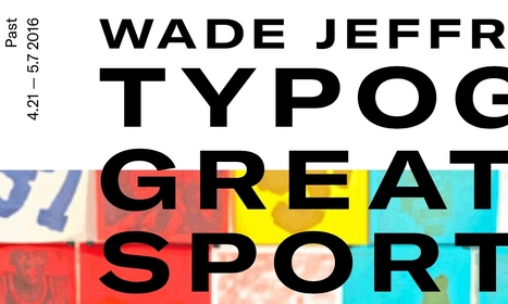
I launched Typewolf as a side project in June of 2013. Working as a designer, I was always frustrated by the lack of good resources for choosing fonts for design projects. Seeing type samples set in “the quick brown fox jumps over the lazy dog” isn’t very useful when it comes to web design—seeing how real type performs on actual websites is much more helpful. I’ve also noticed that other typography sites tend to be written from a type designer’s perspective rather than from the perspective of someone who actually uses type in their day-to-day work. I’ve been a designer for 15 years, so everything on Typewolf is approached from a designer’s perspective....
Just like previous years, we've undertaken great efforts to look for, categorize, and create font previews of 100 typefaces that you can use to do almost anything. Regarding their licenses, you should pay attention to each one individually as, while the majority are completely free, some are for personal use only and others are not full families – this means that you’ll only be able to download regular or medium weights or condensed styles for free. Font Selection As you know, the selection has been made keeping the typical type classifications in mind to help you browse more efficiently: Serif, Sans Serif, Slab Serif, Rounded, Geometric, Decorative, Display, etc. Many of these fonts can also be downloaded as a web font kit so that you can use them in your online projects....
In this post, I have a look at how SEO should be an integral part of your website design (or redesign) process. We are going to look at what you need to consider to have a site that is built for search marketing and lead generation — and how focusing on happy users keeps the Google gods on your side. We will also take a look at some of the common pitfalls that can befall businesses looking to build a new website that is central to your digital marketing efforts. In brief, I am going to help you ensure your next site is a lean, mean SEO and digital marketing machine....
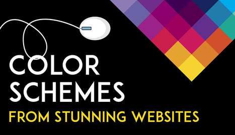
Color is such a fundamental part of the way we perceive the world that we often take it for granted. Think about it: From the youthful and vivid orange on someone’s attire to the gray and gloomy sky above us, colors have the power to mold our perceptions of others and even the circumstances we find ourselves in. This is why one of the most powerful tools in a designer’s arsenal is color. It can either make or break a design; it can be the determining factor in engaging viewers or sending them promptly on their way. As a non-designer, I often find it difficult to find just the right colors for my amateur projects. Whether I’m creating a simple image to support my content or more elaborate projects such as a slide deck or infographic, I frequently spend a good amount of time looking for the perfect color scheme. I ask myself questions like: Do I want my design to be inviting? Provocative and bold? Or intelligent and elegant? Unless you’re a seasoned designer, it takes time and effort to find a color combination that works, which is why the design team at Visme decided to provide our users with a handy list of beautiful color schemes from websites that have been recognized by Awwwards, the most prestigious award for Web designers and developers....
2017 is the year we return to the organic roots and we will see a return to the natural. In terms of colors, the start has been given by Pantone (as every year, in fact), who has crowned the color for 2017 as Greenery, based on it’s meaning of new beginning, freshness and environmentalism. Manifesting as a “fresh and zesty yellow-green shade that evokes the first days of spring”, Greenery envelops the notion of breathing, reinvigorating and appreciating the great outdoors. That said, let’s take a closer look at the graphic design trends that define 2017. Most of them influence both print and web design, but some of them are just for the web....
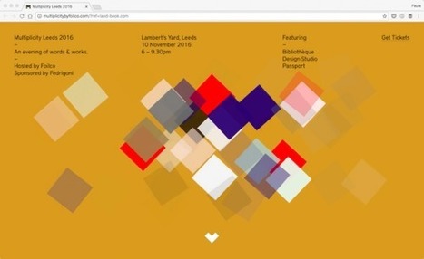
Have you noticed that most websites are, more or less, made up of rectangular boxes? From the rectangular shape of a browser window to the rectangular shape of buttons, websites are mostly rectangular. This is not only practical, it just makes sense. However, that doesn’t mean there is not room for other shapes like circles, triangles, or made up miscellaneous curvatures. I’ve gathered 30 different websites that use different shapes for different purposes. Some of them use random assortments of shape for decorations – like Roadmap – others completely redefine the structure of a web page – like Timetable Records....
Editor’s Note: In the world of web design, we tend to become preoccupied with the here and now. In “Resilient Web Design“, Jeremy Keith emphasizes the importance of learning from the past in order to better prepare ourselves for the future. So, perhaps we should stop and think more beyond our present moment? The following is an excerpt from Jeremy’s web book. Design adds clarity. Using colour, typography, hierarchy, contrast, and all the other tools at their disposal, designers can take an unordered jumble of information and turn it into something that’s easy to use and pleasurable to behold. Like life itself, design can win a small victory against the entropy of the universe, creating pockets of order from the raw materials of chaos....
This is the resource for you: How to Design a Website: 5 Brilliant Homepage Designs to Get You Started. In this free lookbook, you can explore homepage designs from businesses all over the world in several different industries, including: - Agency & Studio - Entertainment -Food & Drink -Nonprofit -Software & Tech -Ecommerce & Retail...
While big businesses often have multiple decision makers with very specific ideas and guidelines to keep their existing brands consistent, smaller companies are usually more open to exploring new creative directions, and can move faster to implement them. If you need some more convincing that working with small businesses can result in some stunning creative work, we've put together a list of 15 small business branding examples to get you inspired for your next project...
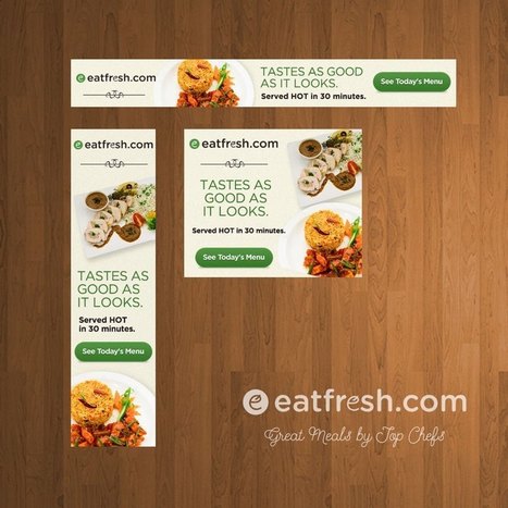
If you’re hoping to boost your online traffic with better ads, you may be asking yourself: what is web banner design? Web banner design focuses on the systematic creation of effective web banner ads through the careful application of basic design guidelines. Banner ads are one of the most prolific forms of marketing used in today’s online world. All companies use them in one form or another because they’re an affordable, measurable and effective medium to increase brand awareness. So how can you design and create web banner ads that will bring in those clicks? Below is a list of tips and general guidelines for designing banner ads....
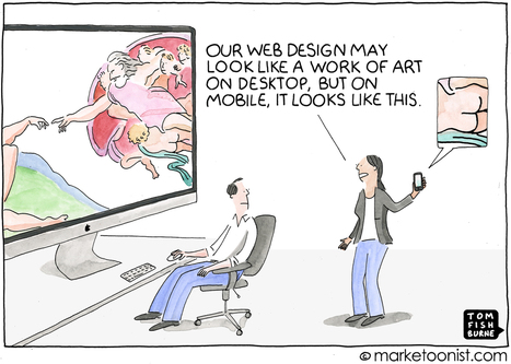
In 2015, Google introduced an algorithm update known as “Mobilegeddon” that prioritized mobile-friendly websites and was a wakeup call for marketers.
And yet, with customers increasingly mobile first, many brands still treat mobile visitors as mini desktop visitors.
Ericcson published a neuroscience study last year that found that the stress caused by using smartphones to find content and complete tasks on the mobile web is akin to watching a horror movie. They found that heart rate increases 38% with mobile content delays.
Curated directory of the best Product Pages
|
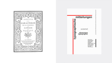
Here's an inspiring collection of typeface and typography pairing resources for designers and bloggers.
Everyone, even non-designers, can agree that the smallest typographical change can make a world of difference (*cough* Warren Beatty *cough*). Elevating designs through typography is a skill every designer should have in their back pocket. Do you want to become a typography wiz—and, ultimately, an even better designer? We want that for you too! That’s why we’ve gathered a list of the best free typography resources—handpicked, just for you. Free typography education Check out these e-courses, e-books, and workshops to get started on your typographical journey....
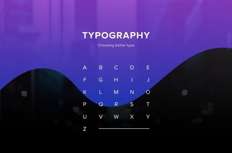
One of the most important skills you can learn as a designer is how to choose type. This is because text is one of the primary ways designers can communicate with users. Typography can make or break a design. There’s a beauty and complexity to typography. Some people devote their entire careers to type. Thankfully, their work is well documented, so we have tons of online resources for typography. This article is designed to serve as a starting point for helping you learn how to choose type for your designs. It will encourage you to explore fonts and font combinations beyond those you’re familiar with....
There is a big misconception about the role of web design. Many people see design as the lipstick, the visual appeal of a website. But your website should be more than a pretty digital brochure. Web design is a tool that can help you achieve specific business goals. For B2B companies, web design should be working towards increasing the leads you get from your website. Good web design can help increase your conversion rate and engagement with your content, funneling leads down your marketing funnel towards a sale.
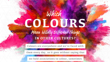
One of the most fun things to do in design is swirling the latest color trends into your work. Color is a fascinating topic, and even a generator that understands color theory has recently been invented. Because they mean different things, companies also actively use color in their brand designs to encourage feelings and behaviors from customers. However, in different cultures, color theory isn’t all black-and-white. In this delightful infographic, SilverDoor describes color associations of different cultures, adding contrast to the way you think. Telling a person from another part of the world that you’re “feeling blue” may mean something entirely different to them. Is your favorite color offensive to another culture? Find out in the infographic below....
‘Crowded’ websites are difficult to read. Complexity often makes users uncomfortable. If we’ve overwhelmed them with lots of different information, all fighting for their attention, they will leave or not take the action we’d wanted them to do. It may be purchasing something on e-commerce website or reading the article on a blog. There is, however, a concept that helps graphic designers to create great web experiences, making the content appealing and easy to follow. It’s white space – the way of giving your layouts extra room, simply by avoiding unnecessary clutter and using the space between elements for their advantage....
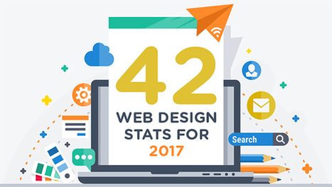
Are you considering a new website or even a redesign in 2017? Need some facts and figures to help you form and execute your web strategy? We share 42 stats you need to know in this infographic....
Adobe, one of the world’s largest and most powerful software companies, is trying something new: It's applying machine learning and image recognition to graphic and web design. In an unnamed project, the company has created tools that automate designers' tasks, like cropping photos and designing web pages. Should designers be worried? The new project, which uses Adobe’s AI and machine learning program Sensei and integrates into the Adobe Experience Manager CMS, will debut at the company’s Sneaks competition later in March. While Adobe hasn’t committed to integrating it into any of its products, it’s one of the most ambitious attempts to marry machine learning and graphic design to date. There have been efforts to use AI in the design world before—for instance, Wix’s Advance Design Intelligence and automated projects like Mark Maker, but Adobe’s is notable because of the company’s sheer reach in the design world. Although it’s just a prototype, it’s one to watch closely....
It doesn’t matter how many years of experience you have of a programming language, framework or CMS, you will always need to refer to the official documentation or, and more than likely, a handy quick reference cheatsheet, as it’s literally impossible to remember and know absolutely everything. In this post I’ve collected useful cheatsheets, references, guides, checklists and docs, covering almost all aspects of web design, that will not only help to improve your productivity, but will also help to solve some of those frustrating programming issues that often arise....
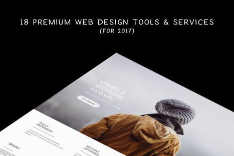
There are many new web tools and services for designers and developers launched every month, but how do you know which are the most useful? Which offers the best solution for a project? And which offers the most value for money? We’ve managed to collect a mix of premium web tools and services covering many areas of web design, that are worth trying out. Take your time, go through the collection, and find the tool that best suits you. Here they are....
The colors you choose while designing a website, poster or any other type of image will have a huge impact on whether or not the overall design is successful. After all, there is a lot of psychology behind the colors that people are attracted to, and designers need to incorporate this into everything they do.
Color contrast plays a very valuable role, but it is often overlooked, undervalued and misunderstood. To avoid this problem, you must learn more about color contrast, including how and why you should use it. Once you go beyond the basics of knowing that red and orange aren’t good colors to create contrast but black and white are, you can begin to develop an enhanced aesthetic that will please clients and viewers.
Why is Color Contrast So Useful?
Color contrast, in a nutshell, provides visual intrigue and keeps viewers interested. Consider for a moment how boring it would be if an entire poster was made from one color or only included shades from the same color family. Although there are some instances when this does work from an artistic perspective, it’s not an approach that is likely to grab someone’s attention when they’re perusing store shelves, looking at movie posters or surfing the web. Therefore, it’s wise to use contrasting colors whenever appropriate....
Whether it’s a brand promotion, video, news update or even a meme, visual content rules the social media landscape. What has become so important is effectively conveying your brand on social media through images and video.
In this quick-scroll world of social media, the visual face of your brand is often times the first thing your audience sees and possibly the one thing they remember. It’s hard to cut and paste an image and reuse it across all of your social networks unless you have a tool like Landscape.
Sprout Social’s very own tool is free to use to resize, crop and scale social media image sizes. And along with our resizing tool, we’ve provided all the specific dimensions and a few quick tips to help you decide which image best fits each position....
|


![How to Design a Website: 50 Brilliant Homepage Designs to Get You Started [Free Ebook] | Public Relations & Social Marketing Insight | Scoop.it](https://img.scoop.it/UtEj4rkdv2Ta7O-g8YMytzl72eJkfbmt4t8yenImKBVvK0kTmF0xjctABnaLJIm9)


Paula Borowska shows how to use color to spark your web design.