 Your new post is loading...
In order to arrange your design, you need a place to start. Backgrounds are the foundation of your graphics — it helps pave the path to forming a successful composition. Textures and colors help create depth and contrast, allowing your graphics to stand out and get noticed. Well composed images can help create space for you to overlay text, while visually communicating your message at the same time. Using a background can help give your designs more context and provide a visual element to help support your content. Bonus: We’ve designed most of the images in this article as templates for you to personalize! To use them for your own stuff, just click them and they’ll be ready to edit in your Canva account (No Canva? It’s free!).
Have you seen the hand-drawn look? Hand lettering's rising popularity has imposed a new grungy, ornated style in fonts that we can't get enough of. These type families offer uniqueness and naivety, while adding an unpretentious touch to print and web designs alike. If you haven't tried your hand at lettering yet, get started with these brilliant fonts that evoke that coveted hand-drawn look....
Think about the iconic brand names you know: Apple, Target, McDonald’s, Gap. What images come to mind? For many of us, probably their logos. That’s because whether it’s an apple or big golden arches, a logo is crucial to a company’s identity. Now, new research says that logos are even more important than businesses and consumers realize. A recent study in the Journal of Consumer Research found that even just a basic element of logos—their shape—affects how people perceive a company and its products.
There’s already a good amount of research on how logos influence customers. For example, a 2011 study found that when a company has an incomplete logo (think IBM), people perceive the business as more innovative but less trustworthy. Another weird logo effect that researchers have found: when consumers see a complex-looking logo over and over again, they start to like the brand more. Given these past findings, Amitava Chattopadhyay and his team at INSEAD thought something as simple as a logo’s overall shape—circular or angular—might also impact people’s opinions in a significant way....
The really eye-catching execution advertises Purdy's XL brushes, which can paint on practically any surface. To communicate this, the agency used XLs to paint over a billboard-size section of an ordinary New York City street—covering materials including brick, glass, wood, metal and plastic.
Among the objects that got a coating of bright yellow: a trash can, a newspaper stand, a bicycle, delicate flowers and even a pigeon. (Yes, it's fake. Don't go torturing actual NYC pigeons with your Purdy brushes.) And while this execution is visually reminiscent of OBI's famous German work from 2014, the message is different....
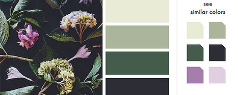
As Buffer writes, over 90% of our assessment of a product is made on color alone, so it makes sense that color should be considered with care for every design decision, particularly on websites. Chances are, if we don’t like the color palette, we’re not going to stay on the site for very long.
To get you started on your own palette, we’ve gathered 50 beautiful websites with versatile color schemes you can take inspiration from. So without further ado, let’s get knee-deep in some beautiful colors.
When thinking about web design, you must consider the full spectrum of possibilities that the internet presents. Done boldly, designers can push the limits of human interaction and imagination on a global scale – as is often seen with edgier industries, such as creative agency websites.
In this article, we’ll boil down some of the most prominent web design trends emerging in 2015. It is here that we can find true innovation and new opportunities – a few of which may completely change our understanding of a “modern website”....
Landing pages are often the most effective means of getting customers to a product. Rather than a traditional website (with multiple tabs and in-depth content), the landing page is usually a stripped-down, single page that’s specifically made for potential customers to “land on” and convert.
To achieve this, these pages utilize a CTA, or “call to action”, that encourages visitors to complete an immediate action – such as downloading an app, submitting an email or purchasing a subscription. Done correctly these pages can revolutionize online marketing efforts. Check out some of these awesome examples from our site and get ready to come in for a landing!...
We’re so excited to have finished 2015 off with a bang! Last December, we ran the third certification contest for Logo & Web. See below for the contest’s top 20 entries and find out why Jimdo’s multi-talento Brent Gummow thinks they out-shined their competition.Let’s start with the winner:...
The tremendous thing about the design community is that we all love to share. We really do. Whether we share our thoughts and ideas via an in-depth article or by giving advice/feedback on a forum, or even by freely offering high-quality resources. The sharing is what makes our community truly great!
Here are last month’s 50 best free resources for designers…
Simplicity never feels big enough. We want big, impressive, inspiring, creative ideas, right?
So we add, and add, and add. Paring back -- removing extra words, images, slogans, and the innumerable things a brand wants to communicate to a consumer in one ad -- isn't easy. But when a brand conveys a message using only the most essential images and text, we take notice. We recognize how difficult it was to tell a story or highlight a benefit using only a few elements.
If you're looking for inspiration on how to make simple attention-grabbing, check out these minimalist print ads....
There were trends that carved a quite niche for themselves such as responsiveness, mobile-friendliness, animations; others that matured such as flat style or scrolling effects; a few that remained unchanged like hamburger menu button or one-pages; and those that took the web by storm and quickly passed like dynamic patterns.
The year certainly supplied creative folks with a fertile environment where one can easily go wild. Although it is challenging to trace every key moment, however, we can demonstrate the overall picture through a collection of ingenious and exclusive projects.
We are going to dive into the best web designs of 2015 that were highly and justly rewarded by Designmodo team. Here’s what we have for you....
An infographic illustrating sufferers of infectious diseases by state took the top prize at the 2015 Kantar Information is Beautiful Awards.
Launched four years ago by data visualizer David McCandless, author ofInformation is Beautiful, and Kantar creative director Aziz Cami, the Kantar Information is Beautiful Awards is a platform to promote global best practice for a nascent design form that is now big business.
This year’s other Gold Winners include:Dear Data, an experiment in creating and sending data visualizations relating to life as it happens around us using analogue instead of digital means, by Giorgia Lupi and Stefanie Posavec won Gold in the Data Visualization Project category....
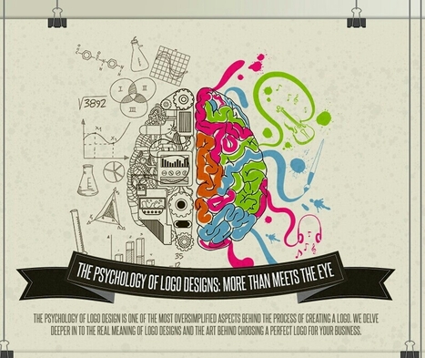
A logo is the strongest symbol of a brand. It's what consumers stop at when scanning the shelves, trying to choose between 20 seemingly similar products. These signs and symbols helps people to make decisions faster, and it helps people to feel like they made the right purchasing decision.
That means the colors, shapes, and fonts you choose for your client's brand image are essential to not only making them recognizable but also creating a sense or trust or authority or affordability or even excitement -- whatever emotions the company wants to be associated with. Colorfast created the below infographic to detailing how influential color, font, and shape choice is when crafting a logo. Learn the science behind how we interpret these small symbols...
|
Back in 2011, food research consulting firm Technomic released a report claiming nearly a quarter of all vodka consumed was flavored. Manufacturers took notice, and over the ensuing half-decade, liquor store shelves exploded. What was once considered a comparatively benign liquor now encompassed a diversity of flavors ranging from fruit-based to dessert-infused to abominations such as fresh-cut grass, tobacco, and sriracha. Pinnacle Vodka now boasts more than 40 “playful” varieties, up from 30 in 2013. My own local store carries five different types of coconut vodka alone. As one would expect, this trend spilled over into other categories of booze. Though lacking the insipidness of vodka, liquor producers found creative ways to appeal to the flavor-seeking niche. Jack Daniel’s introduced honey and cinnamon whiskies, Hoxton gave us iris-imbued gin, and just recently, tequila manufacturers debuted a host of flavored varieties....
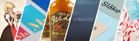
In a sea of similar items, how do you make your product packaging stand out? One of our favorite ways is by complicating it a little with 2016’s coolest packaging trend. Designers are imbuing their designs with texture, giving packaging a tactile quality that drives shoppers to grab them off the shelf.
A great way to accomplish this tactility is by adding a pattern to your package. A play off of color and shape that gives a little hint as to what’s inside, or tells a story without using words. Designers have been doing this for ages, but if you pay close attention, you’ll notice that the kinds of aesthetic stories they tell change from year to year.
Here are five different ways for you to work with the hottest 2016 packaging trend – using patterns to create textural design and to stand out from the crowd:...
See what the design world will look like this year with Shutterstock’s latest infographic.Global TrendsThe top four trends making an impact around the world.
What better time to kick off a fun community contest than right before the Academy Awards?! This time around, we turned to our designer community to reimagine the 2016 Oscars movie posters for the 8 “Best Picture” nominees, drawing inspiration from the minimal movie poster trend.
The results were great – and Mad Max and The Martian were definite favorites. Check out the winners and some of the highlights below!...
UP UNTIL A few years ago, most books in the public domain were lacking. Not lacking in words, which hadn’t changed, but lacking in style, lacking in design, lacking, mostly, in the emotional bond many readers forge when (sorry!) they judge a book by its cover. Most of the classics found on Project Gutenberg didn’t have a cover, and those that did tended to have a scanned, grainy image from a long time ago. “It might technically be available, but if it is, it’s ugly and poor quality,” Jennifer 8. Lee, a co-founder of digital literary studio Plympton, says of the covers on many public domain texts.
It feels wrong to complain about something that’s free, but without a cover, a book, though certainly still a book, is just a bit less gripping. Two years ago, Lee and her collaborators at Plympton were redesigning the website for DailyLit, which aims to get people to read small chunks of fiction daily. They figured they’d use books from Project Gutenberg, the volunteer effort to digitize and archive classic works in the public domain. Then they saw what they were working with. Lee considered commissioning new covers. “It was prohibitively expensive,” she says. Then she recalled a conversation she had with Creative Action Network, a startup aimed at crowdsourcing artwork to support artists and social causes. (Remember Design for Obama? That was them.)...
It is natural to look at brilliant designs by Paul Rand, Saul Bass or David Carson and to want to create designs like that – or even to want to be as great as them. This inspiration is what has reeled many of us into the field of graphic design. For some, it leads nowhere. For others, it unearths a true passion for design and occasionally it brings a brilliant designer into the limelight.
Inevitably, greatness is a status that occasionally churns in the back of a graphic designer’s subconscious. This article brings the concept of greatness to the forefront and breaks it down by looking at commonalities between the all time great graphic designers; both in talent and fame. This list is a good starting point for anyone questioning their status in graphic design....
As we prepare for another exciting year of design, let’s take a look back at some of the best 2015 content from The Creative Edge…
There were trends that carved a quite niche for themselves such as responsiveness, mobile-friendliness, animations; others that matured such as flat style or scrolling effects; a few that remained unchanged like hamburger menu button or one-pages; and those that took the web by storm and quickly passed like dynamic patterns.
The year certainly supplied creative folks with a fertile environment where one can easily go wild. Although it is challenging to trace every key moment, however, we can demonstrate the overall picture through a collection of ingenious and exclusive projects.
We are going to dive into the best web designs of 2015 that were highly and justly rewarded by Designmodo team. Here’s what we have for you....
There’s no reason for your designs to look drab – especially when it comes to color. A quick glance online and you’ll find a stockpile of color scheme apps ready to help you learn, play and perfect your next palette.From clever Hex code games to comprehensive color wheels, here are 15 of our favorite free color scheme apps to take your designs to the next level....
These are the prettiest free minimalist fonts you will ever want to use in order to create super-clean, gorgeous designs!
Whether you want to use them for prints or logos, or want to add them to a website, these minimalist fonts are very versatile and can be used in pretty much any kind of design.
The trend of minimal design is here to stay, which is why minimalist fonts are so popular among designers. With the overwhelming use of mobile devices, and the increasing emphasis of search engines on website speed and usable, users are now looking for designs that are easy to use, without any over the top effects or graphics.
The 25 free minimalist fonts showcased here in this list include both free serif fonts and free sans serif fonts. They have clean shapes, unique details and will make your designs pop out if you decide to use them!...
Undoubtedly, Adobe Creative Cloud is still the best choice for working with visuals and doing advanced design work. But creating great visuals no longer requires you to be a graphic design professional. Even if you don’t have the skills, you can use a variety of free web-based visual tools for designing eye-popping graphics directly in your browser. In this blog post, you’ll find six of the top free visual tools that you can use for your online project.Which visual tools do you use?...
Presenting the recipients of Best In Class, a special award to commend the most impressive sites in each of the WOTY 2015 award categories.
|


![Design School's Ultimate Guide to Designing With Backgrounds [With Ready-to-Use Templates] | Public Relations & Social Marketing Insight | Scoop.it](https://img.scoop.it/eUy0foC9bWwH53Mpp35bKjl72eJkfbmt4t8yenImKBVvK0kTmF0xjctABnaLJIm9)


Blogging or designing visuals? Learn these background design tips to make your message pop.