 Your new post is loading...
It’s design vocabulary time! We know you’ve heard these two terms floating around: skeuomorphism and flat design. What do they mean? They’re two contemporary designs trends that each have their own unique style and set of traits. Skeuomorphism creates a sense of familiarity by emulating materials, while flat design stays true to its medium, often feeling minimal and utilitarian. These opposing styles create a major fork in the road for designers (especially those in UI design), and many projects begin with the question of which world to jump into. Luckily, we’re here to help answer that question with an in-depth look at each design style. We’ll also explore Google’s all-new design language, Material Design, which combines the aesthetic of both skeuomorphism and flat design....
For the early part of this century we saw a lot of colorful artwork in the shape of icons and vibrant mascots. Heavily shaded, three-dimensional characters, and richly rendered forms were all the rage. Now, illustration is heading for a more authentic and organic experience. Low-color, hand-drawn looks that are specifically created for a single-site use are becoming more common and are expected to stick around. Custom designs will more often take on a unique, loose and even childish feel. Websites will feel more personable compared to the copy and paste looks we have been seeing thanks to the prevailing flat design/minimalism bandwagon....
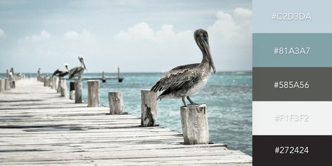
One of the keys to making your design come alive is choosing just the right color combination. Whether you’re attempting to evoke the feelings associated with a breathtaking landscape, a romantic sunset or a dynamic scene bursting with color, it takes a trained eye to bring together the perfect hues to drive your message home. To save you some time and effort in your search for the ideal color combination, we’ve created a list of beautiful color schemes you can use in any of your projects. These color presets are already available for you within Visme, so you can easily apply them to any of your own designs by simply clicking on the color combination of your choice, as seen below....
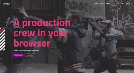
Why do you want to create a site? Is it to deliver good looking visuals to your visitors? No! The objective is to drive conversions, generate sales, improve brand visibility and ensure your business reaches a wider audience. Unfortunately, an unnecessary focus on visuals might see you creating a site that is low on ROI. Your target website visitors are interested in getting more information about your business and its products and services from your site. If great visuals help drive brand and business messaging forward, well and good and that should be their primary objective. If they haven’t been picked keeping the website’s goal in mind, they will just serve to distract visitors. Here are two sites that have made great use of visuals, and they serve to illustrate the purpose of the site. The visuals are arresting but do not distract visitors from what the website is all about and the products/services it is bringing to them....
Minimalism is one of the most dominating styles of today- right from architecture, to design, to literature. It is a style used in almost every other form of art. People often confuse minimalism with absence of detail. Minimalism is certainly not a grand style, but it is also not an absence of detail or design either. Minimalists just focus on how much of useless content can be stripped away from an item without losing its key purpose and identity. Minimalism is simple in form and function, devoid of pointless decorations, yet lavish. What exactly do we understand from Minimalist design? The simplicity of minimalist web design may seem too simple, but it is under the surface that the real content lies. Don’t think minimalism is easier just because it is simple. It gets even more difficult because with fewer elements you still need to provide the same usage with less interface. The less-is-more attitude was first applied in architecture and then slowly moved on to other industries like- interior design, industrial design, and now web design. The basic idea was to eradicate any element that didn’t really contribute to the main purpose or function. 6 Elements to Consider in Minimalist Web Design...
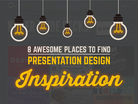
The best designers in the world are not only known for their amazing designs, but also for their inspirational and motivational quotes about design.
Many of the lessons they teach can, unsurprisingly, be directly related to PowerPoint design!
If you need some inspiration and guidance for your next PowerPoint presentation, look no further:
We have compiled a list of 20 of the BEST inspirational quotes about design that relate directly to PowerPoint.
After each designer’s quote, we’ve given a short explanation of how it relates to your presentation, and what you can do to make it amazing....
The layout of a responsive website is designed in such a way so that it becomes sensitive to the screen size of the device, which is used for accessing it. In the present time most of the websites are not responsive. But the pace at which the number of mobile users is increasing, it is high time for the entrepreneurs or the webmaster to upgrade their site and make it responsive. This is especially applicable for the owners of the ecommerce sites as it will definitely impact the conversion rate of their site. There are many ways with the application of which a website can be made responsive. A skilled and knowledgeable web designer can accomplish the task with ease and efficacy if he or she is aware of the technique. We have collected 30+ responsive websites from the internet which is going to be of great help for the designers. These examples will help the designers to draw valuable inspiration as far as the style and layout of the website is concerned....
Are you including images in your social media content? Looking for easy-to-use tools to help you create images for your content strategy? If the idea of using Photoshop makes your head spin or hiring a graphic designer isn’t an option, there are many easy-to-use, low-cost alternatives available to you to create social media graphics. In this article, I’ll show you 6 easy tools that will help you create compelling graphics for social media.
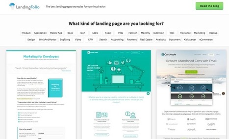
LandingFolio offers an organized collection of landing page screenshots that can be used for design inspiration. For each landing page there is a full page screenshot, assigned to one or more categories and the possibility to comment below it. That's it. My comment: Excellent design and marketing resource to find ideas, solutions and alternative approaches to the creation of an effective and professionally-looking landing page. Free to use. Try it out now: http://www.landingfolio.com/...
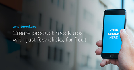
The best collection of free product mock-ups from the internet. Pick one, upload your design and download the final image ready for your projects. Smartmockups app - The easiest way to create stunning product screenshots without using Photoshop Premium mockups - More than 300 premium digital, print and screen mockups to choose from. Changeable backgrounds - Change the background color or add beautiful background gradients....
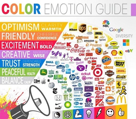
Color wields enormous sway over our attitudes and emotions. When our eyes take in a color, they communicate with a region of the brain known as the hypothalamus, which in turn sends a cascade of signals to the pituitary gland, on to the endocrine system, and then to the thyroid glands. The thyroid glands signal the release of hormones, which cause fluctuation in mood, emotion, and resulting behavior. Research from QuickSprout indicates that 90% of all product assessments have to do with color. “Color,” writes Neil Patel, is “85% of the reason you purchased a specific product.” It’s a no-brainer fact of any website that color affects conversions. Big time. So, the bottom line is: use the right colors, and you win....
According to Buffer, visual content is more than 40X more likely to get shared on social media than other types of content. And if you need any more evidence to convince you visuals are essential to your content marketing, just consider all these stats.
But honestly ... who's got time for all that? And I don't know about you, but I don't exactly have a degree in graphic design, or the budget to hire someone who does. So, what's a design-impaired marketer to do?
Luckily, over the past couple years, we've been on a mission at HubSpot to make visual content creation much less of an obstacle for the average marketer. How, you ask? Templates, my friends ... templates. And what's great about these templates is they're all built for software you probably already have on your computer: PowerPoint.
I'm going to walk you through all the visual content marketing templates we have available for free to download, and show you how we've used them ourselves to create awesome visuals right in PowerPoint....
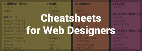
It doesn’t matter how many years of experience you have of a programming language, framework or CMS, you will always need to refer to the official documentation or, and more than likely, a handy quick reference cheatsheet, as it’s literally impossible to remember and know absolutely everything. In this post I have collected an avalanche of useful cheatsheets, references, guides, checklists and docs, covering almost all aspects of web design, that will not only help to improve your productivity, but will also help to solve some of those frustrating programming issues that often arise (I’m looking at you PHP!).Just click on the ‘view’ button beside each resource and either save the PDF or bookmark the page....
|
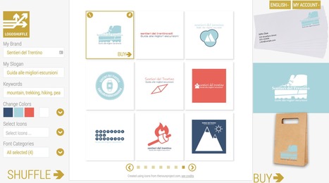
Logoshuffle is a powerful automated logo builder which allows anyone to generate infinite alternative logo designs customized to your preferred brand name, tagline, font and color scheme. Once you have input your brand name, tagline and preferred color scheme Logoshuffle displays nine alternative designs. You can request additional sets by simply clicking on the Shuffle button. Designs that suit you can be saved and kept until you decide which one to buy.Icons are outsourced and licensed from the NounProjec. Pricing: free to use for generating new logo designs. You pay only to download the final high quality version. A 400x400 .PNG version of the final logo you have created costs $29....
When it comes down to it, design is all about making choices. Each color, shape, line, font, text, and graphic you use will ultimately influence the message you're trying to get across.
I’ve often been in conversations with people who know they should get better at design, but they don’t feel they have a “natural sense” for creativity. However, I argue that learning to design well has as much to do with psychology and user behavior as it does creativity.
But learning the "psychology of design" doesn’t mean picking up a playbook that'll tell you the right and wrong way to design something. That's just not the way it works.
What brushing up on psychological principles (as they relate to design) will do is help you understand what goes into the creation of intuitive, intentional design experiences.
Want to learn more? We'll dive into a handful of psychological principles below to help you get the wheels turning....
If you look at how product pages take shape across different companies, it's clear that they run the gamut. Some go for the direct approach, displaying an image of a product and explaining why someone should buy it. Other companies create elaborate pages with moving parts and fancy coded elements. Of course, some companies fare better than others at creating delightful product pages. But since we prefer to focus on the positive, we scouted out 14 examples that we find truly admirable. From messaging, to value propositions, to general product promotions, these brands nail these features in a persona-friendly way....
Snappa makes it easy to create any type of online graphic. Create & publish images for social media, content marketing, and more! Hundreds of ready made templates Don't want to design from scratch? No problem! Just choose from our growing collection of beautiful templates to get started in seconds. Everything you need to create stunning graphics Snappa combines the best visual assets with a fully-featured graphic editor....
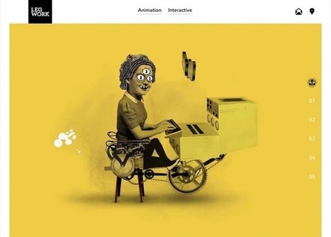
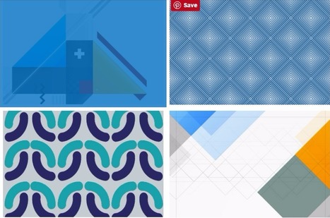
Some trends last for ages while others are cyclical, but whether classic or fleeting, design trends are both inspiring and incredibly useful when it comes to your graphics work. So what’s been hot in 2016? The five styles that have dominated the year so far are outlined here to help you develop eye-catching and relevant concepts, while still staying true your unique creative vision.
We rounded up visual examples of each design trend using royalty-free stock graphics, which you can easily incorporate into your own projects. Here’s the breakdown....
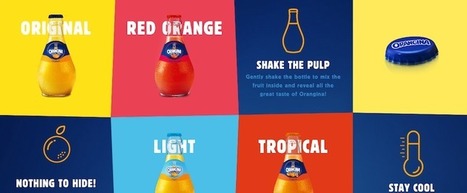
So what is product packaging? It’s a practical tool, yes. (I mean, how else are you going to effectively get beer into your mouth?) But it’s also more than that. Like any good design, packaging tells a story. It’s also a sensual experience, literally engaging us through sight, touch and sound (and possibly smell and taste, depending on the product/package). All of these details help us understand what the enclosed product is for, how it should be used, who should use it and, maybe most importantly, if we should buy a product or not. In the Ultimate Guide to Product Packaging Design we look at how to get your packaging to tell the story you want....
A lot of these lists just cram everything and anything into the lineup. So, we decided to pick our designers’ brains to bring you the best resources that we are using on a daily basis.
The psychology of color as it relates to persuasion is one of the most interesting — and most controversial — aspects of marketing. At Help Scout we believe the problem has always been depth of analysis. Color theory is a topic of complexity and nuance, but splashy infographics rarely go beyond See ‘n Say levels of coverage. Green Lantern can’t turn lemons into lemonade and I’m left equally unequipped to make smart decisions about the spectrum which shades our world. But why is such a potentially colorful conversation so unwaveringly shallow?...
PngImg.com is a large collection of high-quality images of object cutouts on transparent backgrounds ready to be downloaded and used in your next project. You can easily search for the subject you are looking for and select from the image results your favorite ones for immediate download. No registration or login is required. 100% free. N.B.: From the notes in the about page of the site it appears as if some of the images contained in this catalog may have been simply copied from other sources without securing permissions for re-use. Be warned. My comment: Very useful resource for finding image cutouts of objects that can be integrated in existing layouts or photographs thanks to their having a trasparent background. Try it out: http://pngimg.com...
Why typography? Turns out that while the importance of typography is often overlooked, it plays a critical role in strengthening your brand, creating interest in your product, and highlighting your central message. Knowing that, I decided to sign up for a typography course at the Massachusetts College of Art and Design. Couldn't hurt to learn how to identify a good font from a bad one, right? I learned a lot more than that. I realized that paying attention to even the littlest details of type can make all the difference in the world when you're laying out an email, ebook, or image for social media. This is why I wanted to write this post: to share the most important learnings and resources with my fellow marketers. ...
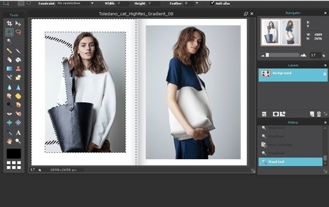
Whether you are a web designer, a marketer or a just an owner of a small business you know what it’s like to be dealing with images on a daily basis. Now, making the background white or transparent (in case you want to use your image layered elsewhere and believe me you will), may seem a bit complicated for those of us coming from the nondesign background. Well, I’ve got good news for you! It doesn’t need to be! Today we’ve got plenty of both online and offline options that will let you do anything with your backgrounds without any knowledge of specialized software such as Photoshop or GIMP. The following tools can be a great alternative, won’t cost you a penny and you’ll be surprised just how easy it can be to edit backgrounds. Afterall, do you really think all these bloggers spend hours learning how to edit their visuals? Nope, they’ve got a couple of tricks up their sleeves and so can you. So, let’s explore that creative zen!...
Except for those who are battling with a crappy connection, the internet moves really fast. Trends will always come and go, but they change at a particularly quick pace on the web. With evolving consumer demands, constant innovation, and the rapid exchange of ideas, the web never sleeps, never stops changing, never stops growing. And yet, despite the limitless possibilities and perpetual transformations, there are some trends in digital design that maintain great staying power. Certain elements of design are timeless and transcend all mediums, with the web being no exception. And one of the neat paradoxes where the internet meets design is that growing expertise and capabilities on the web need not call for greater intricacy or complexity in design. Often innovation is as simple as simplicity itself.In the vast, equalizing space that is the web, great design is accessible to all....
|


Design ideas: Skeuomorphism creates a sense of familiarity by emulating materials, while flat design stays true to its medium, often feeling minimal and utilitarian.