 Your new post is loading...
PngImg.com is a large collection of high-quality images of object cutouts on transparent backgrounds ready to be downloaded and used in your next project. You can easily search for the subject you are looking for and select from the image results your favorite ones for immediate download. No registration or login is required. 100% free. N.B.: From the notes in the about page of the site it appears as if some of the images contained in this catalog may have been simply copied from other sources without securing permissions for re-use. Be warned. My comment: Very useful resource for finding image cutouts of objects that can be integrated in existing layouts or photographs thanks to their having a trasparent background. Try it out: http://pngimg.com...
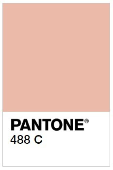
When market research firm Gfk was hired by the Australian government to consider how cigarette packs could be designed to prevent smoking, the firm came up with a colorful solution: Make the packs as unappealing as possible by wrapping them in an earthy "dark brown," or what would be matched to Pantone color 448C. The color was found least appealing to prospective cigarette buyers in tests, and it has since been proclaimed "the world’s ugliest color" by the blogosphere. But in the interest of fairness to all colors, we talked to designers Milton Glaser and Debbie Millman, along with Pantone VP Laurie Pressman, to get their professional take on this cancerous, baby poop, lung brown....
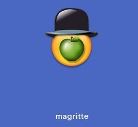
There's a lot of study about how the prevalence of emojis are changing the way we communicate. Linguists debate what we gain versus what we lose when we express sadness by texting a crying face rather than saying, "I'll miss you." But emojis aren't just about communication—they can be art, too. That's the premise of a fun little campaign from Cantor Fine Art gallery in Hollywood, anyway, which for the past couple of weeks has been using its Instagram account to share emoji-fied versions of the world's greatest artists and their work—from Magritte's Son of Man to Vincent van Gogh to Georgia O'Keeffe's skulls to Keith Haring to Jackson Pollack. The breadth of the project is a big part of the fun (Damien Hirst works surprisingly well as an emoji!), but the campaign's faithfulness to both the artists and the emojis is what really elevates the project. Emojis are a part of our culture and how we communicate now, for better or for worse, and while seeing a cute lil' Andy Warhol in sunglasses sipping from his can of Campbell's Soup is a fun gag, it does also raise the question of what a pop culture-obsessed figure like Warhol would make of this contemporary visual language. That's a fair bit of heavy lifting for a quirky campaign intended to draw attention to a fine art gallery in Los Angeles whose current show is called "Please Touch the Art," and it's the least pretentious way possible to get us thinking in those terms....
Typeface selection plays a critical role in the readability of your content. Although it may be one of the overlooked aspects when it comes to designing websites. One of the main finding of Nielsen Norman Group Eye-tracking Study of Web Readers was “Text Attracts Attention Before Graphics”. The study revealed:
“Of users’ first three eye-fixations on a page, only 22% were on graphics; 78% were on text”.
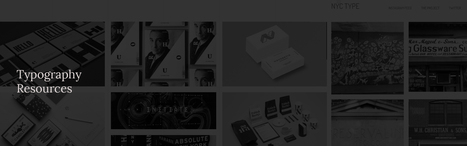
As a web designer, you need to pay more attention to typography.To make your design more effective and impactful we have compiled a huge list of typography tools and resources available on the Internet. If you are serious about web design and want to improve your skills, Take time to work your way through this resources.…
Light colors are easy on the eye, which means that they aren’t as likely to take attention away from the main goal or goals of a site. Negative space, on the other hand, makes websites look less cluttered and easier to navigate. Even though negative space can actually be filled with any color, white is typically the safest bet. For example, a brand like Best Buy is associated with the colors blue and yellow, but the company primarily uses these colors in the navigation menu of its site, which leaves plenty of whitespace to help guide visitors' eyes to calls-to-action (CTAs) like "Shop" and "Find out more."
Some brands, however, are okay with challenging the rules of Web design and are doing so with colorful designs that are pushing the best-practice boundaries. Although colorful designs are certainly not for everyone, they can be successful when they are executed correctly and used for the right brand. For some inspiration, check out the six colorful websites featured below...
Color blocking is nothing new. It’s long been designers’ go-to trick for chopping up large pieces of content, crafting call-outs and adding visual interest to an otherwise plain page. But in today’s design world, color blocking has evolved into a stunning minimalist trend that’s a perfect fit for spring.
Gone are the convoluted colors and clunky squares that too often transform quality design into an eyesore. Now it’s all about airy white space, pastel hues and clean lines. The results are beautiful and soft, confident and more modern – ideal for boutiques, chic websites and stylish brochures.
Curious how to put this update into action? We’ve gathered 18 inspiring designs from 99designs and beyond that prove how compelling this contemporary style can be....
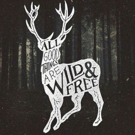
Picture quotes are one of the most pinned images on Pinterest.
The more visually striking your picture and quote combination is, the more shareable it will be. People can use them on social media, turn them into printable wall quotes, or download them as desktop wallpaper — that’s maximum visibility for you or your brand.
So whether you want to take your graphics to the next level or create your own for the first time, let’s go through some ways you can do the same for your quotes using some of the most eye-catching examples on the web....
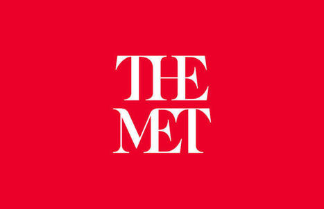
Three weeks ago the Metropolitan Museum of Art—known colloquially and now formally as "the Met"—unveiled a new logo and identity system designed by the international firm Wolff Olins. The response from critics was swift and fierce. Influential typographer Erik Spiekermann harped on the logo's proportions and "forced curvy shapes"; New York Times critic Michael Kimmelman accused the museum of pandering to younger audiences; and Justin Davidson, of New York magazine, compared it to a typographic bus crash. Ouch.
It’s a familiar scenario with logo and identity reveals—the images get passed around the Internet, critics weigh in, and the peanut gallery follows. Such was the case with Google, Airbnb, Hillary Clinton's campaign logo, the Olympics, and the rebrand that (arguably) sparked incendiary "logogate" culture: Gap.
Enter the rise of microsites. Unlike regular websites, microsites tend to be rather simplistic and easier to navigate. This isn't to say they won't make you want to poke around for a while, though. In fact, the really great ones do just that. Ready to see a few use cases? Check out the list below for some great examples of microsites in action....
Collages uses diverse imagery and styles to produce a beautiful image layout.
They’re often related to scrapbooks but they also find a lot of purpose in different spheres of web and print design. And while moodboards and home-made albums are made by hand, the majority of today’s collages can be created with design softwares, like Canva.
Current trends in collage design has lead to the creation of new better tools for building compelling image compositions. This article will guide you though a series of print & digital collage types, classified into 10 main groups....
It’s not every year that we experience big changes. With such rapid growth in technology over the past few years, we’re sure that the big 2016 web design trends will focus on maturing and expanding on those developments.
Flat design will get more texture, “cinematic experiences” will become more common, and the use of JavaScript libraries will enable more experimentation. Growing popularity in WebGL and virtual reality are sure to transform websites as we know them, giving way to new and exciting interactive possibilities.
In this article, we’ll break down 11 of the biggest web design trends we’re expecting to see this year. So get comfortable and start reading – we have a lot to cover!...
As Buffer writes, over 90% of our assessment of a product is made on color alone, so it makes sense that color should be considered with care for every design decision, particularly on websites. Chances are, if we don’t like the color palette, we’re not going to stay on the site for very long.
To get you started on your own palette, we’ve gathered 50 beautiful websites with versatile color schemes you can take inspiration from. So without further ado, let’s get knee-deep in some beautiful colors.
As more and more content continues to deluge the web, experts say that embracing a minimalist approach could help your website or app truly pop in 2016.
To this end, the rise of flat design -- or the use of two-dimensional figures and shapes -- will be a major design trend next year, according to printing company Coastal Creative.
Additionally, according to the company, background and full-screen videos can instantly elevate the perceived quality of a site -- especially as Internet speeds ramp up across the world and designers wise up to content that ornaments, but does not distract. For more design trends poised to typify 2016, check out the infographic below....
|
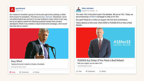
He might not have much chance of winning, and he may not command the same attention in the news cycle, but there's another hopeful in the 2016 presidential election besides Hilary Clinton and Donald Trump: libertarian Gary Johnson, a socially liberal, fiscal conservative whose campaign rests on the idea that he can bridge the divide between the left and the right. Unfortunately, the branding of the Johnson campaign wasn't getting that idea across, so as a fun exercise, the Florida-based branding agency Spark decided to mock up an identity for him.
Then things got weird. Without crediting Spark or paying for the work, a contractor for the Johnson campaign stole Spark's brand identity wholesale. To add insult to injury, the contractor didn't even steal the work correctly. The execution was so bad, Spark felt obliged to publicly release a style guide to its own pilfered work, in the hopes that the Johnson campaign would start using it right.
In a statement to Co.Design, the Johnson campaign acknowledged the screw-up. "At the senior level of the campaign, we were completely unaware until receiving a media inquiry Saturday evening that our website contractor had seen and clearly used the concept and design ideas posted on the web by Spark," said Joe Hunter, communications director for the Johnson campaign. "Upon seeing the obvious connection, we immediately contacted Spark and have since had a very constructive conversation with them—hopefully with no hard feelings. It was never our intent to use anyone's creative work, spec or otherwise, without giving appropriate credit, and we regret that our contractor apparently failed to communicate our desire to use Spark's work. It won't happen again, and we look forward to continued conversations with Spark about putting their excellent work to good use in the campaign."...
The Olympic Games typically choose only one poster to represent the host city—and for better and for worse, these posters tend to reflect the design aesthetic of their particular era.
Kobra, Pipas e Sonhos
But this year, a diverse group of 13 artists created a collection of official posters for the Rio games, meant to showcase the multitudinous array of people who call South America's largest country home. Asked to concoct images that represented Rio de Janiero, 12 Brazilian artists and 1 Colombian artist designed posters full of bright colors and emblems of the city. One depicts a child flying a geometric kite over one of the city's favelas, and another shows a muscular athlete running the Olympic torch across a Copacabana beach. Some take the Olympic rings or the ocean as their central motif, while others are more abstract.
"It's really hard for us in Brazil to choose one artist to represent the Olympic Games, or represent the official posters," Carla Camurati, director of culture for the Rio Olympics, told the Associated Press when the posters were unveiled in Rio last month. "The important thing for us and the Olympic Games is to show Brazil as it is, with the colors, with the brightness, with the beauty of the mixture of people that we have here; the mixture of roots that we have."...
Why typography? Turns out that while the importance of typography is often overlooked, it plays a critical role in strengthening your brand, creating interest in your product, and highlighting your central message. Knowing that, I decided to sign up for a typography course at the Massachusetts College of Art and Design. Couldn't hurt to learn how to identify a good font from a bad one, right? I learned a lot more than that. I realized that paying attention to even the littlest details of type can make all the difference in the world when you're laying out an email, ebook, or image for social media. This is why I wanted to write this post: to share the most important learnings and resources with my fellow marketers. ...
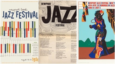
Today, music festivals number in the thousands, taking place around the globe and embracing all kinds of popular music. Here, we’ll look back at some of the biggest music festivals, from the mid 1950s to the present, and focus on an essential part of their culture: festival posters.
Indeed, from the very beginning, graphic design and (especially) festival posters have been an integral way to shape each festival’s unique brand and echo their creative spirit. It’s fascinating to look back and see how modern music festival poster design evolved from historical precedents. Let’s dive in....
Design trends change every year, and it seems like most of them get hyped up to the point that all the chatter actually hinders the acceptance on some of the trends. There comes a point where, as a web designer, you start to settle into your own personal preferences, and the idea of expanding outside your comfort zone seems costly and maybe even detrimental to your job security. The Awwwards Website Trends and Design recognition program is proof that the outliers are the ones that typically get recognition. Awards and big paychecks go to those who stretch the boundaries and try out new, brave and often even re-emerging designs concepts. You hear about new design trends just about every single year, but this time we wanted to cover some of the re-emerging trends, which have some use, but maybe not the adaptation that they deserve. Let’s have a look....
Are you looking for free, high-quality social media icons to bring your website, content or maybe even business cards to life?
Every individual and business has their own style and finding the perfect icon set to match can be tough – not to mention, very time-consuming.
In this post, we’ve collected 50+ social media icons sets to help save you some time and find the perfect set of icons – no matter what your style!...
Back in 2011, food research consulting firm Technomic released a report claiming nearly a quarter of all vodka consumed was flavored. Manufacturers took notice, and over the ensuing half-decade, liquor store shelves exploded. What was once considered a comparatively benign liquor now encompassed a diversity of flavors ranging from fruit-based to dessert-infused to abominations such as fresh-cut grass, tobacco, and sriracha. Pinnacle Vodka now boasts more than 40 “playful” varieties, up from 30 in 2013. My own local store carries five different types of coconut vodka alone. As one would expect, this trend spilled over into other categories of booze. Though lacking the insipidness of vodka, liquor producers found creative ways to appeal to the flavor-seeking niche. Jack Daniel’s introduced honey and cinnamon whiskies, Hoxton gave us iris-imbued gin, and just recently, tequila manufacturers debuted a host of flavored varieties....
Static marketing content is as outdated as print-only newspapers. Just as day-old newspapers become litter in the streets, static digital content is useless to the average reader. With such an inundation of static marketing content, one piece hardly stands out from others, meaning brands blend and ideas fade. Readers crave the dynamic nature of interactive digital content. An ion Interactive studymeasured the success and general feeling from marketers regarding interactive content. In terms of effectiveness, 93% of marketers say interactive media is great at educating buyers; 88% say it’s effective at differentiating brands, whereas static was found to be only 55% effective. Not convinced yet? Did you know that interactive content also drives 2X more conversions than static content? Despite these numbers, many marketers shy away from interactive content. It might be because it has a reputation for being expensive and labor-intensive. But that is an unfair reputation. Creating interactive elements is, in fact, easy, fast and even free....
Web design thrives on two things: innovation and imitation.
Unfortunately, there's often a lot more of the latter. We all like to seize upon the latest trends, use them until they’re ubiquitous, and then look desperately for the next big thing. Think about sliders. They were all the rage a couple years ago. Today, they feel dated. What to do? Stop chasing microtrends, and start looking at the big picture. Here, we've isolated six web design ideas that are here to stay....
Just what separates a brand name in a standard, mass-distributed typeface from a bona fide logo? One of them is generic and basically worthless, while the other is (hopefully) an impactful, memorable, skillfully made, often very expensive work of design.In plainer terms, one of them is nothing, the other is something. Getting from point A to point B is one of the most common, difficult tasks that a graphic designer faces. How do you do it?
Helvetica offers the best possible lesson. Developed in 1957 by Swiss type designers Max Miedinger and Eduard Hoffmann, Helvetica is such a versatile typeface that it is virtually everywhere—logo designs included....
Design, meet the internet.
Finally you can do design work online,
the way it should have been all along.
- Simultaneous editing
- Version control
- Cross-platform.
On the same page. It takes a team to ship a product. Since your files are online, work together like never before....
UP UNTIL A few years ago, most books in the public domain were lacking. Not lacking in words, which hadn’t changed, but lacking in style, lacking in design, lacking, mostly, in the emotional bond many readers forge when (sorry!) they judge a book by its cover. Most of the classics found on Project Gutenberg didn’t have a cover, and those that did tended to have a scanned, grainy image from a long time ago. “It might technically be available, but if it is, it’s ugly and poor quality,” Jennifer 8. Lee, a co-founder of digital literary studio Plympton, says of the covers on many public domain texts.
It feels wrong to complain about something that’s free, but without a cover, a book, though certainly still a book, is just a bit less gripping. Two years ago, Lee and her collaborators at Plympton were redesigning the website for DailyLit, which aims to get people to read small chunks of fiction daily. They figured they’d use books from Project Gutenberg, the volunteer effort to digitize and archive classic works in the public domain. Then they saw what they were working with. Lee considered commissioning new covers. “It was prohibitively expensive,” she says. Then she recalled a conversation she had with Creative Action Network, a startup aimed at crowdsourcing artwork to support artists and social causes. (Remember Design for Obama? That was them.)...
|


On this site you can download free PNG images, pictures and cliparts for design and web design in best resolution and quality. Highly recommended. 9.5/10