 Your new post is loading...
 Your new post is loading...
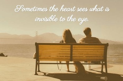
Share As Image is a Chrome extension and bookmarklet tool that you take with you from site to site. It lets you instantly turn text into an image! When you find something interesting, highlight it, click the bookmarklet and get ready to share!
A whole new way to share content.
Microcontent is where it's at. With Share As Image, you have a whole new way of instantly creating highly shareable content as an image....
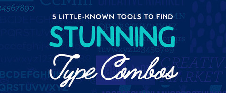
Do you want to master successful graphic design? If so, you can't just focus on finding the right images and colors to use. In reality, one of the most important parts of effective design is ensuring that you find the right combination of fonts to use together. Using multiple fonts in one design is often essential, but it can also be challenging.
To marry typography in a design, you need to find fonts that work in harmony without looking too similar; fonts that offer contrast without fighting for the reader's eye. Most importantly, you want to find fonts that don't clash in some way that the other fonts look awkward. In order to find type combinations that pair well together, try out the useful tools below....
And one of the easiest palettes to use (and hardest to mess up) is a monochromatic one. Although mono does mean “one,” this approach to color isn’t just using the same single shade in multiple places in your design. Instead, you can create a monochromatic color palette by choosing one base color (traditionally one of the 12 on the color wheel) plus any number of variations of that base.
What type of variations? Let’s look at our options: - Shades: the base color darkened with black. - Tones: the base color dulled (or desaturated) with gray. - Tints: the base color lightened with white...
When you are browsing different social media platforms – Facebook, Twitter, LinkedIn, you are likely to see images with text on them – these can be inspirational, informative, or just plain fun. Having your message on a colourful image will catch your customer’s eye more effectively than just using text alone.
However, if you are a small business owner, you probably don’t have the budget to hire a a graphic designer. Luckily, there are plenty of options on the market today to help you create the graphic yourself for minimal time and effort....
So, it’s safe to say that composition is pretty important. So, what exactly is a composition? Well, in very simple terms, it’s the part where all the separate elements come together to form a whole. When all of your type, your images, your graphics and colors, come together to form one cohesive design.
A successful composition means that you have arranged, distributed, aligned and compiled your design in a way that not only looks good but is also highly functional and effective. So, let’s run over a few tips, tricks and techniques that will have you mastering composition in no time....
If you are looking for inspiration to make your sign up and login forms a breeze to fill in, in this post, i’d like to present a couple of new ideas that might be useful for your next designs.
We’ve all received brochures from various businesses and most of the time they all have one thing in common — they’re boring.
Whether they’re packed with so much information you feel like you’re about to read a full length novel, or so plain you feel like you’re sitting in the dentist’s office, brochures tend to get a bad rap. They may be chock full of important stuff, but unless you can get someone to pick it up and read it, it doesn’t matter how great the content inside is.
Here are 25 ways to step up your brochure design game and ensure your information will be shared....
Alright, for the sake of those who feel uncomfortable around negativity, you’ll be happy to know that negative space is also known as ‘white space’.
Is that better? Okay, let’s continue.
Note that just because it’s called negative space it’s not necessarily black. Similarly, it’s not always white just because it’s referred to as white space. Negative space or white space is the open or empty space left around any object. Consider it as the breathing room that you leave around every piece of image or text on your design. This dictates how crowded or how light your overall design looks....
How do you create good design? The difference between success and failure is often as simple as having the right resources. We’ve rounded up 26 of our favorites, from Photoshop plugins, to UI elements, free imagery and mockup graphics.Use these tools to work smarter, faster and create good things along the way....
We’ve all heard it before … a picture is worth a thousand words.Why? Images have a powerful effect on our mental faculties. In fact, a recent MIT study found out that our brains process images that our eyes see in as little as 13 seconds. In other words, the human brain processes images 60,000 times faster than it does text on a page.
According to the study, “while the images are seen for only 13 milliseconds … part of the brain continues to process those images for longer than that.”Images are not just eye-candy, they help us make decisions. Today’s post is going to help you figure out what type of landing page images work best at persuading customers to click your call-to-action button.
First let’s see what you can accomplish with your landing page images....
Black and white can seem like a very inflexible palette, but believe me when I say, it’s actually quite the opposite. In fact, black and white is incredible versatile, easy to use, and effective as anything!In this list we’ll look at 50 stunning monochromatic designs and hopefully you’ll quickly begin to notice how flexible this small palette really is, and just how easy it is for you to kickstart your own black and white designs. So, let’s get started....
Light and shadow can add qualities like depth, dimension, perspective, realism, and visual interest to your designs. This can simultaneously draw viewers into your design and make it seem to pop off the page or screen.
But…it’s easy to get carried away. Overdoing effects is a no-fail way to make an otherwise good design look amateurish and tacky.
To sum up, the secret to using light and shadow in a smart way involves keeping two things in mind: purpose and subtlety. First, make sure any effect you’re using has a specific, practical purpose and makes sense for your project; then, take a “less is more” approach to applying it to your design. If you’re using an effect that came with your design program, the default settings are always more dramatic than realistic (particularly for shadows); don’t rely on them, you’ll likely want to make them softer, lighter, and more subtle....
So what’s the secret to designing with contrast in a way that will enhance your project? Unfortunately, there’s no magic formula. The process often starts to happen subconsciously as you build your design skills. If you’re thinking that this sounds like some mysterious skill that designers are keeping to themselves, don’t give up yet. Contrast is a design tool that anyone can use to organize and add visual interest to their design projects, so keep reading to find out how....
|
How many times you have struggled with the ideas. How to do that or that, how to finish this design or illustration? For me, it happens a lot and I think is normal. Time to time designers face this “black” interim. I’m not saying that you need steal other ideas or designs, but you need to check how the professionals are doing things, it will let you step out of your zone and make something better.
I have collected 15 websites which are covering everything you need, from web design and illustration to furniture design and app design. I hope all these websites will inspire you and will help you to finish your ideas faster and better....
The home page and header are two of the most common things that designers tend to focus on the most when it comes to constructing a website. As a result, the footer generally becomes more of an afterthought, practically becoming the prime location for content such as disclaimers, copyright information, etc.However, the footer does not always have to be this way, nor should it ever be. In fact, the footer is just as much important as the header is, perhaps even more so. This is because the footer serves as the last “port of call” for many of your website’s visitors....
As an owner of a blog, you need to have engaging, relevant and updated content that satisfy the needs of your readers. There are several ways through which a blog owner can make sure that there is enough and more content on his or her blog at any given time.
The most invincible pillar and pinnacle in any online business are therefore the creation and writing of content which is engaging to the readers that visit your blog. There are several ways in which you can create more content for your blog to make sure that you achieve your desired goals of online business.
Do you want to make your infographics iconic? Okay, so we don’t mean “iconic” in the usual sense. We mean using icons in your infographic design. Icons are those little illustrative graphic images/clip art that represent an object, action or idea. They are often stylized and simplified designs. N
Using icons can make your infographic design more cohesive and more professional. With Venngage you can choose from over 10,000 icons in our icon library and stylize them to your preference by editing their colors, sizes and positions. Here are some tips for how to use icons in your infographics....
If you pay attention to web and graphic design styles, you may have noticed that this has been something of a trend in recent years. You might see blurred images popping up in website hero headers (the large images that extend the whole width of a page) or as site backgrounds, or to set off typography in graphic design.
But the design trends that stick around, like this one, usually do because they’re functional as well as beautiful — they have a purpose beyond just following the crowd or experimenting with a new look just because you can. Good trends do something to improve your designs.
So how can you use blurred images to enhance your own designs? Let’s look at 10 techniques....
No matter what your specialism, there's bound to be a tool that's of interest on this month's list. Designing iOS icons? There's a superb gallery of designs to help you get a handle on what's already out there. Frustrated with your clunky version control 'system'? Folio is a slick new app that can help with that.There's also a new inspiration site...
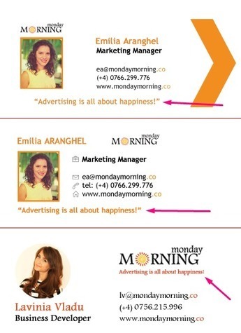
If you are not a design clinched person, email signature can easily give you an elegant hint of style without huge efforts.
Now, you decided that “Regards, Dave” isn’t working for you, or for your business any more.
Here are some tips you’ll need to consider while making an email signature that works....
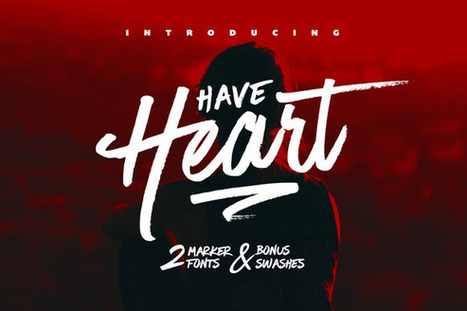
Futuristic fonts are only applicable to certain types of projects. These designs often require an ultra-hip, ultramodern, revolutionary-themed appearance. These fonts have an edge. They are stimulating and can even be sexy. Futuristic fonts are often used on graphics promoting big entertainment events like a concert.
These kind of fonts are also the go-to typefaces for projects with a futuristic feel or persona. Take the Black Eyed Peas for instance. The group has adopted this avant-garde, modernistic character on their songs, videos and outfits. It only follows that the font they use on their concert posters and album covers is part of the futuristic font family. Music duo Daft Punk also embraces this identity. And so when you check out the duo’s website, you’ll instantly be presented with a variety of futuristic fonts as part of the site’s overall design...
These fonts have been used by various designers in Headlines, Headings, print design etc. The versatility of these fonts is of immense importance. Thereby, our today’s post is not a mere help to any single category but will be able to curb the demands of our several visitors.
We have gathered all sorts of different fonts. The variety of fonts being shared will be used in different projects like in posters, websites, and other print designs etc. Lots of time will be retained for other task, as all the desired fonts are in our list. Try these fonts and accomplish your project successfully....
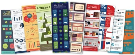
Infographics are a powerful tool for capturing the attention of your target audiences. In fact, businesses that publish infographics grow their traffic an average of 12% more than those that don't.
The hard part, of course, is finding the time and resources to create these infographics.That's why we've created ten fully customizable infographic templates that will give you the inspiration and foundation you need to build your own infographics right in PowerPoint....
There is a great need for web and graphic designers to work under a lot of pressure and meet tight deadlines. In such cases, these tools come in handy, reducing much of their production time. Moreover, these tools also allow designing complex graphics with ease. User interface (UI) designers also require a lot of these graphic tools for meeting their design objectives.
Today, there are a lot of web-based applications that allows designing graphics for web and print media. So, here I am presenting you with a list of some unique and popular graphic tools which designers can use in various contexts. Alright, so check out the list of 12 Graphic Tools Designers can really use....
Inspiring Sites of the Week is the weekly series where we feature the latest and hottest websites targeting the design world from around the globe. If it’s creative, unusual, has great functionality and is built using cutting-edge technology we feature them here. Get inspired by the best designs in the industry in the hundred and fifth edition of the series.
|


 Your new post is loading...




![How To Design With Monochromatic Colors [With Expert Tips From A Designer] – Design School | Public Relations & Social Marketing Insight | Scoop.it](https://img.scoop.it/zXsjH9kCIWNkvGWEa4Xnyzl72eJkfbmt4t8yenImKBVvK0kTmF0xjctABnaLJIm9)





![10 Expert Tips for Designing With a Blurred Background [Case Studies] – Design School | Public Relations & Social Marketing Insight | Scoop.it](https://img.scoop.it/7i7z3gGNZU1UaIwpOJr04zl72eJkfbmt4t8yenImKBVvK0kTmF0xjctABnaLJIm9)




Cool tool Share as Image lets you quickly and creatively create images to share.