Public Relations & Social Marketing Insight
443.6K views | +2 today
Follow
Public Relations & Social Marketing Insight
Social marketing, PR insight & thought leadership - from The PR Coach
Curated by Jeff Domansky
Your new post is loading...
Scooped by Jeff Domansky
Scoop.it!

The 36 rules of social media | PR Daily

The 36 rules of social media | PR Daily | Public Relations & Social Marketing Insight | Scoop.it
Three months ago, Fast Company magazine asked its readers to share their guidelines on social media. It compiled the best into this infographic.


Wouldn’t it be nice to have a really easy guide to social media conduct?


I’m not talking about a detailed roadmap, but a list of principles to remind you (and your staff) how to behave on sites such as Twitter, Facebook, Tumblr, and so on.


Thankfully, Fast Company magazine compiled a close approximation to this list, when in August it asked readers to share their best practices for social media. The publication compiled 36 of them into this infographic...

No comment yet.
Scooped by Jeff Domansky
Scoop.it!

Infographic: Bond's Sex Scenes Breakdown - Who Was the Best Lover?

Infographic: Bond's Sex Scenes Breakdown - Who Was the Best Lover? | Public Relations & Social Marketing Insight | Scoop.it
Look up! Look down! Look out! It's 007! Ohh, this is a good one. It's not actually an infographic, rather it's the nymphographic.


[A little 50th anniversary James Bond fun ~ Jeff]

No comment yet.
Scooped by Jeff Domansky
Scoop.it!

Why Infographics Are Great for Marketing | Contently

Why Infographics Are Great for Marketing | Contently | Public Relations & Social Marketing Insight | Scoop.it
The mind filters out 99 percent of information, but infographics tend to stick.


How meta: An infographic on infographics! 


Neo Mammalian Studios has produced this infographic on how they are great marketing tools for businesses.


It’s full of fascinating facts. For example, it states that on average, a person is exposed to the equivalent of 174 newspapers filled with information daily, and that “99 percent of all sensory information is filtered out by the brain almost immediately.”


Infographics, apparently, help information get into that one percent that sticks.


According to Neo Mammalian, in a little more than two years, infographic search volumes on Google have increased by over 800 percent, and “publishers who use infographics grow in traffic an average of 12 percent more than those who don’t.”...


[Check note this infographic on infographics. Seriously. ~ Jeff]

No comment yet.
Scooped by Jeff Domansky
Scoop.it!

Bad Pitch Blog: The Evolution of the News Release: My #PRSAICON Infographic

Bad Pitch Blog: The Evolution of the News Release: My #PRSAICON Infographic | Public Relations & Social Marketing Insight | Scoop.it

Part of my presentation on media relations at #PRSAICON focuses on the news release paradox. It's seemingly got its own gravitational pull as one of the most mentioned tools in our industry. Yet it's little more than a simple format that hasn't changed much -- in more than a century.


Thousands of releases are distributed daily and we can't even agree upon what to call the format. And while releases haven't changed much, the use case for the news release has expanded beyond the media. It's just one of several changes I'll review before detailing how to turn this change into an opportunity.


Much Ado About Nothing?
Various, conflicting observations like the ones above have been compiled into the infographic below. Take a look, enjoy it and pass it around....


[Very interesting infographic on the news release, it's history and new presentation trends. Kevin Dugan's presentation to PRSA. ~ Jeff]

No comment yet.
Scooped by Jeff Domansky
Scoop.it!

Why B2B Marketers Should Use Infographics + An Infographic

Why B2B Marketers Should Use Infographics + An Infographic | Public Relations & Social Marketing Insight | Scoop.it
B2B marketing is becoming more competitive. Creating infographics is a great way to attract prospects to your website and build your inbound marketing program.


One of the great things about B2B marketing is there is endless potential for generating interesting content for your audience. Marketers have to constantly be aware of what the next big thing is and if that big thing is worth our time and money.


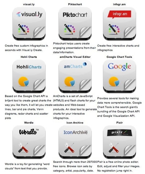
I think we can all agree that tools to help create cool and creative content is worth looking at, especially if that content format has proven successful time and time again.


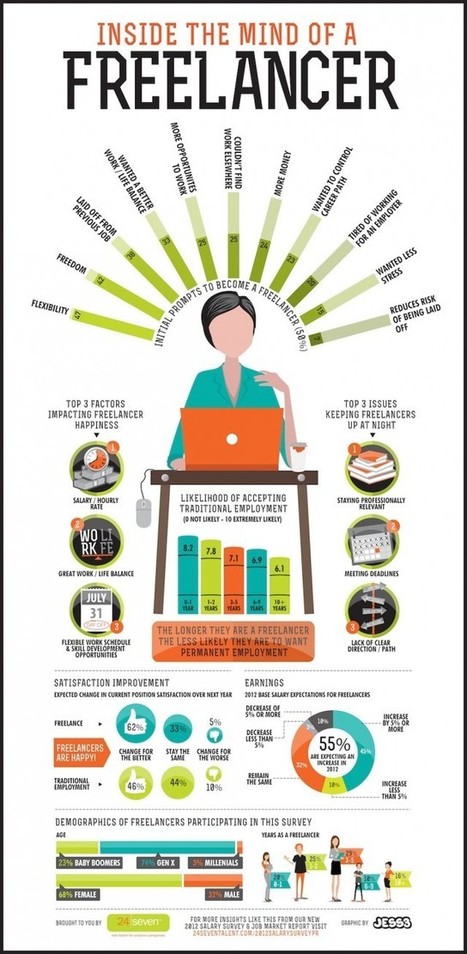
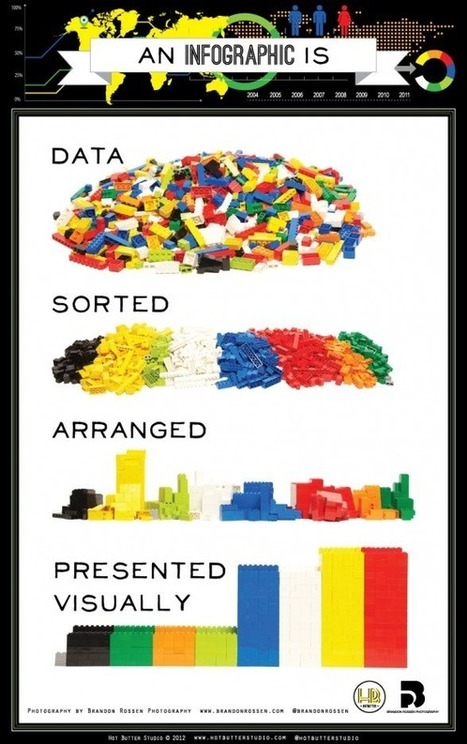
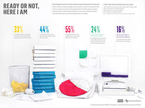
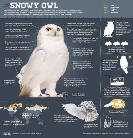
Ok, Rookie, what’s your point? Infographics is that new, interesting style to create and display your content. Information graphic or infographics are graphic, visual representations of information, data or knowledge. These particular graphics are popular because they present complex information quickly and clearly. And given that 65% of the population are visual learners (including myself), infographics can easily be successful.


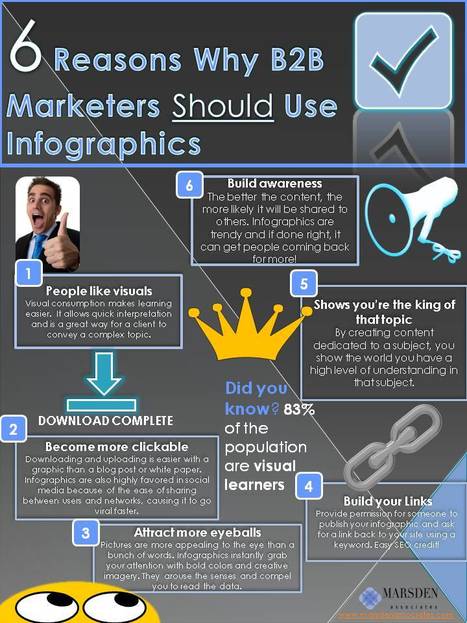
Here’s 6 reasons B2B marketers should use infographics:


1. People connect with visuals.

Visual consumption makes learning easier. In fact, the brain processes visual information 60,000x faster than text. Visuals allow quick interpretation. This would be great way for a client to convey a complex topic.


2. Easily shared.

Downloading and uploading is easier with a graphic than a blog post or white paper. Infographics are also highly favored in social media because of the ease of sharing between users and networks, causing it to go viral faster.


3. Attracts more attention.

Let’s face it, pictures are more appealing than something written. It’s content eye candy! The nature of an infographic is to instantly grab your attention with bold colors and creative imagery. These elements arouse the senses and encourage further reading of the text.


4. Great for link building.

Infographics are great ways to build links. Someone could publish your content and you could ask for a link back to your site with a particular keyword. Google will index your website higher and it will gain importance to search engines.


5. Shows an expert knowledge of a subject.

By creating content dedicated to a particular topic, you show the world you high level of understanding of that topic. You could be viewed as an expert in that topic.


6. Builds awareness and traffic.

Every marketer knows that content creation is important to build hype around your company. The better the content, the more likely it will be shared to others. Infographics are trendy and if done right, it can get people coming back for more!

Natalie Hodgkiss's curator insight, May 13, 2014 3:07 PM

The strength of this infographic is its simple, easy to look at design with clean lines. The weakness of this visualized article, however, is that it presents the information in a circular format which I personally don't like and there's not much eye catching color.

Anthony's curator insight, December 16, 2014 3:35 PM

This is absolutely necessary to take into consideration. We cannot get away from the fact that in this day and age 'visual stimulation' influences the masses almost immediately. Brands are embedded into our consciousness with careful design strategies (colours, angles, lighting, font size etc) just look at the Virgin logo for an example of visual brilliance. Simply yet unforgettable.

See if you can implement some of the strategies given here in this article.

Enjoy!

Scooped by Jeff Domansky
Scoop.it!

How Not to Suck at Designing Infographics | Design on GOOD

How Not to Suck at Designing Infographics | Design on GOOD | Public Relations & Social Marketing Insight | Scoop.it
We saw a lot of trends in infographics - common aesthetics and typography. But creating an effective infographic is much more difficult than just arranging a few charts around a cartoon character.
No comment yet.
Scooped by Jeff Domansky
Scoop.it!

The Pros and Cons of Freelancing

The Pros and Cons of Freelancing | Public Relations & Social Marketing Insight | Scoop.it
An infographic detailing the pros and cons of choosing work as a freelancer over a traditional job.


The main reason many freelancers gave for their job happiness is the salary, which is not surprising since freelancers are expecting a 55% increase in pay this year. That pay bump combined with the freedom of their schedule and other benefits adds up to a pretty sweet-sounding job.


On the other hand, many freelancers also find it difficult to stay relevant, and it’s not like they’re totally off the hook on their schedule; they still have the same grueling deadlines as folks with traditional writing occupations. Thanks to these factors, writers who are in their first year of freelance work are often more likely to accept traditional employment versus people who have been freelancing for many years....

No comment yet.
Scooped by Jeff Domansky
Scoop.it!

5 Infographics About Infographics To Master Basics in Five Minutes

5 Infographics About Infographics To Master Basics in Five Minutes | Public Relations & Social Marketing Insight | Scoop.it

In my forthcoming book, “Measuring the Networked Nonprofit,” co-authored with KD Paine, my favorite chapter was about the sense-making process of measurement – called “Measurement and the Aha! Moment—Using your data to tell stories, make decisions, and change the world.”


There’s where I discovered a new passion – data visualization techniques for sense-making. The process of translating your spreadsheet into an infographic can help lead you to insights and the product, the infographic itself, is a good way to report your results as this example of a quarterly dashboard report from DoSomething.Org illustrates. It can also make using data fun!...


[Entertaining content marketing post from Beth Kanter - JD]

No comment yet.
Scooped by Jeff Domansky
Scoop.it!

10 Beautiful Social Media Infographics | Mashable

10 Beautiful Social Media Infographics | Mashable | Public Relations & Social Marketing Insight | Scoop.it
We've gathered 10 amazing infographics which are still quite fresh and contain very relevant info. We hope you enjoy them!


What’s happening in the world of social media? That’s not a simple question to answer, as this space is quickly becoming one of the busiest, most interesting aspects of our digital lives.


However, if we had to choose the best way to present the wealth of recent information on social media — how companies are using it to improve their business, how individuals are interacting with its many facets and how it’s affecting our lives — the simplest way would probably be to showcase the best social media infographics from the last few months, and that’s exactly what we did....


[These really are impressive social media infographics worth viewing - JD]

No comment yet.
Scooped by Jeff Domansky
Scoop.it!

PiktoChart - Infographics Tool

PiktoChart - Infographics Tool | Public Relations & Social Marketing Insight | Scoop.it

Want to create your own infographics? PiktoChart is a full-featured tool that lets you write, design and produce your own professional visuals for PR, content marketing, sales and marketing.


It has free and reasonably priced pro versions. Well worth a closer look. 

Jeff Domansky's curator insight, June 29, 2013 8:47 PM

PiktoChart is my preferred tool for creating infographics. It rocks!

Rescooped by Jeff Domansky from Presentation Tools
Scoop.it!

Infographic Builders: 9 Free Tools To Create Great Visual Charts

Infographic Builders: 9 Free Tools To Create Great Visual Charts | Public Relations & Social Marketing Insight | Scoop.it

Robin Good: Here is a handy short guide to nine free infographic creation tools that can be utilized to create enticing visuals, word charts and data-based infographics without having special technical skills.


Useful. 8/10


Check them all out: http://www.infographicsarchive.com/create-infographics-and-data-visualization/ ;


(Unearthed by Andres Taborga)


Hey All -- sometimes in business we need to display/convey data with our storytelling. So how do you display data in engaging ways? I love this article because it shares 6 free tools to use, plus there's a little tutorial on how to make infographics.


We all know how important it is to have the right tool for the job at hand. Bookmark this article so when you need the tools you have them. Enjoy playing with your numbers and showing them in different ways!


Thank you Robin Good for curating this article.


Via Robin Good
Trude Burnett's curator insight, May 9, 2014 3:48 PM

Good tools to make Infographics

becool's curator insight, May 4, 2015 6:40 AM

Infographics voor zij die er nog steeds zot van zijn.

Sahana Chattopadhyay's curator insight, May 4, 2015 11:59 PM

Infographics are great tools to present curated and focused content from a specific perspective. 

Scooped by Jeff Domansky
Scoop.it!

10 Steps To Designing An Amazing Infographic | Fast Company

10 Steps To Designing An Amazing Infographic | Fast Company | Public Relations & Social Marketing Insight | Scoop.it
Information can be useful--and even beautiful--but only when it’s presented well. In an age of information overload, any guidance through the clutter comes as a welcome relief. That’s one reason for the recent popularity of information graphics.


Infographics are visual designs that help to explain complicated data in a simple way (mental-health emergencies at Burning Man, anyone?). But how are they created? What can we learn from the designer’s process? And what does an infographic designer know about storks delivering babies?...


[Useful checklist for creating infographics ~ Jeff]

No comment yet.
Scooped by Jeff Domansky
Scoop.it!

The Magic of the Snowy Owl | Daily Infographic

The Magic of the Snowy Owl | Daily Infographic | Public Relations & Social Marketing Insight | Scoop.it
HOOT! That's owlspeak for BOO! In honor of this spooky Halloween I found a nifty little infographic on the Ghost Owl, better known as the Snowy Owl in the States (and Hedwig for those attending Hogwarts)


[Most of all, a great design! Jeff].

No comment yet.
Scooped by Jeff Domansky
Scoop.it!

DIY: 5 Free Tools for Creating Killer Infographics | Business 2 Community

DIY: 5 Free Tools for Creating Killer Infographics | Business 2 Community | Public Relations & Social Marketing Insight | Scoop.it
To paraphrase from The Social Network a bit here, a million (words) isn't cool, you know what's cool? An infographic.


To paraphrase from The Social Network a bit here, a million (words) isn’t cool, you know what’s cool? An infographic. Nowadays, people don’t have the time or energy to sit and plow through pages or screens of text; they want to be able to ingest information as quickly and easily as possible. Thankfully, with the recent rise of infographics (information graphics), what used to require an avalanche of stats or analyses to dissect, can now be interpreted and relayed into an easy-to-read, fun, and visually appealing schematic – an excellent content marketing concept! Indeed, you can use infographics to spruce up your different online assets (and again, avoid the monotony of text-only posts), such as your website, blog, email/newsletter, or your social network pages (Facebook, Pinterest…).


Listed below are 5 free (!) apps that allow you to start easily infographic-ing...


[Cool, free infographic tools ~ Jeff]

No comment yet.
Scooped by Jeff Domansky
Scoop.it!

50 Years of Bond [Infographic]

50 Years of Bond [Infographic] | Public Relations & Social Marketing Insight | Scoop.it
Infographic on various statistics from the James Bond movie franchise.


[Wow! 50 years and still entertaining and fun! ~ Jeff]

No comment yet.
Scooped by Jeff Domansky
Scoop.it!

Awesome(ly sarcastic) infographic tips

Awesome(ly sarcastic) infographic tips | Public Relations & Social Marketing Insight | Scoop.it

[Nothing like a fresh bit of social media & marketing sarcasm - well done! ~ Jeff]

No comment yet.
Scooped by Jeff Domansky
Scoop.it!

Cool Infographics - Blog - The History of Mickey Mouse

Cool Infographics - Blog - The History of Mickey Mouse | Public Relations & Social Marketing Insight | Scoop.it
Mickey Mouse hasn’t just survived for 80 years, he has thrived. The History of Mickey...


[Just a little weekend fun!  - Jeff]

No comment yet.
Scooped by Jeff Domansky
Scoop.it!

Sink or Swim: How to Brand Without Getting Eaten Alive | Visual.ly

Sink or Swim: How to Brand Without Getting Eaten Alive | Visual.ly | Public Relations & Social Marketing Insight | Scoop.it

Branding isn't easy. If it was, every business in the world would have a successful ad campaign and company.

No comment yet.
Scooped by Jeff Domansky
Scoop.it!

How To Make Your Message Stick Infographic

How To Make Your Message Stick Infographic | Public Relations & Social Marketing Insight | Scoop.it
A great infographic about how to make your message stick. This is perfect for any budding social entrepreneurs trying to figure out how to convey their ideas to potential funders, partners, employees,...


LOVE this infographic! It's all about using storytelling and story elements to make your content stick. The infographic makes perfect sense, is easy to read and understand, and is right on!


Keep this one handy and refer to it often :)) I know I will be using it in my classes and workshops.

No comment yet.
Scooped by Jeff Domansky
Scoop.it!

Flack's Revenge: Putting Pictures to Work in PR - Infographics Resources

Flack's Revenge: Putting Pictures to Work in PR - Infographics Resources | Public Relations & Social Marketing Insight | Scoop.it

My monthly column on Neal Schaffer's Windmill Networking blog today is about visual content marketing. I thought that this might be a good opportunity to also talk about the use of images in PR....


I thought I would share below some resources and articles about infographics that I kicked around with my team here. Hopefully others will find these useful too....

No comment yet.
Rescooped by Jeff Domansky from Presentation Tools
Scoop.it!

Build Your Own Infographic with Easel.ly

Robin Good: Easel.ly is a new web app which allows you to create, edit and publish your own infographics.


Easel.ly makes it easy to add visual, icons and graphic elements by providing a rich library of ready-made elements that can be dragged and dropped on your infographic.


Infographics are created by selecting a ready-made template which can be edited and personalized in every possible aspect.


You can also upload your own images and save the final work in your preferred format among JPG, PNG, PDF and SVG.


Free to use.


Try it out now: http://www.easel.ly/  ;

(Thanks to Nik Peachey for finding it first) 


[A promising looking tool for PR, content marketers alike - JD]


Via Robin Good
Jeff Domansky's curator insight, June 29, 2013 8:50 PM

Easel.ly rruns a close second to Piktochart- both are very easy to use and effective infographics tools.

Scooped by Jeff Domansky
Scoop.it!

Infographics in Press Releases: Tips & Examples

Infographics in Press Releases: Tips & Examples | Public Relations & Social Marketing Insight | Scoop.it

...Late last year, PR Newswire analyzed press release data and found that the inclusion of multimedia significantly improves press release results. An infographic, which is more detailed than a photo and conveys information more quickly than a video, successfully extends the core message of a press release, bringing text to life by highlighting the important components. Due in part to social media, information is so abundant it can make your head spin, so an infographic, as a diversion from plain text, gets right to the point, simplifies complex information and creates another opportunity to impact the reader in an instant. All this considered, it is no wonder that multimedia news releases get more play....

No comment yet.