Simply Social Media
2.1K views | +0 today
Follow
Simply Social Media
Sharing the best social media tips and tactics with the emphasis on SIMPLE <a href="http://www.socialimpakt.com" rel="nofollow"&gt
Curated by Jeff Domansky
Your new post is loading...
Rescooped by Jeff Domansky from Public Relations & Social Marketing Insight
Scoop.it!

The Complete Social Media Image Size Guide: With Awesome Design Tips | Canva

The Complete Social Media Image Size Guide: With Awesome Design Tips | Canva | Simply Social Media | Scoop.it

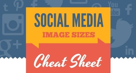
With Canva, creating social graphics is a snap, with templates already sized to fit Facebook covers and posts, Twitter headers and posts, Instagram posts, Pinterest pins, Google+ covers, Tumblr banners and graphics, and YouTube channel art.

Above all – your first concern should be that your visual content is being seen how you intend it to — that the dimensions are right, so nothing gets cut off or stretched out of proportion.

But don’t strain your brain trying to remember how many pixels go where or scour each site’s help section for the information — instead, bookmark this page and use the infographic below as a cheat sheet for creating all your social media images....

Jeff Domansky's insight:

Here's a really handy design guide for social media image sizes for the major social media channels. Useful reading. 9/10.

Jeff Domansky's curator insight, September 27, 2015 10:24 PM

Here's a really handy design guide for social media image sizes for the major social media channels. Useful reading. 9/10.

Roger L. Gill's curator insight, September 28, 2015 7:44 AM

Great Info!

Joe Gillard's curator insight, September 28, 2015 5:16 PM

Canva is amazing - Joe Gillard

Scooped by Jeff Domansky
Scoop.it!

55+ Twitter Bootstrap Templates - Want a Future Proof Website? - splash magazine

55+ Twitter Bootstrap Templates - Want a Future Proof Website? - splash magazine | Simply Social Media | Scoop.it

What is responsive website design?


Responsive website design is a new approach to web design in which websites adapt to an optimal viewing experience across a wide range of devices from desktops & laptops to mobile phones & tablets. In summary, screen sizes and resolutions are changing regularly, and creating different versions of a website for each individual device is just not a cost effective way forward.


Responsive website design addresses the issue head on.Why are we even talking about a new type of website design?More than half of UK adults now connect anytime-anywhere using their mobile device, and this is growing year on year.As an example of this, one of Brightfire’s technology sector clients saw 28% of all of their 2012 traffic came via mobile devices. 87% of this was from Smartphones devices, and they also saw a dramatic growth of 13% for larger tablet devices....

Jeff Domansky's insight:

This post lists more than 55 Twitter Bootstrap templates that you can use to future proof your website! And it's all about responsive design.

No comment yet.