


 Your new post is loading...

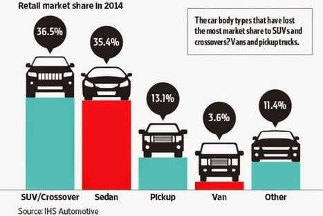

"We continually look for resources to use for “mini” lessons or “do nows” to help learners interpret data and draw conclusions through visual analysis.
The Statshot column in the weekend edition of The Wall Street Journal provides just that. David Goldenberg compiles the data, and the graphics are designed by Carl de Torres. The topics run the gamut, including pop culture, finance, technology, and science."
Via Beth Dichter


Finding great graphs to use with students is sometimes difficult. The Wall Street Journal may be the place to turn. This post shares examples of 3 graphs published in their Statshat column. This appears to be a new feature since the first publication is dated May 9, 2014.
These graphs will be useful for elementary and middle school. If you teach high school you may want to check out "the Numbers blog (which) examines the way numbers are used and abused,” and the topics are equally as diverse as those on Statshot."
Here are some great graphical resources found in the WSJ! Obviously some are quite Americanised but there are some great ones you could use for a discussion on statistics, skewed data or how data is used in the media to reinforce a bias.