

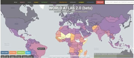

"In World Atlas 2.0, you can click on any one of nearly 3,000 different data sets related to technology, population, education, etc, and a visual representation of it will show up on a world …"
Via Leona Ungerer
Get Started for FREE
Sign up with Facebook Sign up with X
I don't have a Facebook or a X account


 Your new post is loading...
 Your new post is loading...
Your new post is loading...
"In World Atlas 2.0, you can click on any one of nearly 3,000 different data sets related to technology, population, education, etc, and a visual representation of it will show up on a world …" Via Leona Ungerer 
No comment yet.
Sign up to comment
These 22 charts and maps all told me something I found surprising. Some of them genuinely changed the way I think about the world. Via Beth Dichter

Gary Harwell's curator insight,
October 5, 2014 2:06 AM
Some cool stuff to share with your students. 
Leah Hood's curator insight,
August 22, 2017 4:54 PM
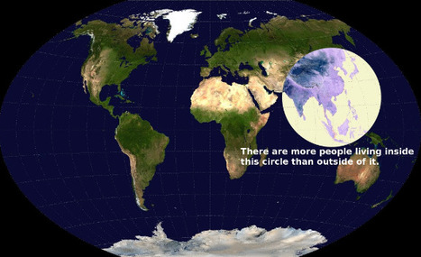
If you are looking for some maps that will have students scratch their heads and consider come concepts in a new light this post will provide you with 22 choices. The one above intrigued me. It shows a map of the world, and has a circle that shows where more people live than the rest of the world. I suspect this image would bring up many questions, and that many would be interdisciplinary. Click through to the post to find many other great maps and charts. |

Internet World Stats, Population and Internet Users in all countries and usage in all regions of the world. The Internet Big Picture.
|


