 Your new post is loading...
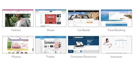
As reported by Fast Company and Inc. Magazine, a new EyeQuant study has shown that there's a surprisingly strong relationship between the "visual clarity" of a website (as rated by an algorithm) and its bounce rate. In fact, the results suggest that up to one-third of a user's decision to stay or bounce comes down to a snap judgment of whether or not the page is too cluttered. In this post, we'll take a closer look at the data and the methodology behind the study.
Why study the impact of visual clarity?
Within the design community, there's been a definite trend towards simpler, more stripped-back design. At EyeQuant, we've seen many of our customers "de-clutter" their way to higher conversion rates, and even observed that amongst a collection of online retailers, the ones with "cleaner" design were growing the fastest.
What we wanted to understand is this: does "clean" design have a positive impact on user engagement across the board, or is it limited to specific cases like overly cluttered-sites or retail?
Via Jeff Domansky
There are several nifty ways to go about pairing fonts for your design projects, including this machine learning-based tool and this Tinder-style app. But if you just want to see some great combinations, you’ll want to check out this excellent guide by designer Lou Levit. It features 50 top-notch pairings that draw from Google’s extensive web font collection – so you can grab all the typefaces you like for free, and use them on web design projects – and they’re matched with beautiful classic art. The pairings are organized and navigable by font style and mood (choose from Modern, Striking, Eccentric, Classic, Minimal, Neutral, and Warm). That’s handy for quickly finding a combination that suits your needs, whether it’s to professionally present information or announce an event. Plus, you can download the entire guide as a PDF. Find the guide, as well as tips on pairing fonts and the handy PDF, over at ReliablePSD.
Via Jeff Domansky
Designing for the web, you must keep up-to-date with the latest trends and tools. For the trends, it’s fairly easy to know what’s going on, but it can be hard to follow with the tools. …
Via Becky Roehrs
Most people go online and never really leave. Ofcom reported that UK adults spent nearly one day (21.6 hours) each week online in 2016. The study, conducted by the UK’s communications regulating body, also found that these numbers will continue to grow as new users go online for the first time.
Via Becky Roehrs, Elizabeth E Charles
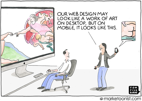
In 2015, Google introduced an algorithm update known as “Mobilegeddon” that prioritized mobile-friendly websites and was a wakeup call for marketers.
And yet, with customers increasingly mobile first, many brands still treat mobile visitors as mini desktop visitors.
Ericcson published a neuroscience study last year that found that the stress caused by using smartphones to find content and complete tasks on the mobile web is akin to watching a horror movie. They found that heart rate increases 38% with mobile content delays.
Via Jeff Domansky
If you work in the world of web design, whether that be in a studio or working from home, it's vital to keep up-to-date with the latest industry tools and standards. This month, we've found a number of interesting resources that should help you do just that. So, whether you’re looking to delve into the world of artificial intelligence, learn some new skills or launch an app, you’ll find something interesting on this list.
Via Jeff Domansky
This best web design inspiration 2017 will let you know about the modern, creative and brilliant design. You can get fresh ideas to make yourself better. Here’s a wonderful, creative and awesome collection of web design inspiration 2017. Websites let people know about the brand, product, company etc. It helps people out to know about regarding thing. Feature, about, description is mentioned to give clear view. Web design in any website does matter a lot because you’re not going to show feature and about only but are responsible for all engagement you made for viewers. So, keep in mind while selecting any design as it leaves good or bad impact....
Via Jeff Domansky
In a creative profession like web design, inspiration plays a huge part in your daily work schedule. It’s not always easy to come across inspiration which is why I started collecting all of the little snippets of inspiration I could find with my new side project. Whether you are a freelancer or part of a larger design team, getting a dose of inspiration in the morning is an excellent way to start your day. With inspiration in mind, I want to welcome you to a curated roundup of inspiring web design elements. Featuring everything from simple, animated SVG logo design to complex interactive storytelling, this page is sure to inspire – so take a look and tell us what you think!...
Via Jeff Domansky
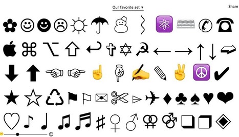
CopyPasteCharacter is a super-simple web page that displays all of the extended special characters, grouped into families, that you have at your disposal, while offering one-click copy into memory (as if you did Ctrl + C) for immediate pasting into any app. 100% free. My comment: Extremely useful tool for finding and using extended characters inside any text or app. Highly recommended. Try it out now: http://copypastecharacter.com/...
Via Jeff Domansky
I was curious what colors were being used by large, popular sites, so I decided to find out.Alexa.com maintains a list of the most visited sites on the internet. I wrote aPHP script to scrape the ten most popular sites and record all the colors used in the sites' home pages and style sheets. I plan to rescrape the data on a regular basis. Because of this, I'll keep analysis to a minimum, since it could become outdated when the data changes. Once I have data over a larger time period I'll be able to examine and graph trends in web development. I also plan to examine the difference in color usage between popular websites from different parts of the world....
Via Jeff Domansky
Do you want to create a static website using WordPress CMS? Here in this post we have covered the details about the process of creating a static site using WordPress along with some quality themes for any static site. WordPress is the most popular platform for creating blogs, it helps you to create a blog and publish your content without the requirement of any technical knowledge. But that doesn’t mean you can’t create a static website with WordPress....
Via Jeff Domansky
Every year web design trends come and go, and it’s necessary for designers to keep up with them in order to stay up-to-date. Designers see each other’s work, browse likes and comments, and draw conclusions. Although minor trends pop up all the time, we’ll only talk about one of the major trends in this article: single page design.
Via Jeff Domansky
If you’re looking into learning, studying, broadening your knowledge of web design then reading an eBook is great place to start. Within this article we have composed the 15 best eBooks for web designers that we think are great and even better, they’re all free!...
Via Jeff Domansky
|
Building a new website? Here are 4 steps to choosing the right color schemes for your brand. You’re creating a website, what colors should you be using on your site? Here’s the thing, different colors mean different things. Green means nature and kind and nice and organic, colors like red mean urgency and stop, colors like black resemble luxury but you know what? Pick whatever colors you feel resembles your brand....
Via Jeff Domansky
Are you going to burst the Internet with something really creative? You are at the right place. Here we compiled 50 most creative WordPress themes. They are suitable for different business niches like art, fashion, photography, entertainment, personal blogs and many others. We have thoroughly handpicked them for you, so you doesn`t need t
Via Jeff Domansky
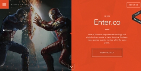
If you want to get the job or freelance gig you’re looking for, your portfolio needs to impress. And web designers have a tougher time than other creatives, as it isn’t just the case studies people will judge you on, but the design of the site itself. In this post, we bring you 10 of the coolest web design portfolios we’ve seen emerge in 2017 so far. While some go to town on special effects, others just rely on the timeless values of good design. All, however, should provide ample inspiration for your own portfolio....
Via Jeff Domansky
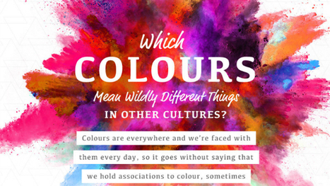
One of the most fun things to do in design is swirling the latest color trends into your work. Color is a fascinating topic, and even a generator that understands color theory has recently been invented. Because they mean different things, companies also actively use color in their brand designs to encourage feelings and behaviors from customers. However, in different cultures, color theory isn’t all black-and-white. In this delightful infographic, SilverDoor describes color associations of different cultures, adding contrast to the way you think. Telling a person from another part of the world that you’re “feeling blue” may mean something entirely different to them. Is your favorite color offensive to another culture? Find out in the infographic below....
Via Jeff Domansky, Antonio Ormachea, Stephania Savva, Ph.D
Whether it’s a brand promotion, video, news update or even a meme, visual content rules the social media landscape. What has become so important is effectively conveying your brand on social media through images and video.
In this quick-scroll world of social media, the visual face of your brand is often times the first thing your audience sees and possibly the one thing they remember. It’s hard to cut and paste an image and reuse it across all of your social networks unless you have a tool like Landscape.
Sprout Social’s very own tool is free to use to resize, crop and scale social media image sizes. And along with our resizing tool, we’ve provided all the specific dimensions and a few quick tips to help you decide which image best fits each position....
Via Jeff Domansky
If you’re feeling overwhelmed when attempting to select a theme for a WordPress site that will work for you, you’re not alone. There are so many to choose from, that after a while, all the good candidates begin to look alike. The real problem could be that you’re unsure of what theme characteristics to look for. After all, you want to build more than just websites; you want to build web experiences.Here’s what to look for....
Via Jeff Domansky
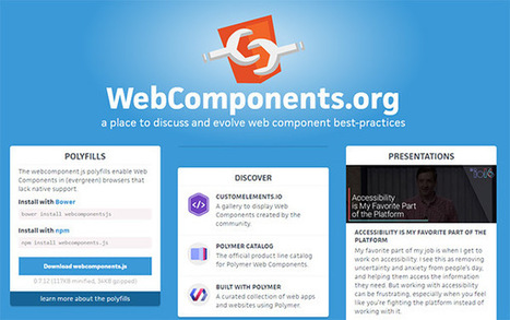
"Over the past few years many new frontend technologies have leaked onto the market. The web design landscape has shifted radically and it’s now much easier and much more technical to build websites. I’m always interested in the latest tools and best practices because the new tools of today often become the must-use tools of …" Web ComponentsPolymerAMPGulpTypeScriptThree.jsDockerIonic FrameworkZurb's LibrariesGoogle Web Starter Kit
Via Leona Ungerer, Juergen Wagner
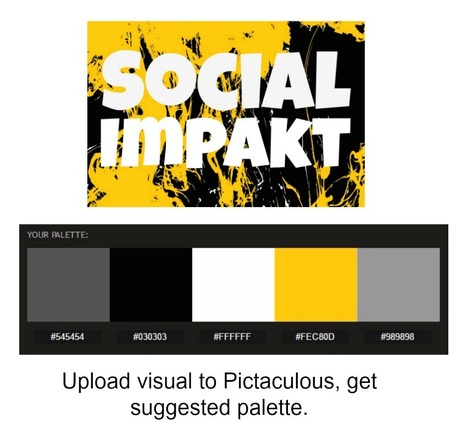
Generate a color palette from PNG, JPG or GIF image/photo. Receive color suggestions, download Photoshop swatches (.ACO). All possible with the fabulous Pictaculous tool. if you're a blogger or web designer, this tool is essential. Simply upload a photo and it scans and suggests color palette similar to the one in the photo above.
Via Jeff Domansky
When it comes down to it, design is all about making choices. Each color, shape, line, font, text, and graphic you use will ultimately influence the message you're trying to get across.
I’ve often been in conversations with people who know they should get better at design, but they don’t feel they have a “natural sense” for creativity. However, I argue that learning to design well has as much to do with psychology and user behavior as it does creativity.
But learning the "psychology of design" doesn’t mean picking up a playbook that'll tell you the right and wrong way to design something. That's just not the way it works.
What brushing up on psychological principles (as they relate to design) will do is help you understand what goes into the creation of intuitive, intentional design experiences.
Want to learn more? We'll dive into a handful of psychological principles below to help you get the wheels turning....
Via Jeff Domansky
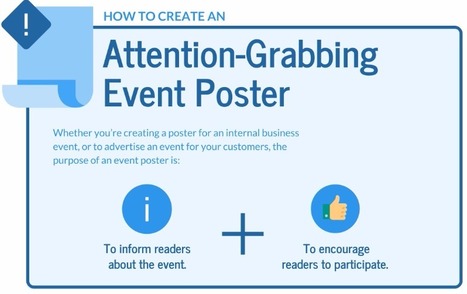
I come to you today with my best tips for how to create awesome, attention-grabbing event posters.
This article focuses specifically on how to create posters to advertise events. I’m going to write another article on how to create informational posters soon.
In this article, I’ll explain how to: Create a hierarchy of information.Grab readers’ attention with a beautiful design.Design specifically for print.Design specifically for email....
Via Jeff Domansky
Choosing harmonious font combinations is a key part of typography. Good font pairings will lead to beautiful designs that are also easy to read.For font-pairing ideas and inspiration, check out the following resources....
Via Jeff Domansky
At the beginning of my journey, I sought advice from graphic designer friends. They were telling me the same thing over and over: "Learn Photoshop, Illustrator, and InDesign;" "Read a book about basic design principles." As much as these tips helped, there were still holes in my knowledge that couldn't be filled by software lessons or books. Anyone who's tried to teach themselves creative concepts understands the pain points associated with trying to balance learning fundamentals, navigating new tools, and developing a personal style.
The following tips are pieces of advice I wish I had been given at the onset of my DIY graphic design journey. I hope they help you smooth some bumps in the road. (And for more great tips, resources, and inspiratoin, be sure to subscribe to HubSpot's Design Blog.)...
Via Jeff Domansky
|


O-e third of the websiite visitors decision to stay more bounce is based on page clutter.
O-e third of the websiite visitors decision to stay more bounce is based on page clutter.