 Your new post is loading...
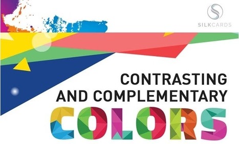
There's a reason companies test the colors of things like advertisements, banner ads, and call-to-action (CTA) buttons. When we did a button color test here at HubSpot, for example, we found that a red CTA button outperformed a green CTA button by 21%. In other words, we increased conversion rate without changing anything about the page except for the color of the CTA. That's the power of color psychology in marketing. Let's explore the ways color psychology plays a role in marketing, with a quick vocabulary lesson and a visual guide...
Building a new website? Here are 4 steps to choosing the right color schemes for your brand. You’re creating a website, what colors should you be using on your site? Here’s the thing, different colors mean different things. Green means nature and kind and nice and organic, colors like red mean urgency and stop, colors like black resemble luxury but you know what? Pick whatever colors you feel resembles your brand....
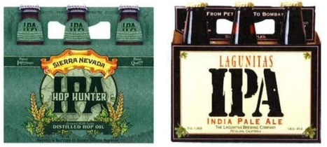
Ten years ago, a lot of breweries found they could get away with soliciting a friend to design their beer packaging. Not anymore.
With so many beers competing for attention on the shelves, standout beer labels have become a critical part of any brewery's marketing strategy.
So which breweries have come up with those really standout designs?
In 2009, I started a stock media company with a single vision: to provide premium creative content that everyone could afford. This idea grew into VideoBlocks, followed by the launch of GraphicStock and AudioBlocks. Now, we’re adding millions of photos to our new image Marketplace and it’s time to bring our expanding libraries together as Storyblocks.
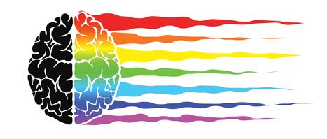
Color theory is the art and science of colors, our understanding of how colors mix, how people perceive colors, and the message the colors communicate. Are you aware that colors impact how one thinks and behaves? In fact, color ads attract 42 percent more attention than those in black and white. This holds true even outside the realm of social media and into print marketing. Prospects hold on to colored business cards 10 times longer than standard white cards.
Why Is Color Theory Important to Content and Social Media Campaigns?
When a prospect’s eyes meet a particular color, they immediately send a message to the brain. After a nanosecond of processing the information, the individual makes a judgment about what they see. They may be interested, bored, or repulsed.
Great marketers wind up testing multiple visuals to find the best option. However, this can’t begin without an understanding of the benefits of color theory in marketing.
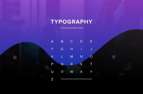
I launched Typewolf as a side project in June of 2013. Working as a designer, I was always frustrated by the lack of good resources for choosing fonts for design projects. Seeing type samples set in “the quick brown fox jumps over the lazy dog” isn’t very useful when it comes to web design—seeing how real type performs on actual websites is much more helpful. I’ve also noticed that other typography sites tend to be written from a type designer’s perspective rather than from the perspective of someone who actually uses type in their day-to-day work. I’ve been a designer for 15 years, so everything on Typewolf is approached from a designer’s perspective....
One of the most important skills you can learn as a designer is how to choose type. This is because text is one of the primary ways designers can communicate with users. Typography can make or break a design. There’s a beauty and complexity to typography. Some people devote their entire careers to type. Thankfully, their work is well documented, so we have tons of online resources for typography. This article is designed to serve as a starting point for helping you learn how to choose type for your designs. It will encourage you to explore fonts and font combinations beyond those you’re familiar with....
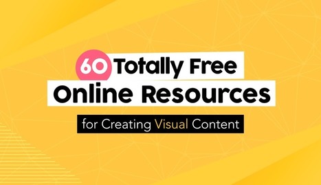
Creating engaging visual content doesn’t have to require a financial investment. Sure, at one time graphic designers needed expensive software and even more costly images to craft a winning visual campaign. But thanks to a host of free online resources, anyone can design high-quality visual stories with ease. Of course, navigating the sea of online images and editing tools is easier said than done. Some require membership, others charge royalty fees, some require advance permission and others charge for high-definition. Fortunately, we’ve scoured the Web for the most complete, the easiest to use and the most innovative resources to aid even the most amateur designer in crafting stunning visual content. Check out these 60 totally free design resources for non-designers...
Many artists today are taking the e-commerce road to market their talent. And that’s actually a great idea. Amazon, eBay and other popular online selling p
Via Baiba Svenca
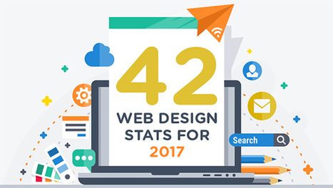
Are you considering a new website or even a redesign in 2017? Need some facts and figures to help you form and execute your web strategy? We share 42 stats you need to know in this infographic....
It doesn’t matter how many years of experience you have of a programming language, framework or CMS, you will always need to refer to the official documentation or, and more than likely, a handy quick reference cheatsheet, as it’s literally impossible to remember and know absolutely everything. In this post I’ve collected useful cheatsheets, references, guides, checklists and docs, covering almost all aspects of web design, that will not only help to improve your productivity, but will also help to solve some of those frustrating programming issues that often arise....
The design report is an exploration into the future of design. A deep-dive into the rapid changes created by tech and man. This report has been developed in co-creation with the most ambitious brand leaders around the world.
It identifies five developments that we all must act upon to stay ahead of the game....
Another year has passed and designers are looking ahead towards the future. Many promising design trends are bound to erupt in 2017. Last year I covered the top 2016 design trends and we’ve seen a lot of changes since then. So, for this post I’ve picked the top 20 trends that I’ve noticed gaining traction in 2017. These design trends can apply to any website, so keep your eyes out for these techniques as we move through 2017 and beyond....
|
As reported by Fast Company and Inc. Magazine, a new EyeQuant study has shown that there's a surprisingly strong relationship between the "visual clarity" of a website (as rated by an algorithm) and its bounce rate. In fact, the results suggest that up to one-third of a user's decision to stay or bounce comes down to a snap judgment of whether or not the page is too cluttered. In this post, we'll take a closer look at the data and the methodology behind the study.
Why study the impact of visual clarity?
Within the design community, there's been a definite trend towards simpler, more stripped-back design. At EyeQuant, we've seen many of our customers "de-clutter" their way to higher conversion rates, and even observed that amongst a collection of online retailers, the ones with "cleaner" design were growing the fastest.
What we wanted to understand is this: does "clean" design have a positive impact on user engagement across the board, or is it limited to specific cases like overly cluttered-sites or retail?
Branding is a key part of building any business. But what if you are the business? When promoting yourself—as all consultants and freelancers must do—one of the first steps is to create a strong, recognizable logo that conveys who you are, both as a person and as a company. Sound complicated? It can be. But luckily, there are some incredibly successful branding role models who can show you the way—professional athletes. Though many of them are part of a team, top athletes also have specific personal brands that accompany them wherever they go. So, how do you create a personal logo that’s inspiring and enticing (and represents the essence of who you are, of course)?Let’s check out how some of the pros have done it...
In terms of design, the minimalist aesthetic is the visual representation of this concept. Even if in the early days of this style it was very difficult for the designers to achieve its simplicity and clean lines, they have learned to “declutter” the visual to the point of it being the second nature. However, some of the designers take it a step further and cut out almost everything from the design.
Indeed, even if the latest web designs with loud color, trendy headers, and stunning imagery are really attractive, sometimes, it’s nice to see and admire the everlasting minimalist style. The ultra-minimalist websites in this list focus on composition and typography to create clean and simple visuals, and the naked designs are as beautiful as those full of glamour.
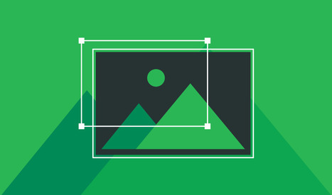
Images are a vital component of any website, and using the right ones can enhance both your content and design. The problem lies in finding the right graphics without resorting to the same free stock images everyone else uses. If you really want to set your site apart, there’s an alternative to stock images – you can create your own. The best part is, you don’t need to be a designer to get it done. Nowadays, there are plenty of tools that can help you create stylish graphics with only a little practice, and they’re a great option if you don’t have the budget to hire a designer. In this article, we’ll talk about why images are so important for any website, then we’ll introduce you to three tools that can help you create your own custom graphics. Let’s get started!...
Selling services online is an entirely different ballgame than selling products. There are separate processes, marketing techniques, and web design principles you must follow. You can’t pitch services in the same way as products and you must understand the advantages and disadvantages that come with the service industry. With the right web design ideas, your company can easily meet and exceed the business success of your product-selling peers. Optimize your website with these six tips..
Just like previous years, we've undertaken great efforts to look for, categorize, and create font previews of 100 typefaces that you can use to do almost anything. Regarding their licenses, you should pay attention to each one individually as, while the majority are completely free, some are for personal use only and others are not full families – this means that you’ll only be able to download regular or medium weights or condensed styles for free. Font Selection As you know, the selection has been made keeping the typical type classifications in mind to help you browse more efficiently: Serif, Sans Serif, Slab Serif, Rounded, Geometric, Decorative, Display, etc. Many of these fonts can also be downloaded as a web font kit so that you can use them in your online projects....
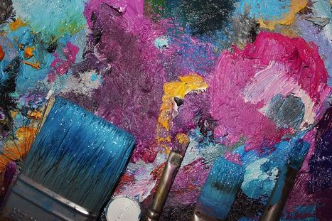
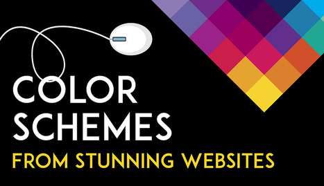
Color is such a fundamental part of the way we perceive the world that we often take it for granted. Think about it: From the youthful and vivid orange on someone’s attire to the gray and gloomy sky above us, colors have the power to mold our perceptions of others and even the circumstances we find ourselves in. This is why one of the most powerful tools in a designer’s arsenal is color. It can either make or break a design; it can be the determining factor in engaging viewers or sending them promptly on their way. As a non-designer, I often find it difficult to find just the right colors for my amateur projects. Whether I’m creating a simple image to support my content or more elaborate projects such as a slide deck or infographic, I frequently spend a good amount of time looking for the perfect color scheme. I ask myself questions like: Do I want my design to be inviting? Provocative and bold? Or intelligent and elegant? Unless you’re a seasoned designer, it takes time and effort to find a color combination that works, which is why the design team at Visme decided to provide our users with a handy list of beautiful color schemes from websites that have been recognized by Awwwards, the most prestigious award for Web designers and developers....
‘Crowded’ websites are difficult to read. Complexity often makes users uncomfortable. If we’ve overwhelmed them with lots of different information, all fighting for their attention, they will leave or not take the action we’d wanted them to do. It may be purchasing something on e-commerce website or reading the article on a blog. There is, however, a concept that helps graphic designers to create great web experiences, making the content appealing and easy to follow. It’s white space – the way of giving your layouts extra room, simply by avoiding unnecessary clutter and using the space between elements for their advantage....
Have you noticed that most websites are, more or less, made up of rectangular boxes? From the rectangular shape of a browser window to the rectangular shape of buttons, websites are mostly rectangular. This is not only practical, it just makes sense. However, that doesn’t mean there is not room for other shapes like circles, triangles, or made up miscellaneous curvatures. I’ve gathered 30 different websites that use different shapes for different purposes. Some of them use random assortments of shape for decorations – like Roadmap – others completely redefine the structure of a web page – like Timetable Records....
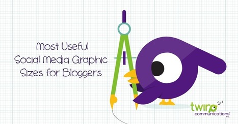
Stop me if this seems familiar. You have just written the most epic blog post of your business career and you want to create amazing images to help you promote it. Knowing how things change in social media on a regular basis you fire up a Google search for “social media image sizes”. Maybe you even add in the current year to weed out old results. Perhaps you go one step further and search for “Facebook image sizes 2017”. No matter what you search for you still seem to find three different answers. And even if you find what you think is current info, there are so many different options listed for each network, you’re not sure which dimensions to use. Fear not! I have compiled a list of the most commonly used social media image sizes. The infographic below shows only the images and dimensions you can easily control with your design, not every single image size you’ll see on the networks. Some of the images you see on Facebook, for example, are pulled in from other places and therefore we don’t really “design” for those spaces. And the best news is you can get away with using some of these social media image sizes on multiple networks....
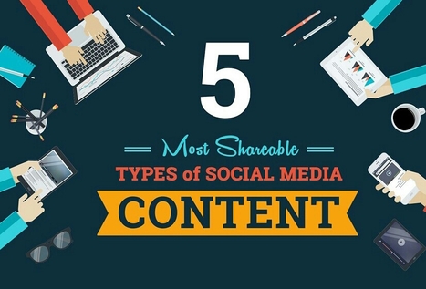
Whether it’s a brand promotion, video, news update or even a meme, visual content rules the social media landscape. What has become so important is effectively conveying your brand on social media through images and video.
In this quick-scroll world of social media, the visual face of your brand is often times the first thing your audience sees and possibly the one thing they remember. It’s hard to cut and paste an image and reuse it across all of your social networks unless you have a tool like Landscape.
Sprout Social’s very own tool is free to use to resize, crop and scale social media image sizes. And along with our resizing tool, we’ve provided all the specific dimensions and a few quick tips to help you decide which image best fits each position....
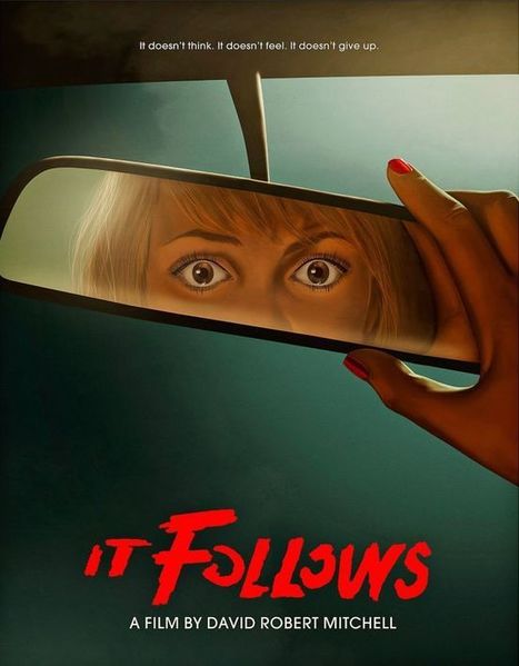
Posters offer a diverse canvas for graphic designers, and some of the very best are not only beautifully designed but also inspiring and thought-provoking. There are hundreds of stunning poster designs that are instantly eye-catching, but we’ve narrowed this list down to a few of the most intriguing examples from the current decade. Whether you prefer to be bold or understated, you’re certain to find something here that will get your creative juices flowing.
|


Color psychology and its role in buyer decision-making are fascinating elements of marketing. But how can such nuance be quantified? Well, look no further as HubSpot answers.