Public Relations & Social Marketing Insight
443.4K views | +0 today
Follow
Public Relations & Social Marketing Insight
Social marketing, PR insight & thought leadership - from The PR Coach
Curated by Jeff Domansky
Your new post is loading...
Scooped by Jeff Domansky
Scoop.it!

30+ Awesome Responsive Web Design Examples

30+ Awesome Responsive Web Design Examples | Public Relations & Social Marketing Insight | Scoop.it

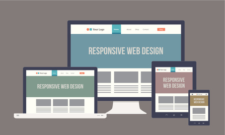
The layout of a responsive website is designed in such a way so that it becomes sensitive to the screen size of the device, which is used for accessing it. In the present time most of the websites are not responsive. But the pace at which the number of mobile users is increasing, it is high time for the entrepreneurs or the webmaster to upgrade their site and make it responsive.


This is especially applicable for the owners of the ecommerce sites as it will definitely impact the conversion rate of their site. There are many ways with the application of which a website can be made responsive. A skilled and knowledgeable web designer can accomplish the task with ease and efficacy if he or she is aware of the technique.


We have collected 30+ responsive websites from the internet which is going to be of great help for the designers. These examples will help the designers to draw valuable inspiration as far as the style and layout of the website is concerned....

Jeff Domansky's insight:

Good sample of responsive designs.

No comment yet.
Scooped by Jeff Domansky
Scoop.it!

25 Amazing Responsive Design Templates That Will Make You Mobile Friendly

25 Amazing Responsive Design Templates That Will Make You Mobile Friendly | Public Relations & Social Marketing Insight | Scoop.it

Responsive web design has been discussed for the last several years. And, there's a perfectly good explanation why. Responsive web design can be viewed as the welcome mat for a website, which has to satisfy visitors who are viewing the site on multiple devices.


However, when only 18 percent of the web (at most) are making use of responsive web design, there remains a lot of work ahead for website owners. If you want to improve the experience of your customers, boost your search engine ranking, and stay relevant, then you definitely should consider giving your site a responsive web design update. And, here are 25 templates to help get you started....

Jeff Domansky's insight:

Here are 25 terrific responsive web design and blogging templates to help you be more mobile friendly.

No comment yet.
Rescooped by Jeff Domansky from Digital Delights - Digital Tribes
Scoop.it!

9 Essential Responsive Web Design Best Practices

9 Essential Responsive Web Design Best Practices | Public Relations & Social Marketing Insight | Scoop.it
An effective responsive design solution is the number 1 requirement for a modern website in 2014. Discover the 9 essential responsive web design best practices

Via Ana Cristina Pratas
Jeff Domansky's insight:

Good look at responsive web design best practices.

Adlava's curator insight, November 9, 2014 11:48 AM

Especially fond of #2: TEST your design on the ACTUAL device! Spoofers can only do so much...

José Antônio Carlos - O Professor Pepe's curator insight, November 11, 2014 7:58 AM

Mais uma excelente dica da Ana Cristina Pratas. O design de páginas web vem sofrendo, como tudo aliás, uma forte mudança em momentos recentes. As práticas apontadas nesta postagens merecem atenta análise.

Scooped by Jeff Domansky
Scoop.it!

6 Undeniable Reasons Why The Future of Web Design is Responsive

6 Undeniable Reasons Why The Future of Web Design is Responsive | Public Relations & Social Marketing Insight | Scoop.it

...There are two major methods for creating a mobile websites Responsive Design and Mobile Templates. Responsive design requires you only have one website that is coded to adapt to all screen size no matter what the device it’s being displayed on.In contrast, a mobile template is a completely separate entity requiring you to have a second mobile only website or sub-domain.


Mobile templates are also built for each specific, not per screen size. This can cause some issues as we will discuss below.


Responsive design, a term originally coined in a  2010 A List Apart article  by Ethan Marcotte, responsive design has been by far the most popular and widely used method for designing a mobile website. Here are just a few of the undeniable reasons your website needs to be responsive....

Jeff Domansky's insight:

Luke Summerfield explains why having a responsive website is so critical to your marketing and some key considerations to keep in mind when designing a responsive website.

July 31st-MY BDAY! ¶'s curator insight, July 30, 2014 2:29 AM

As a new WordPress blogger (but not a noob by any stretch of the imagination!), I'd become confused between all the choices in themes that promised to be "super-responsive." I had no idea what that really meant.


Or why it even mattered. A blog is a blog is a blog, right? Right?

I am not 100% wrong, but I am 100% not-right.

imaginetsa's curator insight, July 30, 2014 3:22 AM

6 Undeniable Reasons Why The Future of Web Design is Responsive

LawRank's curator insight, August 4, 2014 4:03 PM

If you don't have a responsive site for your law practice, might be a great time invest in getting one.

Scooped by Jeff Domansky
Scoop.it!

Beyond Responsive Design: How to Optimize Your Website for Mobile Users

Beyond Responsive Design: How to Optimize Your Website for Mobile Users | Public Relations & Social Marketing Insight | Scoop.it

The algorithm change is evidence Google knows it has to surface websites that painlessly get users what they need at the time that they need it. Google doesn't want to send mobile users to websites that provide a frustrating browsing experience -- that would damage Google’s promise to its users to always deliver helpful, relevant content. 

But this algorithm change is not what marketers should be reacting to. It’s a signal of a much larger shift that’s afoot. It’s the canary emerging from the mine shouting, “Consumer behavior is changing! We must adapt!”

Building a mobile-friendly website is step one, but tweaking your website will not keep you ahead of consumers’ changing behavior and expectations. In short, you have to infuse your marketing strategy with a “mobile mindset.” Here's how....

Jeff Domansky's insight:

Great website mobile optimization tips from HubSpot.

No comment yet.
Scooped by Jeff Domansky
Scoop.it!

The Next Big Thing In Responsive Design

The Next Big Thing In Responsive Design | Public Relations & Social Marketing Insight | Scoop.it

Responsive design, which allows designers and developers to build websites that adapt to every screen size, is one of the most empowering web tools to be adopted in the last decade.


RESPONSIVE PHILOSOPHY IS NOT JUST ABOUT DESIGNING WEBSITES THAT ADAPT TO SCREEN SIZE.


But adapting to the screen is only the first frontier of a new, responsive web. Today, users expect online experiences that not only respond to what device they're using, but also their location, time of day, what they’ve already read, and events happening in real time.


To capture a user’s attention for the next generation of the web, you’ll need more than just responsive design. You’ll need a responsive philosophy....

Jeff Domansky's insight:

Responsive design has to go beyond optimizing for different screen sizes, write Code and Theory's Dan Gardner and Mike Treff.

No comment yet.
Scooped by Jeff Domansky
Scoop.it!

The Next Big Thing In Responsive Design | Fast Company

The Next Big Thing In Responsive Design | Fast Company | Public Relations & Social Marketing Insight | Scoop.it

Responsive design, which allows designers and developers to build websites that adapt to every screen size, is one of the most empowering web tools to be adopted in the last decade.


But adapting to the screen is only the first frontier of a new, responsive web. Today, users expect online experiences that not only respond to what device they're using, but also their location, time of day, what they’ve already read, and events happening in real time.


To capture a user’s attention for the next generation of the web, you’ll need more than just responsive design. You’ll need a responsive philosophy....

Jeff Domansky's insight:

What's a responsive philosophy like you doing in a place like this? Just kidding. But it is a good question ponder when thinking about the future of responsive web design.

No comment yet.
Scooped by Jeff Domansky
Scoop.it!

29 new inspiring responsive designs on the web | The Next Web

29 new inspiring responsive designs on the web | The Next Web | Public Relations & Social Marketing Insight | Scoop.it

Everyone who is anyone is talking about responsive design these days — and everyone certainly has a strong opinion about it. But, whether you love it or hate it, responsive design is bound to go mainstream in 2013. Every business from Harvard to AOL are embracing responsive design as the wave of the future, and more websites are popping up on every device with an internet connection with conforming layouts.


Take a look at these new, smart and stylish responsive layouts and get inspiration for your next website. Spanning across different kinds of companies, strategies and aesthetics, all of these websites have one thing in common: great responsive design.


What’s your favorite responsive design website?

  
Jeff Domansky's insight:

These are truly impressive designs. Browse and be inspired...

No comment yet.